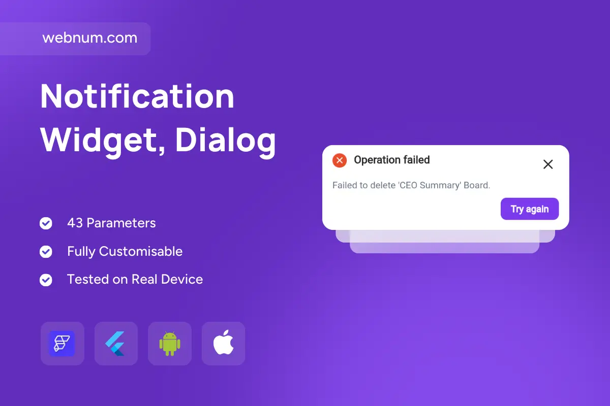
Meet the actionable alert toast ⚠️ — a modern, non-blocking error notification that pairs a bold red icon ❌, a clear failure message 🧾, and a “Try again” CTA 🔁 so users can recover instantly without leaving the current screen. Smooth fade/slide animations ✨ and a dismiss button ✖️ keep it visible yet unobtrusive, while consistent styling builds trust across all failure states.
Functionality
-
✅ Error state UI: red status icon + bold title for instant clarity.
-
📝 Contextual message: include operation details (e.g., Failed to delete “CEO Summary”).
-
🔁 Inline Retry button: custom callback to re-attempt the action.
-
✖️ Dismissible: close icon and optional auto-dismiss with timeout.
-
🎞️ Motion: configurable fade/slide in & out.
-
🧱 Stackable: queue and display multiple toasts gracefully.
-
🎨 Themeable: colors, copy, radius, elevation, spacing for light/dark modes.
Use Cases
-
🗂️ CRUD apps (boards, file managers): show failures and let users retry.
-
🌐 Network/API issues: timeouts, 5xx errors, offline states.
-
🧾 Checkout & dashboards: payment/submit errors with immediate recovery.
-
☁️ Uploads & sync: retry failed transfers without leaving context.
Keywords
actionable alert toast, error notification widget, retry button toast, dismissible error toast, snackbar error, toast with action, inline retry alert, failed operation message, network error toast, api error handling, upload error notification, delete failed toast, flutterflow widget, flutterflow action toast, modern error ui, non blocking alert, app notification, cross platform toast, error feedback, retry cta widget
Notification Widget, Dialog
- BEST VALUE
- Full Flutter source code
- Editable Figma design files
- Lifetime updates
- Technical support included
- Commercial use license
You may only use this template for one project. For more details, please read the Marketplace Terms of Service.