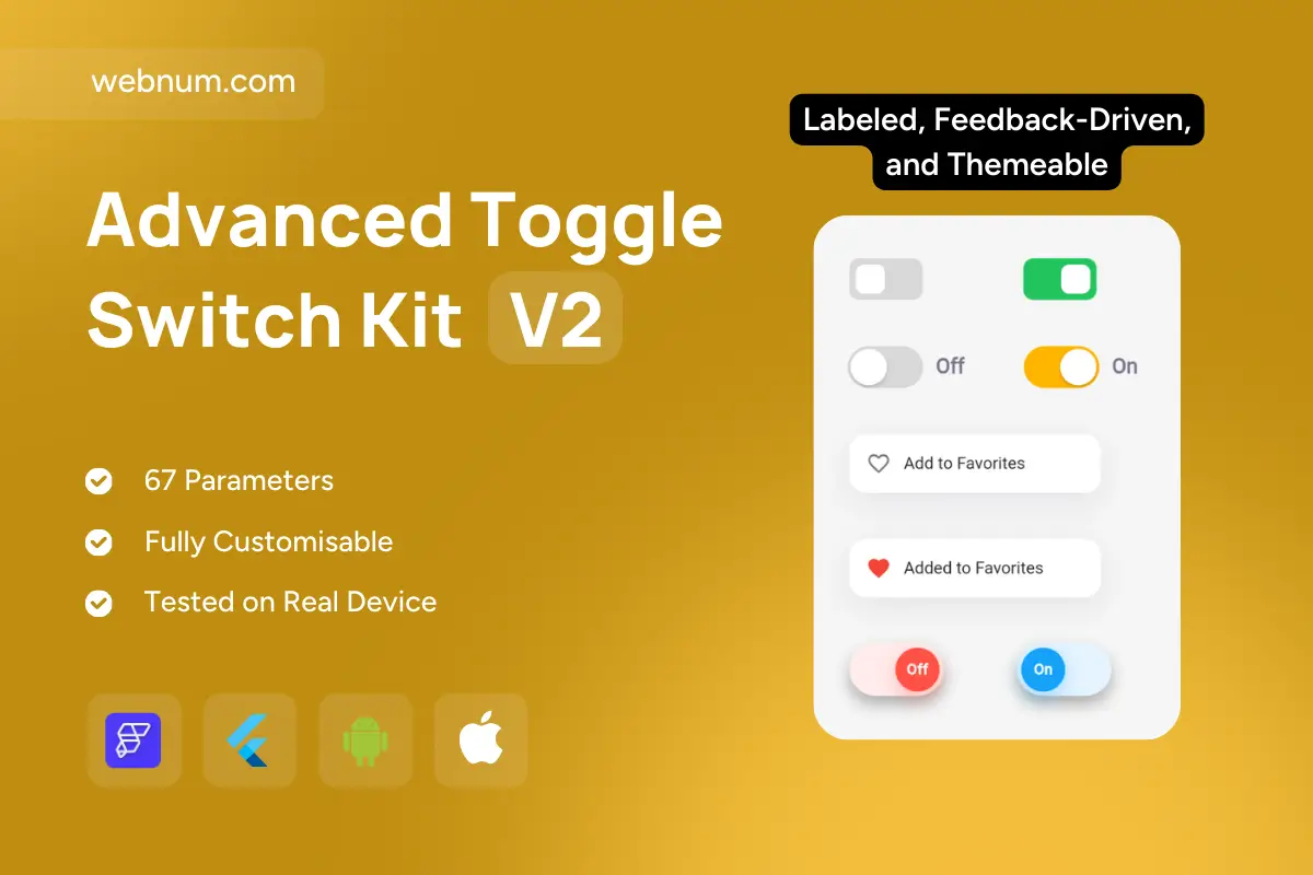
Toggle switch widget flutterflow — a polished toggle set for binary actions with crystal-clear feedback. Choose compact iOS/Material switches, “Off/On” labeled controls, or action cards (💖 Add to Favorites → ✅ Added). Transitions feel buttery-smooth with tiny haptics, and every state is accessible, localizable, and production-ready for forms & settings.
✨ Functionality
-
👆 Tap/drag with spring-physics thumb, ripple effect, and optional haptic confirm
-
🧭 Visual states: off/on, hover, focus, pressed, disabled, async loading (guard + spinner)
-
🗂️ Context cards: dynamic text + icon swap (heart outline → filled), optional toast/snackbar
-
🏷️ Labels (left/right), thumb badges, density presets (compact/regular)
-
🎨 Themes: solid, outline, soft/neo shadow, gradient pill; light/dark ready
-
🧩 Form bindings: controlled/uncontrolled, validation,
onChanged, optimistic update with rollback -
♿ Accessibility: ARIA switch, screen-reader labels, Tab/Space/Enter keys, RTL & Reduce Motion
-
⚡ Performance tuned for lists (layer caching, 60fps)
✅ Use cases
-
💟 Favorites/likes, subscriptions, save-for-later
-
⚙️ App settings: notifications, privacy, biometrics, dark mode
-
🛒 E-commerce quick toggles: stock alerts, auto-reorder
-
🛠️ Admin/ops: feature flags, access controls
-
🎬 Media/streaming: autoplay, downloads on cellular
-
🏠 Smart-home scenes & device power switches
Keywords: toggle switch, on/off control, labeled switch, favorites toggle, heart icon, optimistic ui, async guard, haptic feedback, ripple, gradient pill, neumorphic, outline style, accessibility, aria switch, keyboard navigation, rtl, reduce motion, theming tokens, dark mode, responsive ui, flutterflow widget, flutterflow component, high performance.