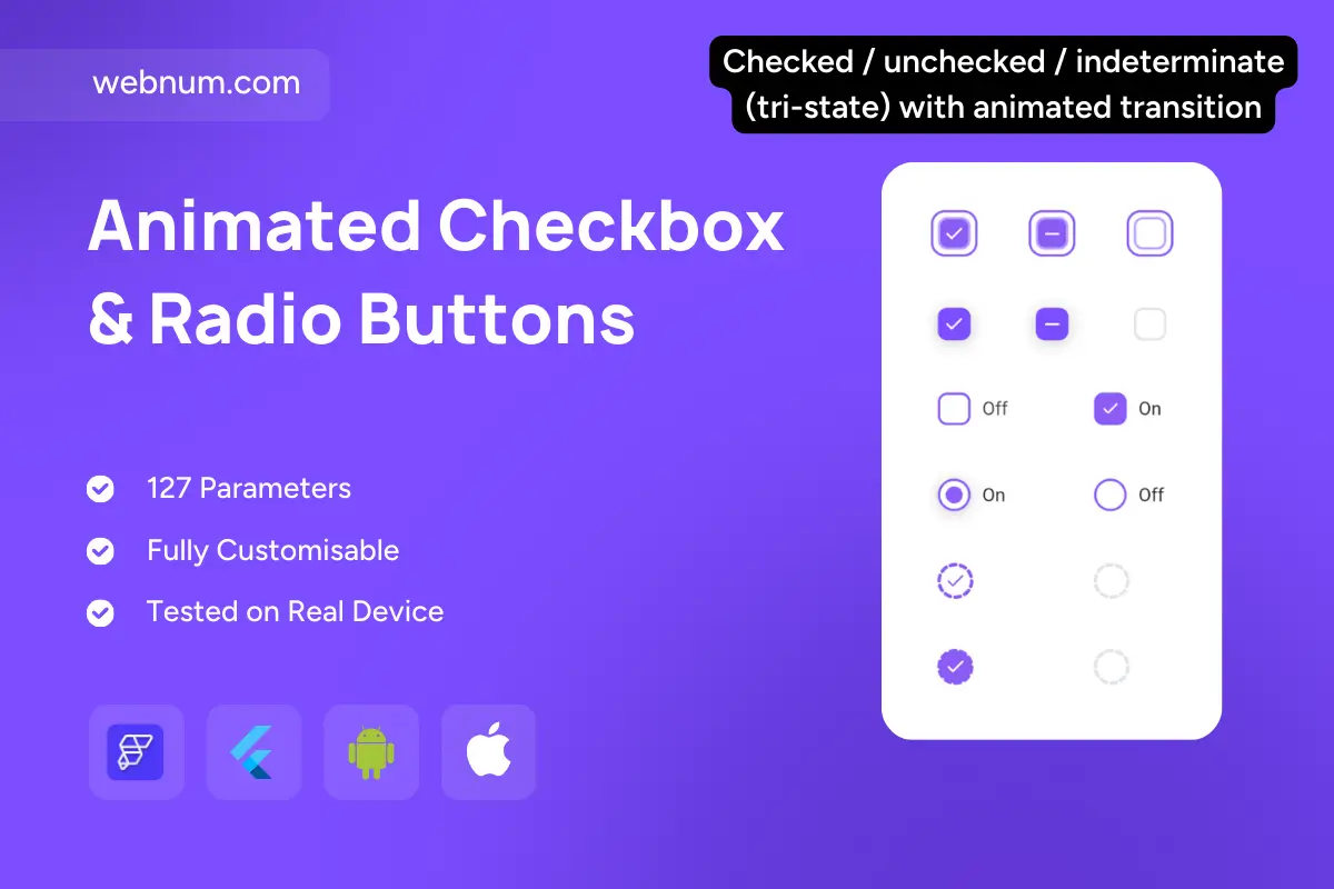
Meet a polished suite of selection controls for FlutterFlow — covering ✅ checkboxes (on/off/indeterminate) and 🔘 radio buttons with gentle glow, ripple, and focus rings. Perfect for large forms, everything is themeable, keyboard-friendly, and plugs cleanly into validation & state. Shapes, sizes, and icons are configurable (square/rounded for checks, circular for radios) with crisp, buttery transitions and optional outlined/loading looks. Built for production and SEO-ready with the key phrase: flutterflow checkbox.
Functionality ✨
-
✅ Checkbox: checked / unchecked / indeterminate (tri-state) with smooth animated transitions.
-
🔘 Radio: selected / unselected with inner-dot morph + soft glow.
-
🎨 Variants: filled, outline, ghost, subtle shadow; sizes S / M / L.
-
🏷️ Labels: left/right placement, spacing, multiline, semantic pairs (On/Off).
-
🖱️ Interaction: ripple, hover, pressed, haptic feedback, focus ring.
-
🚦 States: disabled, read-only, error/warning/success with color tokens.
-
♿ Accessibility: ARIA roles (checkbox, radio, radiogroup), screen-reader labels, Tab/Space/Arrow keys.
-
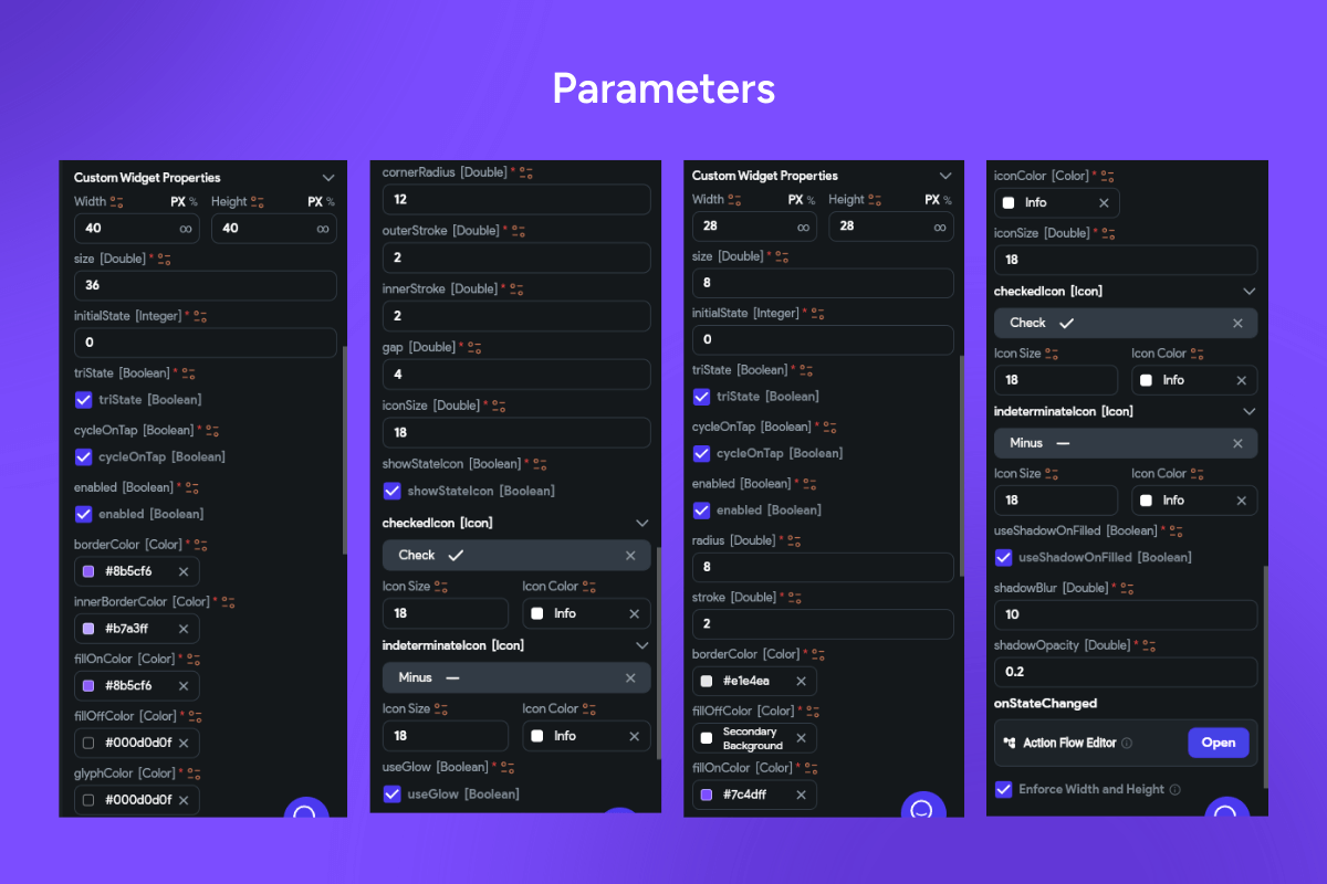
🧩 Form bindings: initial value, validation, error text, onChanged / onSubmitted.
-
👥 Group logic: checkbox groups with Select-all & partial aggregation; radio groups with exclusive selection.
-
🧱 Theming: stroke/fill/halo colors, corner radius, icon set, elevation, density, typography.
-
🚀 Performance: layer caching for 60fps, Reduce-Motion, RTL & dark-mode ready.
Use cases 🧰
-
🧭 Multi-step onboarding & profile consents
-
🛍️ E-commerce filters (brands, sizes, in-stock)
-
⚙️ Settings & permissions (feature flags, roles)
-
📝 Surveys & quizzes (single vs. multiple select)
-
📊 Admin dashboards with bulk actions & indeterminate feedback
-
🏥/🎓/💳 Regulated forms needing strict a11y & validation
Keywords 🔎
checkbox, radio button, tri-state, indeterminate, radiogroup, selection controls, form inputs, on/off, outline vs filled, glow, ripple, haptic feedback, keyboard navigation, aria, accessibility, validation, error state, disabled state, select all, partial select, theming tokens, density, dark mode, rtl, reduce motion, flutterflow widget, flutterflow component, high performance, modern ui, flutterflow checkbox