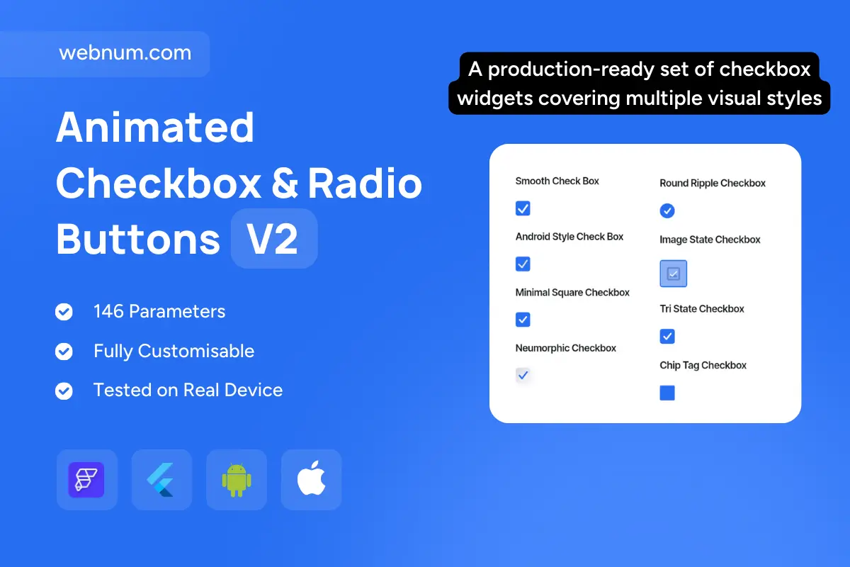
Checkbox widget that’s production-ready and gorgeous ⚡️. A versatile pack of checkboxes in multiple visual styles—Smooth, Android/Material, Minimal square, Neumorphic, Round Ripple, Image-state, and Tri-state. Every variant ships with crisp micro-interactions ✨ (morphing checkmark, ripple, glow), resilient state handling, and accessibility that just works ♿. Fully themeable and tuned for dense forms and filter panels on mobile & web.
Functionality 💡
-
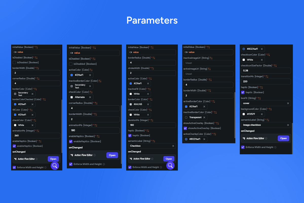
7 presets + custom builder: Smooth • Material • Minimal • Neumorphic • Round Ripple • Image-state (custom icons/bitmaps) • Tri-state.
-
Tri-state logic: ✅/⬜/➖ with parent–child aggregation (e.g., Select all shows partial state).
-
Animated transitions: checkmark path morph, scale/fade, ripple/halo, optional haptics; configurable duration & easing.
-
Rich states: hover, focus, pressed, selected, disabled, error/warning/success with tooltips & helper text.
-
Form bindings: initialValue, validation, error text, onChanged/onSubmitted, controller APIs; group helpers (select all/none/invert).
-
Accessibility first: ARIA roles, screen-reader labels, Tab/Space/Enter keys, focus rings; RTL & Reduce-Motion ready.
-
Theming & sizing: radius, stroke width, icon set, fill/outline/ghost, elevation/shadow, densities (S/M/L), color tokens for light/dark.
-
Performance: GPU-friendly drawing & layer caching for buttery 60fps in long lists.
Use cases ✅
-
Settings & preference forms (privacy, notifications, feature flags)
-
E-commerce faceted filters (brand, size, availability) 🛍️
-
Admin dashboards with bulk actions and partial-select banners 🧰
-
Surveys/quizzes & onboarding consents 📝
-
Checklists, to-dos, and QA workflows with success/error feedback ✅❌
Keywords
checkbox widget, material checkbox, minimal checkbox, neumorphic checkbox, round ripple checkbox, image state checkbox, tri-state checkbox, indeterminate checkbox, select all, partial select, animated checkmark, ripple effect, glow effect, haptic feedback, form input validation, error state, disabled state, accessibility aria, keyboard navigation, rtl support, reduce motion, theming tokens, dark mode, density control, high performance, 60fps, flutterflow widget, flutterflow component, modern ui