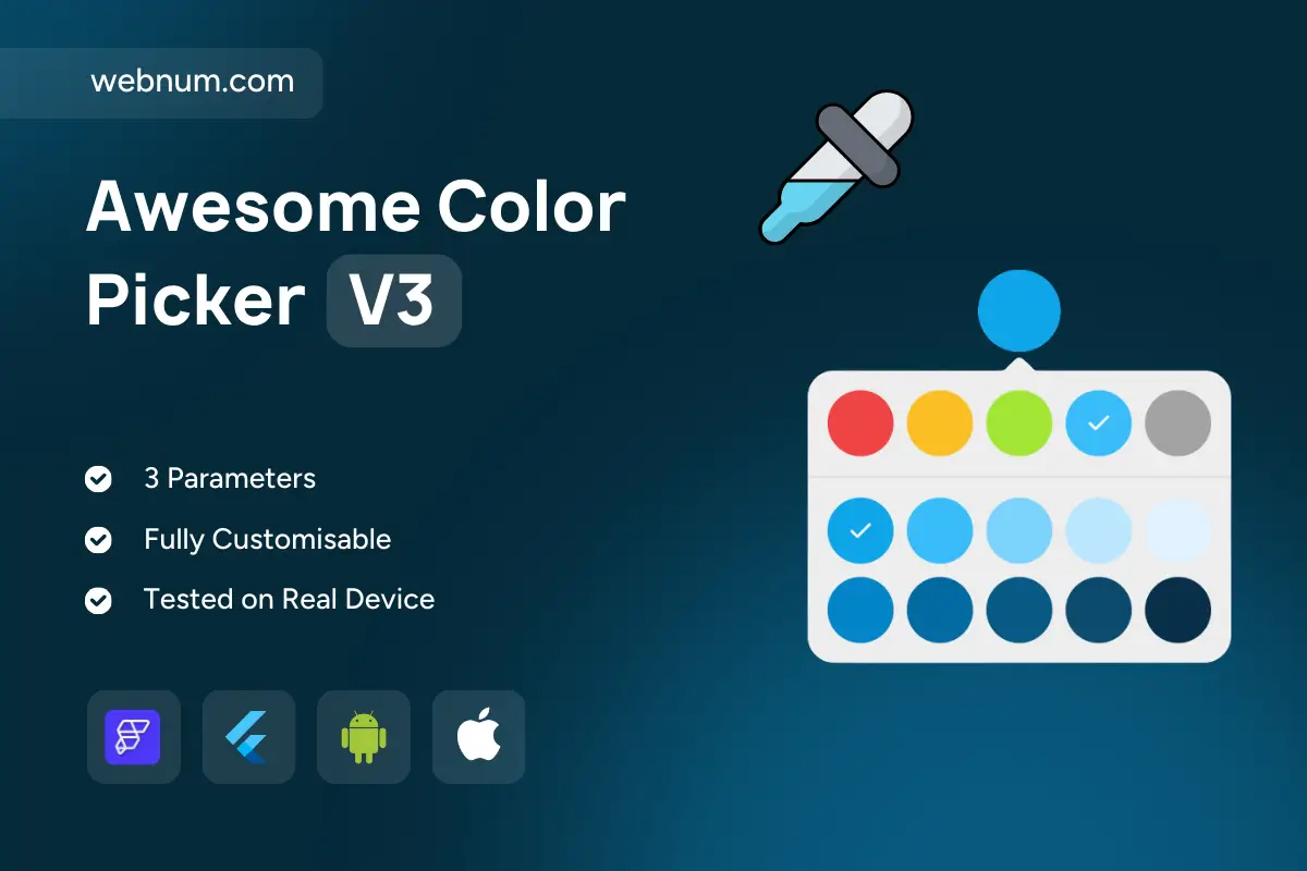
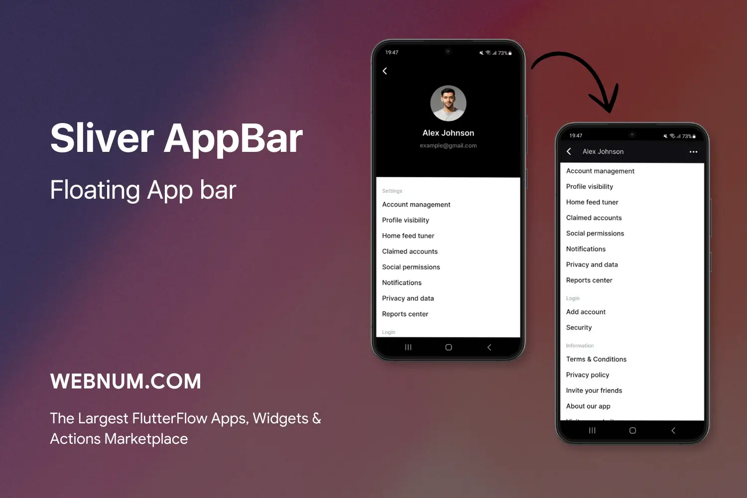
Functionality
-
Anchored popover with smart placement and outside-tap dismiss
-
Custom swatch palette (rows/cols, spacing, “Recent” row)
-
Clear selection state (check/ring), haptics & ripple
-
Callbacks: onOpen / onChange / onConfirm / onClose
-
Output formats: HEX (default), RGB, HSL, MaterialColor
-
Lock/disable specific brand colors with tooltips
-
Persistence of last chosen color (optional)
-
Themeable chips, radius, borders, elevation, blur; light/dark
-
Accessibility: large hit targets, ARIA labels, RTL support
-
Lightweight, 60 fps animations; list/grid friendly
Use cases
-
Tag/label colors in todo, notes, and kanban boards
-
Quick theme/accent selection for profiles and dashboards
-
Chart series & map layer colors in analytics screens
-
Status/priority chips, category badges, product variants
-
Design-system palettes in admin/config pages
Keywords color picker, swatch palette, popover color picker, anchored popover, HEX RGB HSL, brand colors, recent colors, chip grid, theme accent, tag color, label color, chart series color, Flutter color picker, FlutterFlow widget, accessible, RTL, haptic feedback, ripple, dark mode, light mode, Material 3, mobile UI component
Awesome Color Picker V3
- Fixed price & scope
- Pixel-perfect UI/UX
- App Store & Google Play submission
You may only use this template for one project. For more details, please read the Marketplace Terms of Service.