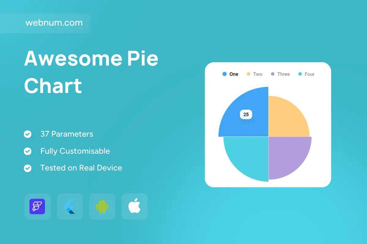
A clean, modern quarter pie chart 🍰 that merges a classic pie with a subtle donut ring for crisp readability. Each slice represents part of the whole, with an active slice highlighted by an outer stroke ✨ and an inline value badge 🏷️ for instant recognition. A top legend 🎨 mirrors slice colors and labels so the chart stays self-explanatory. Rounded geometry and soft shadows add contrast without clutter. Works with counts or percentages and scales smoothly from phones to full dashboards — perfect for at-a-glance comparisons where one category needs the spotlight.
Functionality
🍩 Donut/pie rendering with configurable inner radius (solid pie → hollow donut)
🌟 Active slice highlight (outer ring + value/percent badge)
🧭 Legend with color swatches & labels (toggleable)
👆 Optional tooltips on tap/hover + slice-selection callbacks
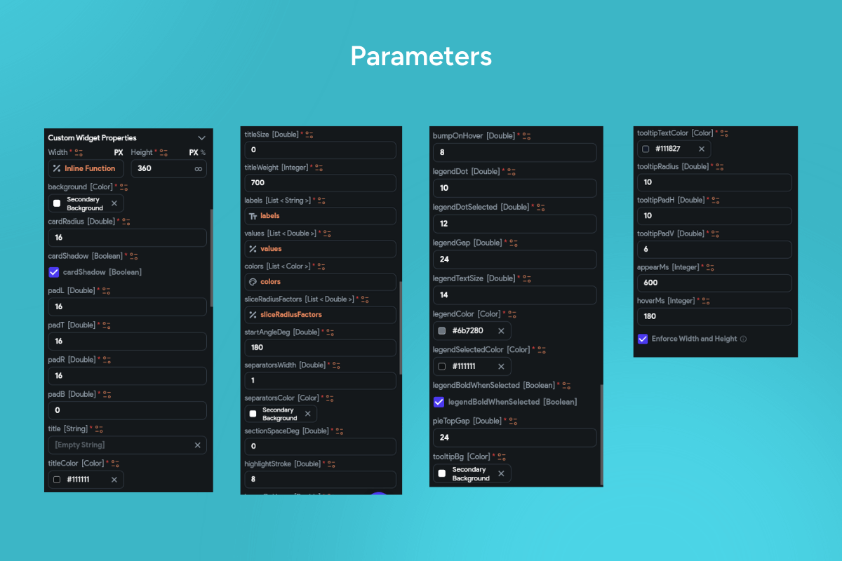
🎨 Custom colors, start angle, order, and rounding
📱 Responsive layout with light/dark theme support
Use cases
📊 Show category share (product mix, traffic sources, spend breakdown)
🎯 Emphasize a primary segment in summaries & KPI cards
📱 Mobile dashboards needing quick distribution insight
📰 Reports/infographics with clear, color-coded proportions
Keywords (one line) quarter pie chart, donut pie chart custom widget flutterflow, ring chart custom widget flutterflow, category distribution pie widget, active slice highlight chart widget, legend pie chart flutterflow, responsive pie chart custom widget, interactive pie chart widget flutterflow, percentage pie chart widget, dashboard visualization pie widget, kpi pie chart flutterflow, mobile analytics chart, custom widget flutterflow charts