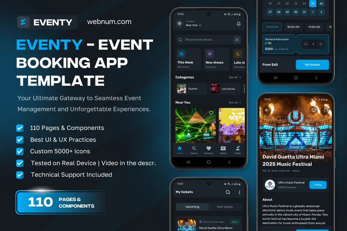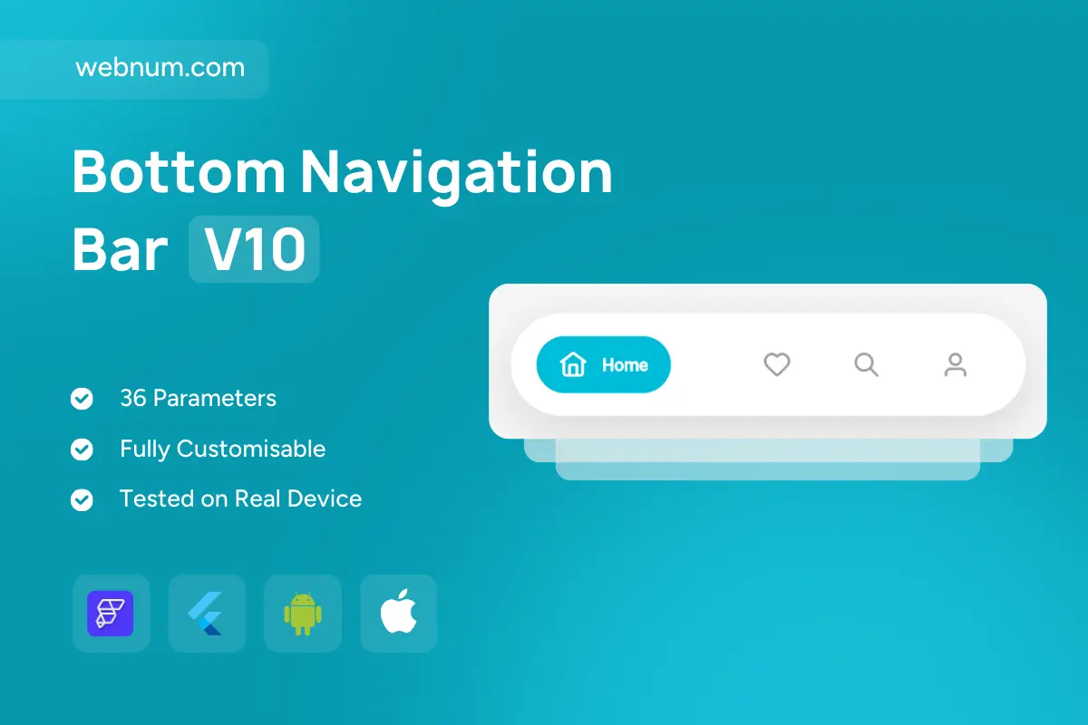
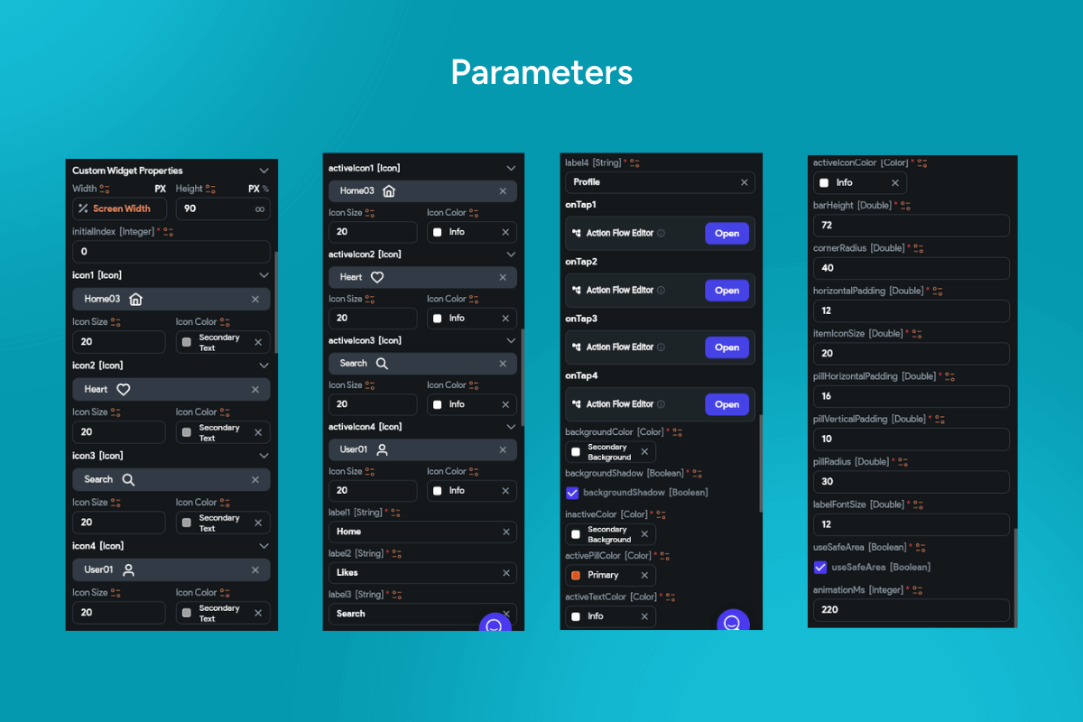
A modern bottom navigation bar for FlutterFlow that floats in a rounded container and spotlights the active tab with a capsule “pill” highlight. The selected item expands into a chip with icon + label, while inactive items stay minimal for a clean, content-first look — ready for iOS and Android production apps. ✨📱
Functionality
-
🔵 Pill highlight state: active tab morphs into a filled chip (icon + text).
-
🛸 Floating bar: soft multi-layer shadow, adjustable elevation, and corner radius.
-
⚙️ Icon & label control: toggle labels; set sizes, weights, and spacing per tab.
-
🎨 Per-tab styling: active/inactive colors, custom icons, backgrounds, and ripple.
-
🧈 Smooth animations: scale/expand, color fade, and slide with custom curves/durations.
-
🔔 Badges: dot or numeric counters for cart, inbox, notifications, etc.
-
🧭 Behavior options: initial index, state persistence, hide on scroll, sticky/overlay modes.
-
🧩 Safe-area aware: notch/gesture insets; works with transparent system bars.
-
🤝 Haptics & feedback: optional tactile tap + Material ripple.
-
🔗 Routing-ready: wire onTap to GoRouter/AutoRoute or Flow Actions.
-
♿ Accessibility & RTL: large tap targets, semantic roles, high contrast, full localization.
Keywords: bottom navigation bar, bottom nav bar, pill highlight, chip tab, floating bar, rounded navigation, capsule tab, animated tabs, icon and label, active state, inactive state, tab badges, notification dot, smooth animation, color transition, elevation shadow, soft UI, neumorphism, safe area, notch support, haptic feedback, ripple effect, hide on scroll, sticky nav, routing, GoRouter, AutoRoute, FlutterFlow widget, FlutterFlow component, Material 3, iOS Android, RTL, accessibility.
Bottom Navigation Bar V10
- BEST VALUE
- 200+ FlutterFlow Widgets & Icons
- 30+ Hour FlutterFlow Express Course (Real Projects)
- 70+ Figma UI Kits & 3D icons
- Help with Customizations
- Unlimited Project Help
- Unlimited Bug Fixing Assistance
You may only use this template for one project. For more details, please read the Marketplace Terms of Service.