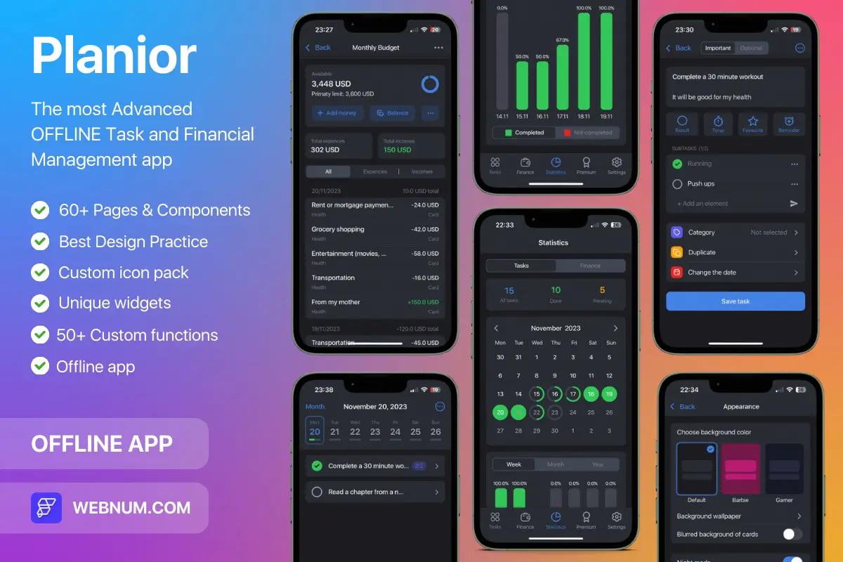
Neumorphic bottom navigation bar for dark UIs with neon accents ✨
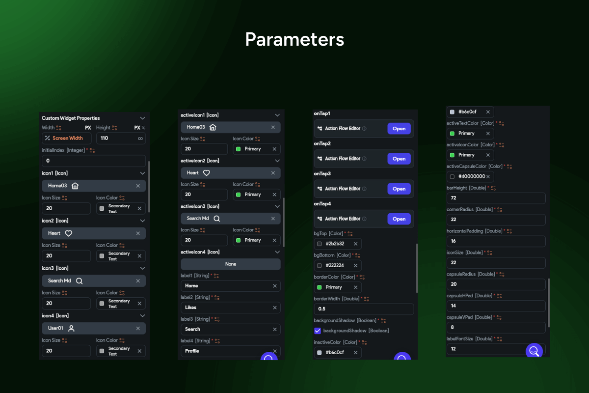
A premium bottom nav built for FlutterFlow that looks 🔥 on iOS & Android. The active tab pops into a pill highlight (icon + label), the bar “floats” with layered shadows, and everything is configurable (36 params) for production-ready apps. 🌚🧪
Functionality
-
🌌 Neon / glassmorphism: dark surface, soft blur feel, luminous outline accent.
-
🟢 Pill highlight state: active tab becomes a compact chip with icon + text.
-
🪄 Floating depth: stacked shadows for a lifted, dock-like appearance.
-
⚡ Micro-interactions: color morph, scale & slide animations with custom curves/duration.
-
🔔 Badges ready: dot or numeric counters per tab (cart, inbox, alerts).
-
🖼️ Icon & label controls: sizes, weights, spacing, per-tab visibility.
-
🎨 Theme-aware: easy accent theming (neon green by default).
-
⚙️ Behavior options: initial index, sticky/overlay, hide on scroll, state persistence.
-
📳 Haptics & ripple: tactile feedback with Material ripple on tap.
-
🛡️ Safe-area & gestures: perfect with notches and system gestures.
-
♿ Accessibility & RTL: large hit targets, semantic roles, high contrast, full localization.
-
🧭 Router-friendly: simple onTap wiring to GoRouter / AutoRoute / Flow Actions.
Great for: ecommerce 🛍️, socials 💬, media apps 🎧, fintech 💳 — any product that wants a sleek, glowing bottom nav.
Keywords: neumorphic bottom navigation bar, Bottom Navigation Bar Widget FlutterFlow, neon glow navbar, glassmorphism navigation, pill highlight tab bar, floating bottom bar, animated bottom tabs FlutterFlow, custom bottom navigation widget, tab badges, sticky nav, hide on scroll, safe area navbar, GoRouter AutoRoute nav, dark mode navigation bar, iOS Android bottom navigation.
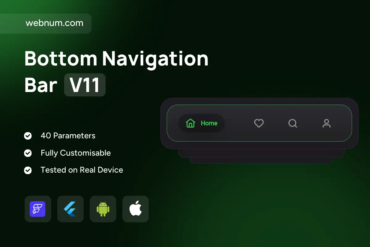
Bottom Navigation Bar V11
- BEST VALUE
- 200+ FlutterFlow Widgets & Icons
- 30+ Hour FlutterFlow Express Course (Real Projects)
- 70+ Figma UI Kits & 3D icons
- Help with Customizations
- Unlimited Project Help
- Unlimited Bug Fixing Assistance
You may only use this template for one project. For more details, please read the Marketplace Terms of Service.