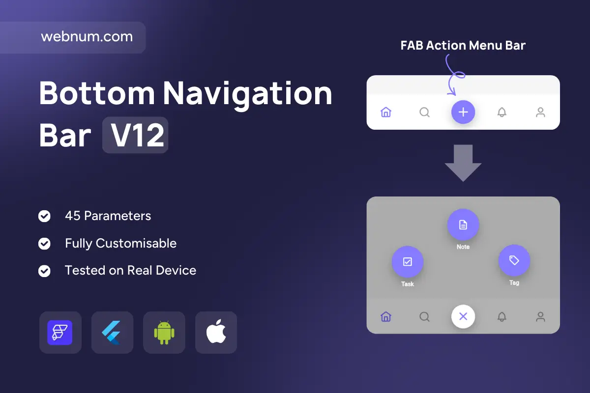
A modern bottom navigation bar with a docked “+” Floating Action Button that expands into a radial quick-actions menu. Tap the FAB to dim the content and reveal three large actions (e.g., Task, Note, Tag). Tap again—or outside the overlay—to close. Perfect for apps that need fast creation flows without cluttering the primary navigation.
-
Docked FAB centered in the bar, morphs to X on open.
-
Radial menu overlay with three prominent actions and labels.
-
Dimmed backdrop (scrim) to focus attention; tap-outside to dismiss.
-
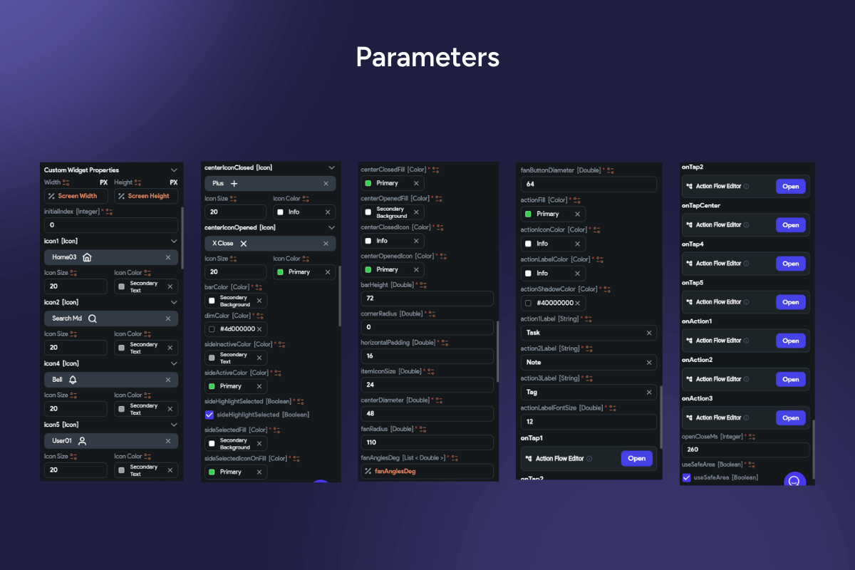
Smooth animations for scale, fade, and icon morph; configurable durations & curves.
-
Fully themable (colors, elevation, corner radius, icon sizes, labels on/off).
-
Safe-area aware; great on devices with notches and gesture bars.
-
Stateful & accessible: semantic labels, large hit targets, haptic feedback.
-
Action wiring: hook each quick action and nav item to Flow/Router events.
-
Badge support for nav items (e.g., alerts on bell/profile).
-
Performance friendly with lightweight overlay and reusable controllers.
Keywords: bottom navigation, FAB, floating action button, docked FAB, radial menu, speed dial, quick actions, overlay, backdrop scrim, material design, action sheet, morph animation, icon morph, fade scale, tap outside dismiss, safe area, notch support, haptic feedback, accessibility, large hit targets, badges, notifications, theming, elevation, glassmorphism, rounded bar, Flutter widget, FlutterFlow component, mobile navigation, create flow, add button, modal menu, animated menu, production ready.
Bottom Navigation Bar V12
- Fixed price & scope
- Pixel-perfect UI/UX
- App Store & Google Play submission
You may only use this template for one project. For more details, please read the Marketplace Terms of Service.