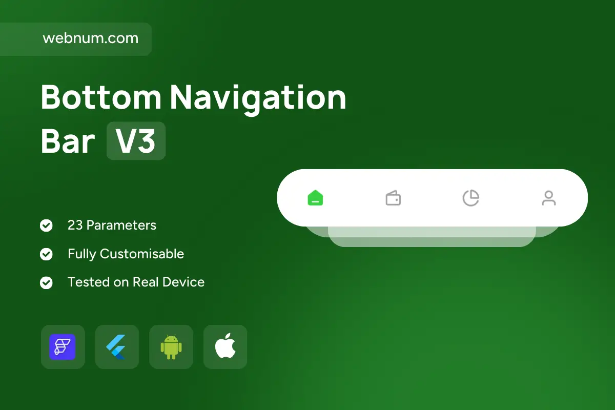
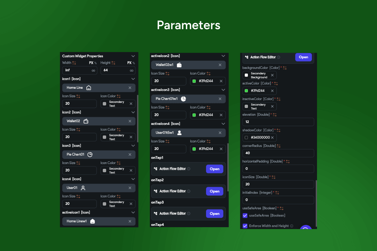
A sleek floating bottom navigation bar ⚪️💡 with a pill-shaped capsule, soft elevation, and crisp active states. Feels native on iOS & Android, fully themeable 🎨, and ships with 23 parameters for icons, colors, radii, shadows, and behaviors—perfect for production FlutterFlow apps.
Functionality 🔧
-
4–5 tabs → icon-only or icon + label variants.
-
Active / inactive styling 🎯 with separate colors and opacity.
-
Rounded capsule container → configurable cornerRadius, elevation, shadowColor.
-
Initial index + persistent selection on reopen 🔁.
-
onTap actions per tab → GoRouter / AutoRoute / custom flows 🧭.
-
Badge-ready (dot / count) for notifications 🔔.
-
Safe-area toggle to float above system gestures 📱.
-
Icon controls → per-tab asset, size, color; active icon overrides ✅.
-
Spacing controls → horizontal padding, item gaps, large hit areas ↔️.
-
Haptics & ripple feedback (optional) ✨.
-
Hide on scroll / auto-reveal for immersive lists (optional) 📜.
-
Light / Dark themes with optional blur/overlay 🌗.
-
Accessibility & i18n → big touch targets, semantic roles, RTL/localization 🌍.
-
Performance-minded: lightweight rebuilds & stateless tap handling ⚡️.
Keywords: floating bottom navigation bar, bottom nav bar, capsule bar, pill nav, floating bar widget, active tab indicator, icon only, icon with label, badges, notification dot, elevation shadow, corner radius, safe area, initial index, onTap action, route navigation, go_router, auto_route, page transitions, haptic feedback, ripple effect, dark mode, light mode, RTL, localization, accessibility, adaptive layout, iOS, Android, Material 3, Cupertino, Flutter widget, FlutterFlow component, app shell, persistent navigation, modern UI, theming, customizable parameters.