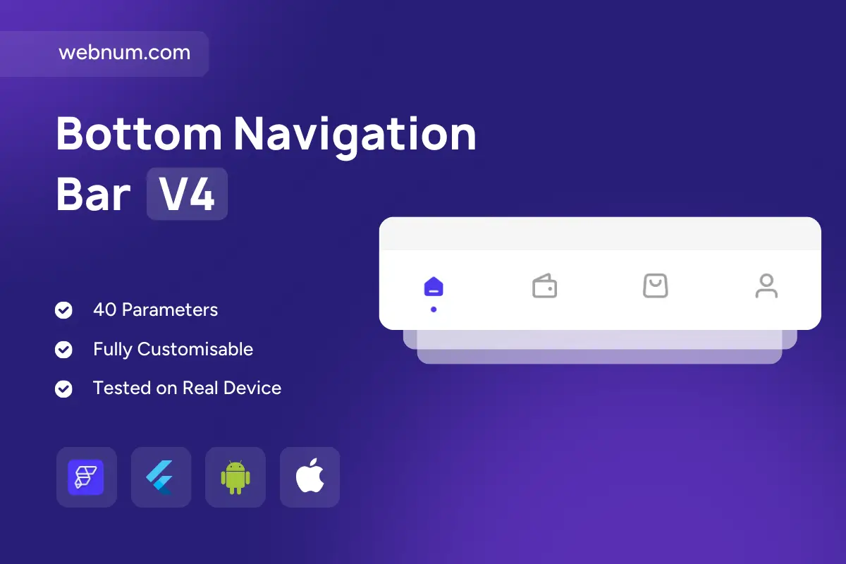
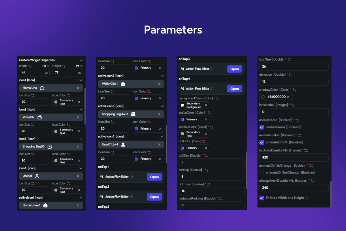
A polished bottom navigation bar with a subtle floating card, crisp elevation, and an animated dot indicator beneath the active icon. With 40 parameters, it’s fully themeable and production-ready for iOS and Android.
Functionality
-
4–5 tabs with icon-only or icon+label modes.
-
Animated active indicator: configurable dotSize, dotGap, dotTravel, dotColor.
-
Active/Inactive styling: separate activeColor / inactiveColor per theme.
-
Smooth animations: animateOnInit, animateOnTabChange, custom durations.
-
Floating container: adjustable elevation, shadowColor, cornerRadius.
-
Icon controls: per-tab asset, iconSize, active icon overrides.
-
Layout controls: horizontalPadding, item spacing, safe-area toggle.
-
Initial index & state persistence across app restarts.
-
onTap actions per tab for routing (
go_router
,auto_route
, or custom flows). -
Badge-ready (counts/dots) and notification hooks.
-
Hide on scroll / auto-reveal optional behavior for immersive lists.
-
Accessibility: large hit targets, semantic roles, high-contrast states.
-
Localization & RTL support; adaptive labels for compact layouts.
-
Light/Dark themes, blur/overlay support, and platform-responsive feel.
Keywords: bottom navigation, bottom nav bar, animated dot, dot indicator, active tab, floating bar, capsule bar, elevation, shadow, corner radius, safe area, icon size, icon label, badges, notification dot, route navigation, go_router, auto_route, page transitions, animate on init, animate on tab change, duration ms, horizontal padding, theme colors, dark mode, light mode, RTL, localization, accessibility, adaptive layout, iOS, Android, Material 3, Cupertino, Flutter widget, FlutterFlow component, app shell, persistent navigation, modern UI, production ready.
Bottom Navigation Bar V4
- Fixed price & scope
- Pixel-perfect UI/UX
- App Store & Google Play submission
You may only use this template for one project. For more details, please read the Marketplace Terms of Service.