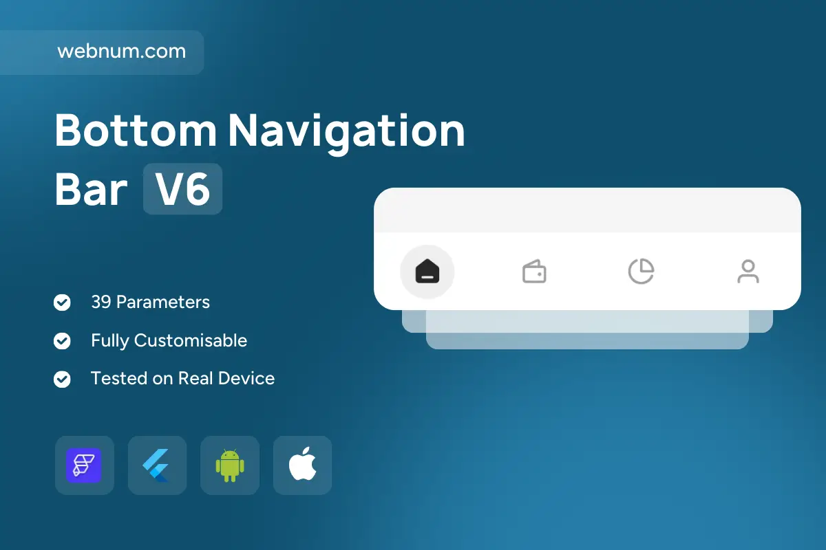
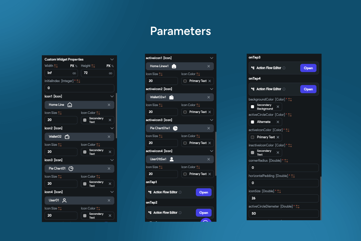
Floating bottom navigation bar widget — a minimalist, icon-only bottom bar with a soft circular “bubble” behind the active tab. Clean, airy, and distraction-free for apps that speak in icons (🏠 💼 📈 👤). Smooth micro-animations, badges, and full theming make it production-ready for FlutterFlow on iOS & Android. ✨
Functionality
-
🔵 Bubble highlight for the selected tab (size, color, opacity, radius).
-
🔘 Icon-only layout with optional label toggle.
-
🎨 Active/Inactive states: separate colors & alpha.
-
🌀 Smooth animations: fade / scale / slide with custom curves & duration.
-
🔔 Badges per tab (dot / count) for notifications.
-
🧭 Routing-ready: wire taps to
go_router,auto_route, or custom flows. -
🛟 Safe-area aware: handles notches, gesture insets, bottom padding.
-
⚙️ Theming: icon set, sizes, spacing, bubble shadows, backgrounds.
-
🫥 Hide on scroll / auto-reveal (optional).
-
📳 Haptics & ripple for delightful feedback.
-
💾 State persistence to restore last selected tab.
-
♿ Accessibility: large hit targets, semantic roles, high-contrast mode.
-
🌍 Localization & RTL support.
Keywords: bottom navigation, bottom nav bar, floating bottom navigation bar widget, bubble highlight, circular highlight, icon only nav, minimalist bottom bar, tab badges, animated tabs, fade scale animation, routing go_router, auto_route, safe area, notch support, gesture insets, theming icons spacing, dark mode, light mode, accessibility, RTL, hide on scroll, iOS, Android, Material 3, Flutter widget, FlutterFlow component, app shell, persistent navigation, modern UI.