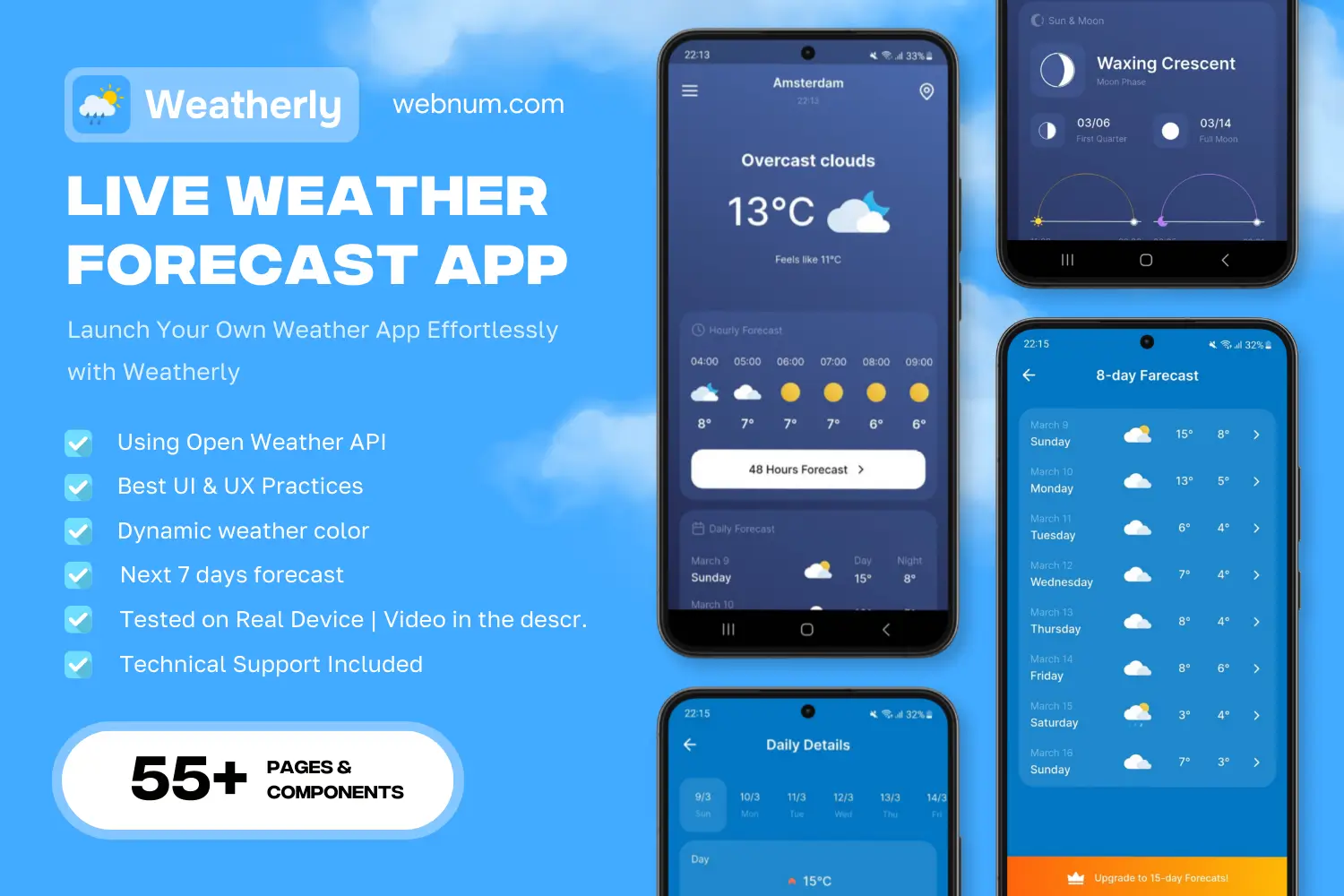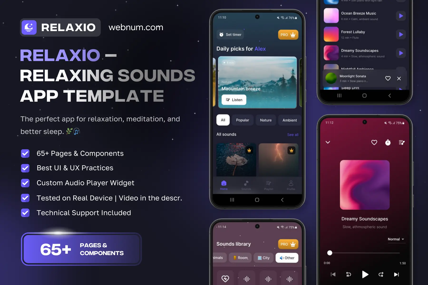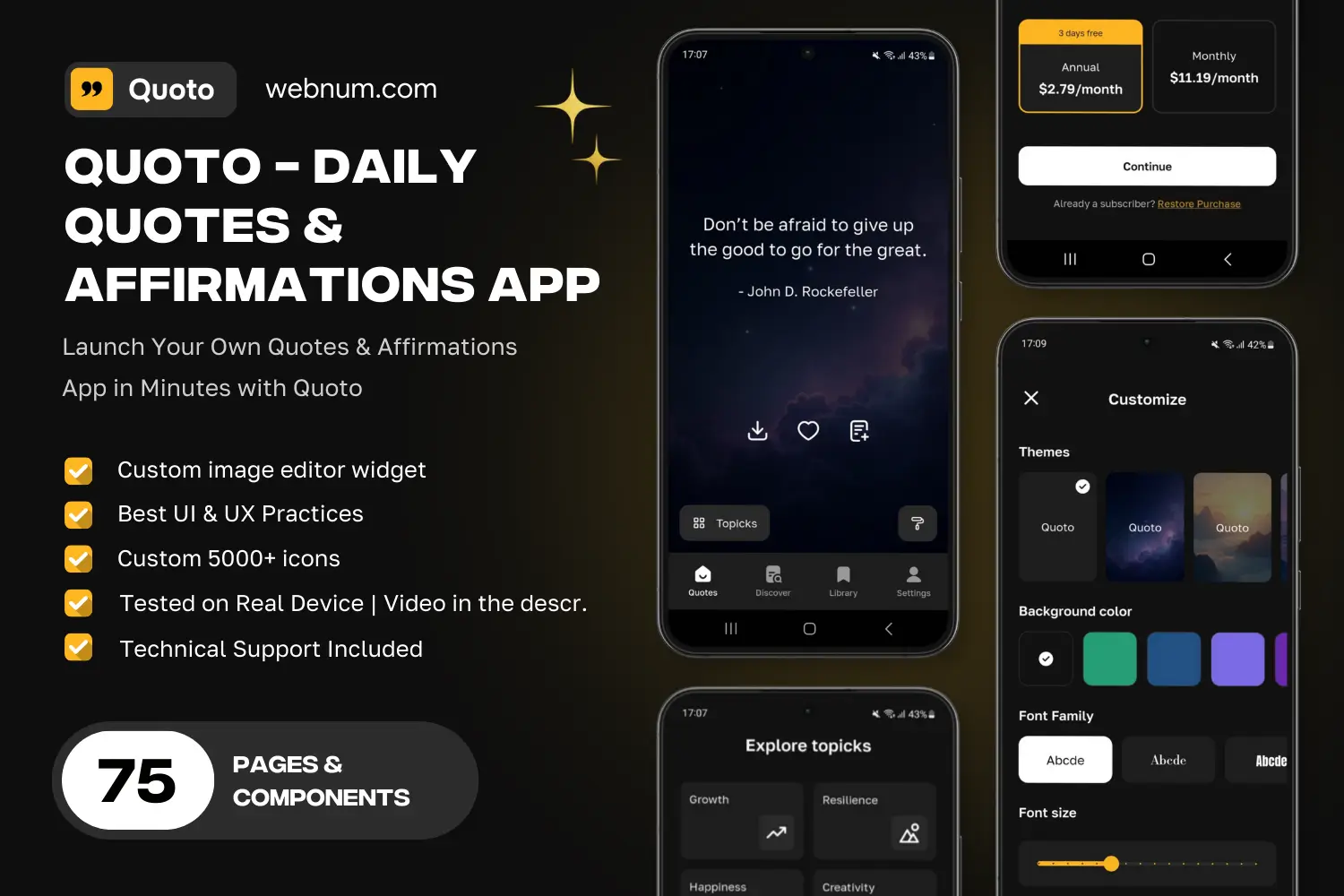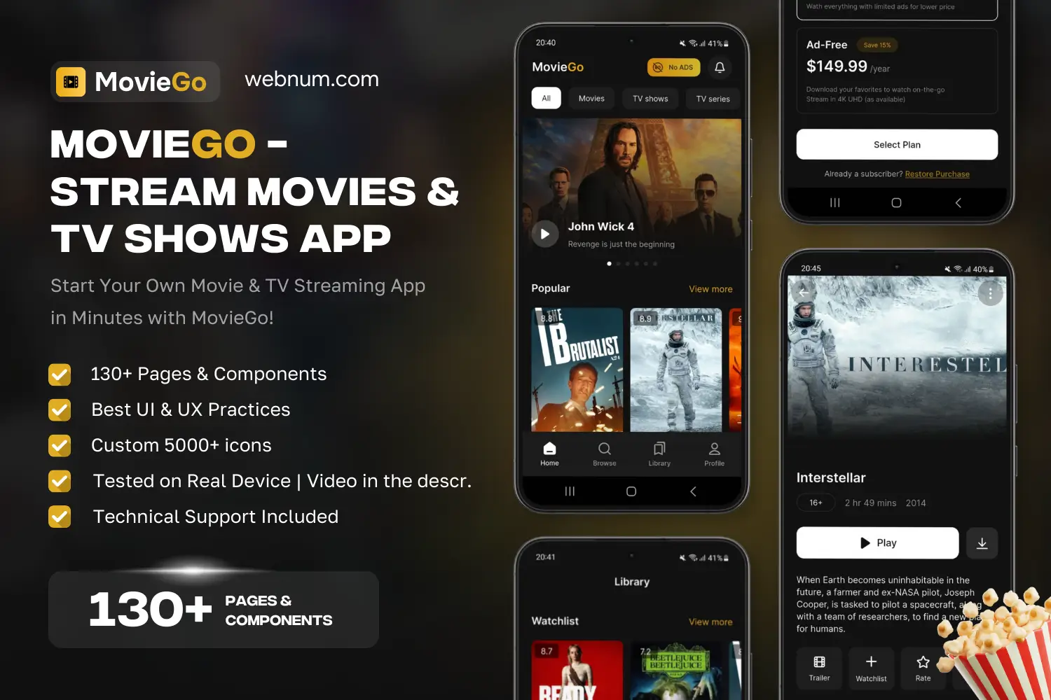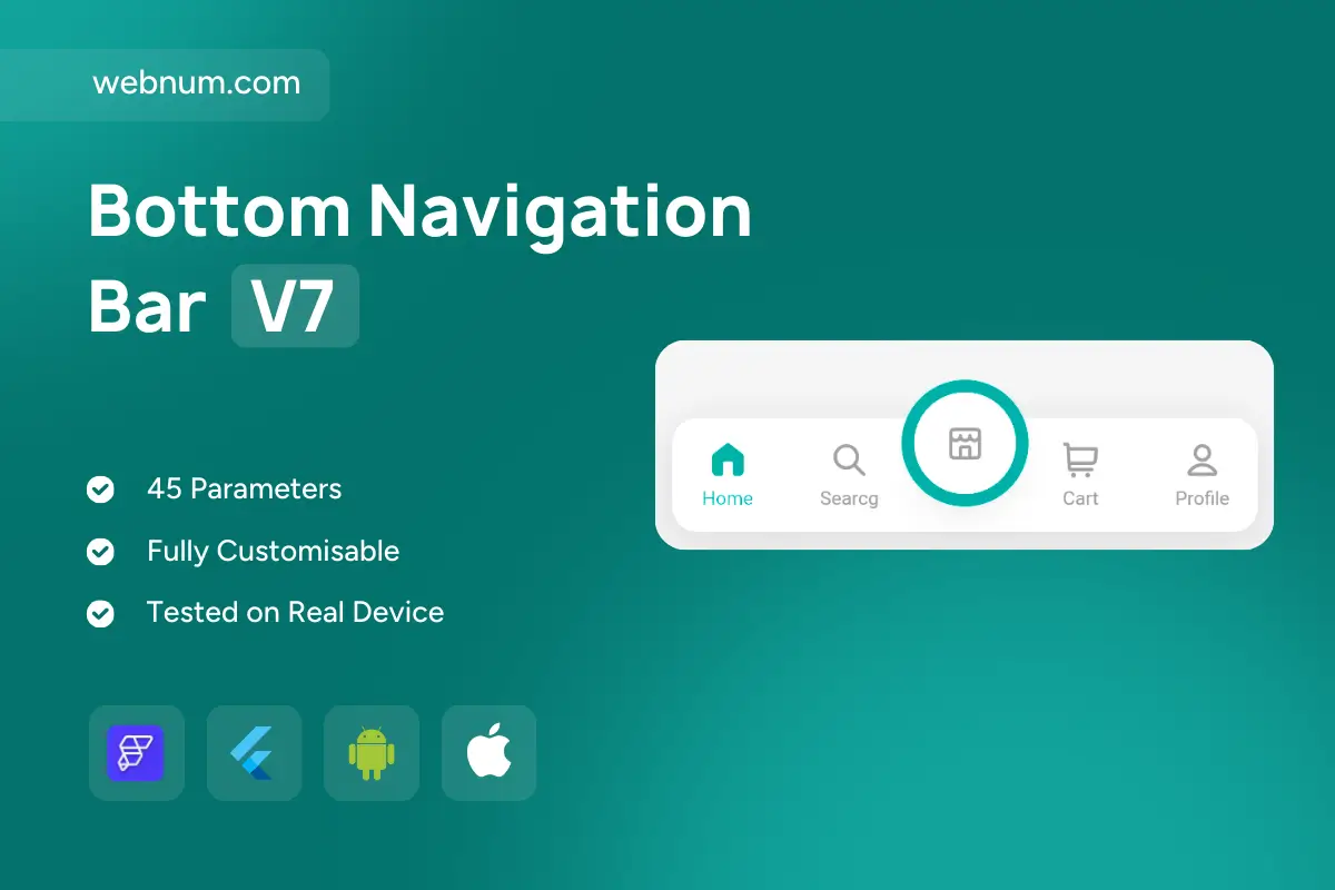
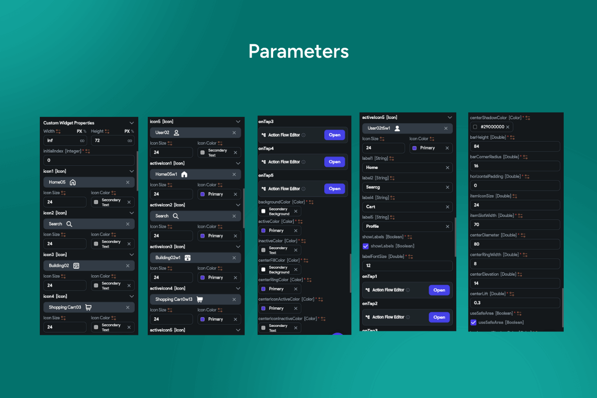
Premium bottom navigation bar widget flutterFlow — a floating, glass-like capsule with crisp labels and a clean spotlight ring on the active tab. ✨ The bar feels perfectly native on iOS & Android, adapts to storefronts, dashboards, and social apps, and ships with 45 tweakable parameters. 🧩📱
Functionality
-
🫧 Floating capsule container — adjustable corner radius, elevation, and soft shadow.
-
🎯 Spotlight ring on the selected icon — control size, stroke, color, and animation speed.
-
🏷️ Icon + label layout — per-tab icon, title, and active/inactive color styles.
-
🎞️ Animated tab changes — fade / scale / slide with custom durations & easing.
-
🔔 Badges (dot or count) for notifications on any tab.
-
♻️ State persistence — set initial index and restore the last opened tab.
-
🫥 Hide on scroll / auto-reveal for immersive content screens.
-
🧭 Safe-area aware — notch/gesture compatible; optional background blur.
-
🤏 Haptics & ripple feedback on selection; optional long-press tooltips.
-
🧭 Routing-ready — wire
onTapto go_router, auto_route, or custom flows. -
♿ Accessibility & RTL — large touch targets, semantic roles, high-contrast states, localization.
Great for: 🛍️ storefronts, 📊 dashboards, 💬 social & media apps, and any mobile UI that needs an elegant, responsive nav bar.
Keywords: bottom navigation, bottom nav bar, capsule bar, glassmorphism, floating bar, spotlight ring, active indicator, icon + label tabs, tab badges, elevation shadow, corner radius, safe area, notch support, gesture insets, tab animations, easing, duration, routing, go_router, auto_route, state persistence, hide on scroll, haptic feedback, ripple effect, dark mode, light mode, RTL, localization, accessibility, Material 3, Cupertino, iOS, Android, Flutter widget, FlutterFlow component, modern app shell.
Bottom Navigation Bar V7
- BEST VALUE
- 200+ FlutterFlow Widgets & Icons
- 30+ Hour FlutterFlow Express Course (Real Projects)
- 70+ Figma UI Kits & 3D icons
- Help with Customizations
- Unlimited Project Help
- Unlimited Bug Fixing Assistance
You may only use this template for one project. For more details, please read the Marketplace Terms of Service.