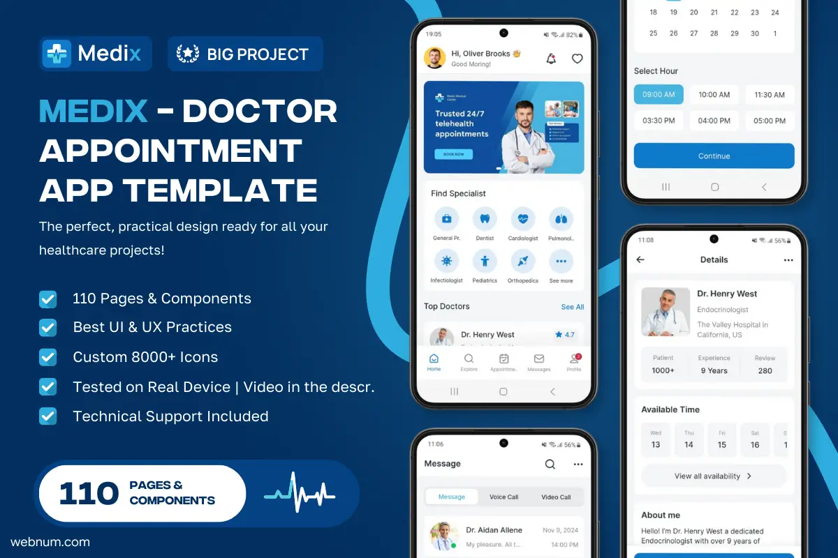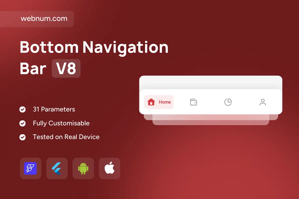
Meet the pill highlight bottom navigation bar widget 🧭✨ — a refined bottom nav for FlutterFlow with a floating, rounded container 💫 and a colored capsule “pill” that lights up the active tab (🖼️ icon + 🏷️ label). Layered soft shadows add depth ☁️, while the pill keeps interactions modern and touch-friendly 👆. With 31 configurable parameters ⚙️, it fits ecommerce, dashboards, media, and social apps on iOS & Android 📱.
Functionality
-
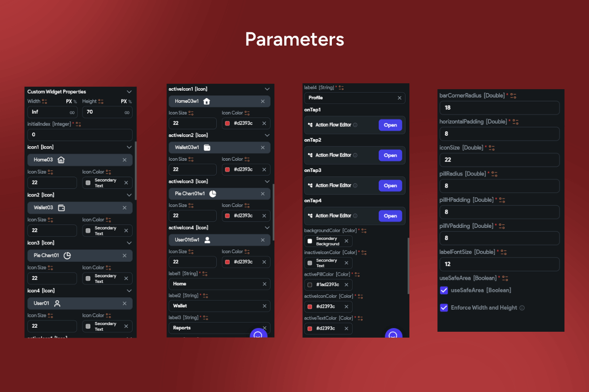
🎯 Active pill highlight: customize background, radius, padding, opacity, and label style.
-
🧩 Icon + label tabs: separate active/inactive colors & typography controls.
-
🏃 Smooth animations: fade / scale / slide with custom durations & easing curves.
-
🪟 Floating container: adjustable elevation, shadow, corner radius, and blur.
-
🔔 Badges: dot or counter per tab for alerts & notifications.
-
♻️ State restore: initial index + persistence to reopen the last selected tab.
-
🧵 Hide/Reveal on scroll: immersive content screens when you need them.
-
🛡️ Safe-area & notch aware: gesture insets and bottom padding supported.
-
🤝 Haptics & ripple: tactile feedback on selection; optional long-press tooltips.
-
🧭 Routing-ready: wire
onTapto go_router, auto_route, or custom actions. -
♿ Accessibility & RTL: large tap targets, semantic roles, high contrast, localization.
Keywords: bottom navigation, bottom nav bar, pill highlight, capsule tab, active chip, floating bar, glassmorphism, shadow, elevation, icon label, animated tabs, fade scale, slide animation, badges, notification dot, routing, go_router, auto_route, state persistence, hide on scroll, safe area, notch support, gesture insets, haptic feedback, ripple effect, dark mode, light mode, Material 3, Cupertino, accessibility, RTL, localization, ecommerce navigation, dashboard navigation, Flutter widget, FlutterFlow component, modern UI, app shell.
Bottom Navigation Bar V8
- BEST VALUE
- 200+ FlutterFlow Widgets & Icons
- 30+ Hour FlutterFlow Express Course (Real Projects)
- 70+ Figma UI Kits & 3D icons
- Help with Customizations
- Unlimited Project Help
- Unlimited Bug Fixing Assistance
You may only use this template for one project. For more details, please read the Marketplace Terms of Service.