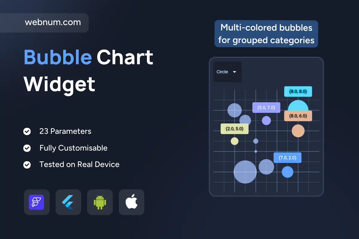
A flexible bubble chart widget 🫧 for visualizing three-dimensional data on two axes. Each bubble’s X/Y position maps the first two variables, while size shows magnitude 📏 (e.g., revenue, population, impact). Clear inline labels 🏷️ and color-coded groups 🎨 make patterns pop for instant insight — ideal for dashboards, analytics, and multidimensional comparisons.
Functionality
-
🔺 Dynamic bubbles sized by a third metric (population/revenue/magnitude)
-
📈 XY grid plotting with customizable scales & ranges (± values)
-
🎨 Multi-colored groups for fast category recognition
-
🏷️ Inline value labels with optional tooltips
-
🔍 Zoom & pan for large datasets
-
✨ Hover/selection highlights for interactive exploration
-
🧭 Configurable legend, axis labels, gridlines, and colors
-
📱 Responsive rendering for mobile/web; smooth performance
Use cases
-
💼 Business Intelligence: revenue vs expenses vs margin
-
🛒 Market Analysis: competitors by share, growth, region size
-
🗂️ Project Management: resources vs timeline vs team size
-
🔬 Research: experimental variables vs volume/density
-
📣 Social Media: engagement rate vs followers vs impressions
-
💹 Finance: risk vs return vs portfolio size
-
🩺 Healthcare: age vs severity vs treatment impact
Keywords (one line)
bubble chart widget, scatter bubble chart flutterflow, 3d data bubble visualization, xy bubble chart custom widget, color coded bubbles widget, grouped bubbles chart, interactive chart widget flutterflow, zoom pan bubble chart, tooltip bubble chart, business intelligence bubble chart, market analysis bubble chart, responsive bubble chart widget, real time data chart, analytics dashboard visualization, customizable chart flutterflow, flutterflow chart component, axis grid bubble chart, performance tracking chart, modern ui chart widget