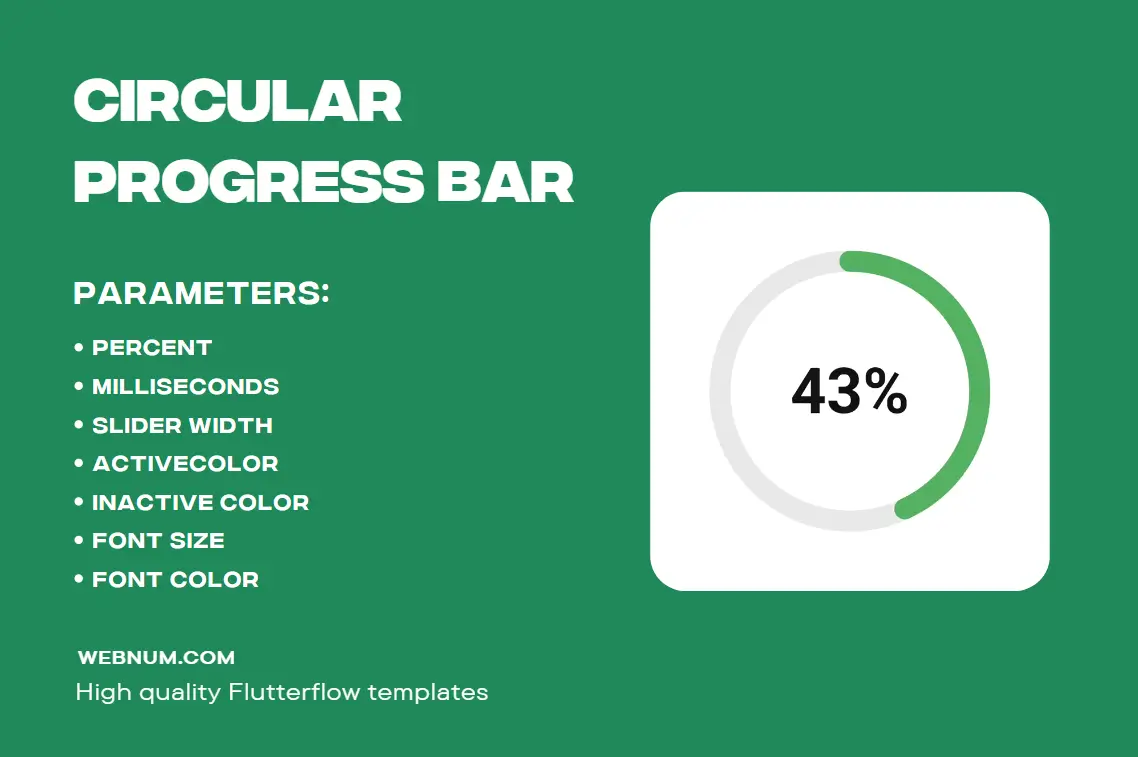
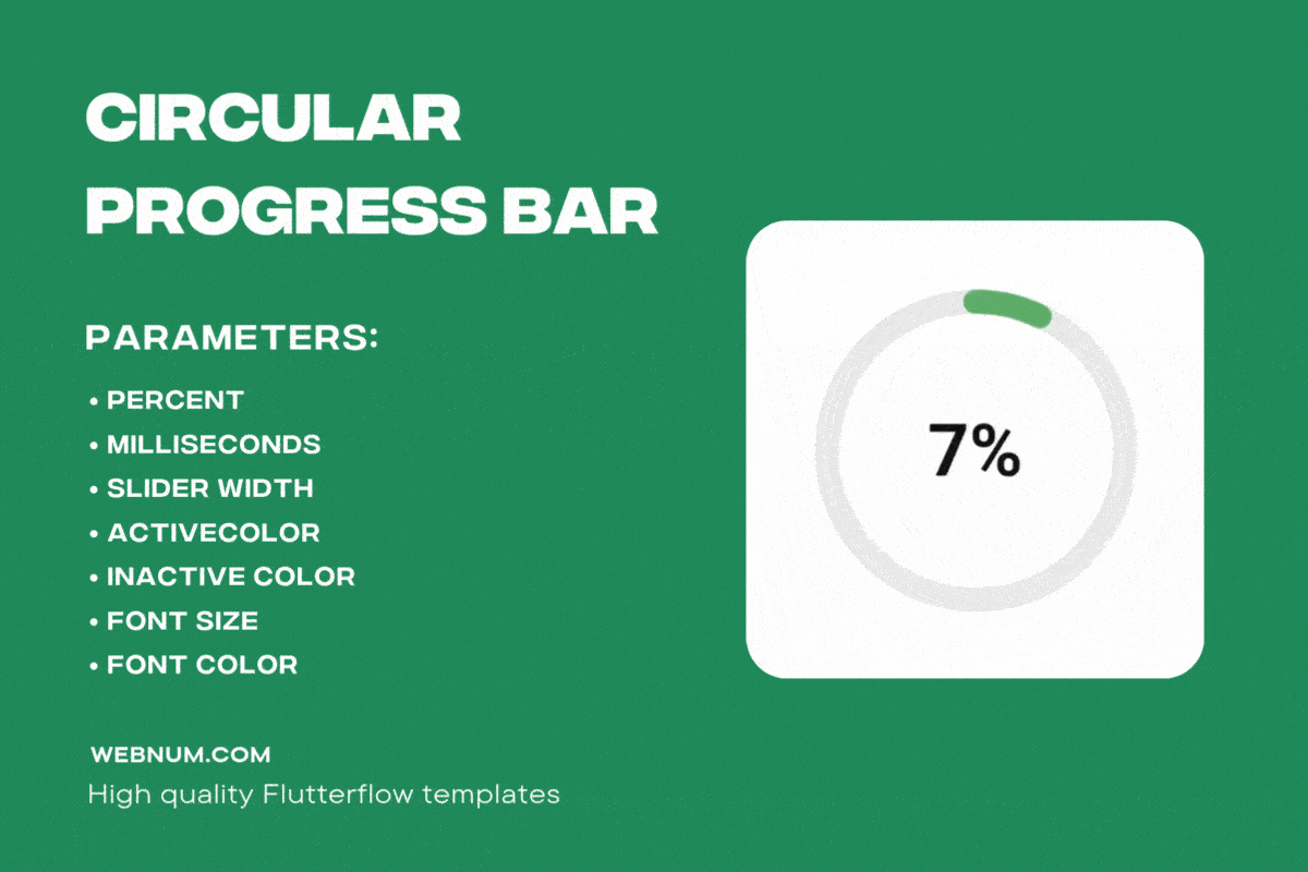
Animated Circular Progress Bar Widget — a lightweight, silky-smooth widget that turns any percentage into a beautiful radial gauge. ⚡ From 0% → your target it glides with buttery 60-fps animation, while the value is rendered in the center for instant clarity. 🎯
Why you’ll love this Animated Circular Progress Bar:
-
🎨 Fully customizable: set ring thickness, overall size, start angle, and direction (clockwise / counter-clockwise).
-
🌈 Color control: choose track & active colors, add gradients or a subtle glow for premium visuals.
-
⏱️ Timing & easing: define duration in seconds and pick easing curves for snappy or mellow motion.
-
🧮 Smart label: auto-formats 0–100% (optionally with decimals), plus prefix/suffix (e.g., “⏳ 75%”, “43 pts”).
-
🧩 Modular center: place text, an icon, or a mini stat card inside the ring.
-
🌗 Light/Dark ready: crisp contrast in any theme.
-
♿ Accessible: optional semantics/tooltip text so everyone gets the progress story.
-
🔁 Modes: determinate (to a target) or looping indeterminate for loading states.
Perfect for uploads/downloads, fitness goals, checklist progress, timers, finance dashboards, learning streaks, and task trackers. 📊 Drop multiple instances on a screen and style each uniquely—this Animated Circular Progress Bar keeps your UI fast, readable, and delightful. 🚀
Use the Animated Circular Progress Bar to elevate loaders and KPIs from “okay” to “wow” with a single, flexible component. ✅
Keywords: circular progress bar, animated circular progress bar, progress bar widget, percent indicator, radial progress, ring chart, progress circle, loading indicator, animated loader, progress tracker, donut gauge, round progress indicator, timer ring, progress with label, custom widget, webnum