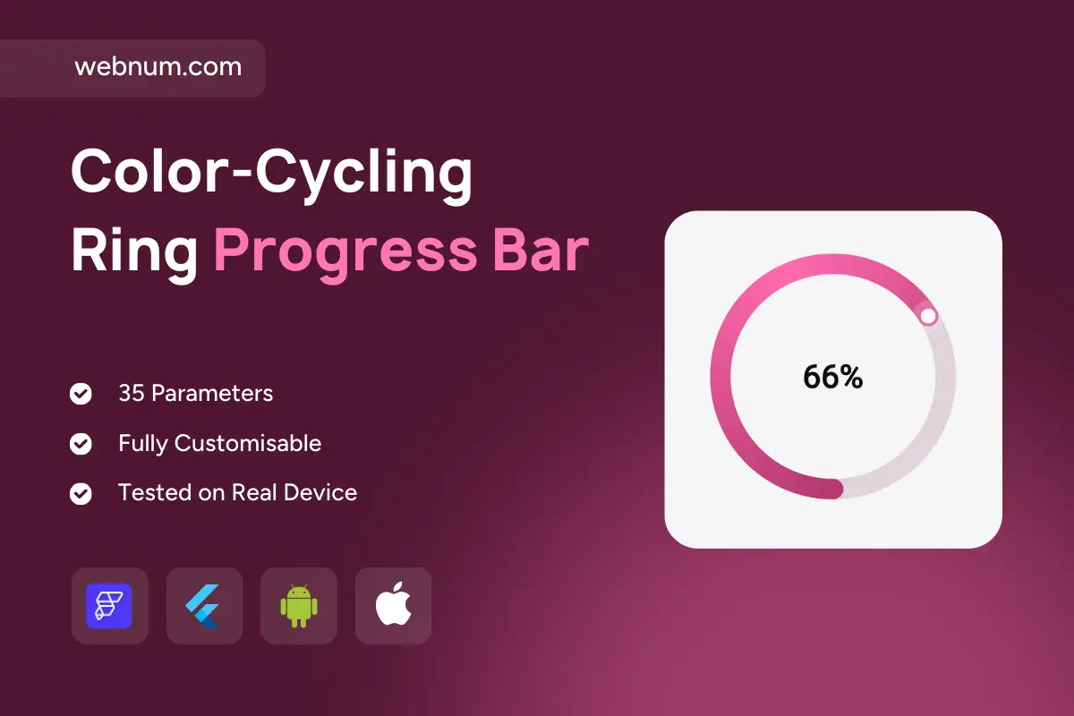
About

A clean radial progress widget with a glossy, gradient ring, a smooth moving head, and a bold percentage in the center. Each time it appears (or refreshes), the accent shifts hue slightly for a lively, premium feel—perfect for dashboards, habits, and KPI cards.
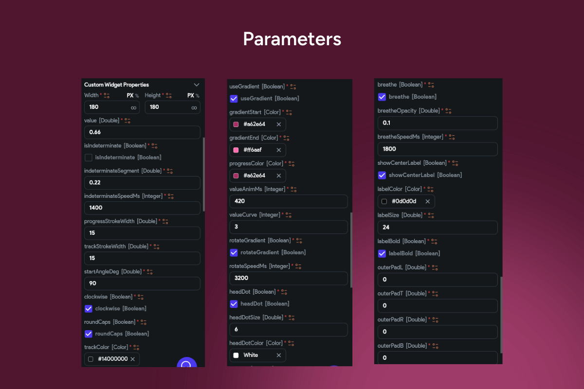
Functionality

  • Animated radial sweep with rounded caps and a glossy head indicator.

  • Auto color cycling (subtle hue shift on build/refresh) for visual variety.

  • Center label with dynamic percentage (supports custom units/text).

  • Configurable size & thickness of the ring; inside padding control.

  • Start angle & direction options (top/right; clockwise/counter-clockwise).

  • Gradient/solid modes with optional shadow/glow.

  • Threshold colors (success/warning/danger) or value-based palettes.

  • Deterministic value: bind to 0–100% (or any min/max) from your data.

  • Animation tuning: duration, curve, and easing for smooth updates.

  • Tap/press actions (optional) to open details or refresh.

  • Accessible semantics: announces value and status for screen readers.

  • Light/Dark theme ready; high contrast for small footprints.

  • Data-ready: Firestore/Supabase/REST/local state bindings.

  • Performance-minded: minimal rebuilds, GPU-accelerated drawing.

Great for: KPI cards, fitness/habit trackers, goals, quota usage, uptime/health, course progress, and onboarding/completion meters.

Keywords: FlutterFlow progress, radial progress, circular progress, ring progress, gradient ring, color cycling, hue shift, animated sweep, rounded caps, progress indicator, KPI widget, goal tracker, completion meter, percentage label, start angle, clockwise, counterclockwise, glow head, threshold colors, success warning danger, dashboard widget, habit tracker, quota usage, storage meter, fitness progress, uptime indicator, solid gradient, dark mode, light mode, responsive UI, accessible widget, data binding, Firestore, Supabase, REST API, smooth animation, premium UI, modern design, Flutter widget, FlutterFlow component.

Color-Cycling Ring Progress Bar

We’ll build your app in 7 days
Features
Categories
Style
Support
Single Use Individual License

You may only use this template for one project. For more details, please read the Marketplace Terms of Service.