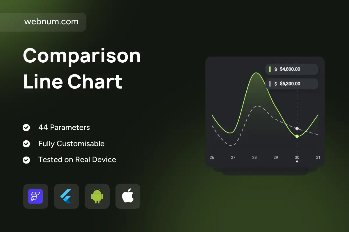
A clean, dark-themed dual line/area chart for tracking revenue over time with a same-period comparison. The primary series is highlighted with a neon line and soft area fill for instant focus, while the comparison series uses a dashed line for contrast. A vertical cursor marks the selected day and shows precise values in compact badges. Dots on the lines indicate data points and support tap/hover interactions for tooltips. Smooth curves and rounded corners keep the visual friendly and modern. Built for finance dashboards where you need quick, glanceable trends and an easy way to compare against a target or previous period.
Functionality
Primary smoothed line with optional area fill; secondary dashed comparison line.
Interactive cursor (vertical guide) with value tooltip badges.
Point markers (active/inactive states) and tap/hover highlights.
Custom start/end dates, tick formatting, and currency display.
Animations on load and on range changes; responsive layout for mobile/desktop.
Compare daily/weekly revenue vs. last period or target forecast.
Monitor marketing performance (conversions vs. goal) on product analytics dashboards.
Track subscription MRR/ARR trajectory vs. projections.
Visualize store sales vs. rolling average in retail BI.
Present KPI trends in executive or investor reports.
Keywords
line chart, area chart, revenue chart, sales trend, comparison line, dashed line, time series, KPI dashboard, finance analytics, business intelligence, tooltip, cursor, value badges, mobile dashboard, responsive chart, dark mode, light mode, Flutter chart, FlutterFlow component, data visualization.