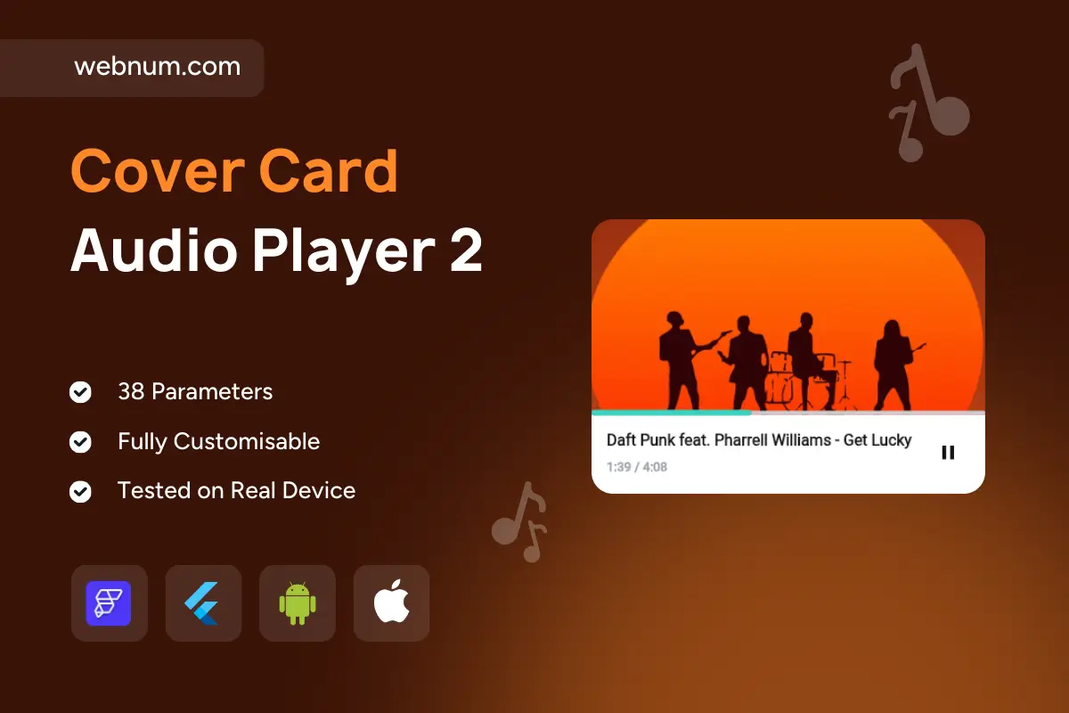
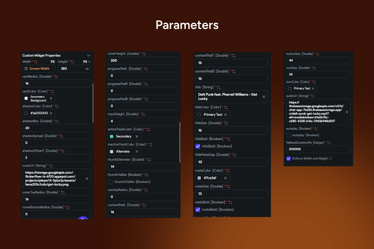
🎨📀 Cover card music player widget — a modern media card that puts bold cover art front and center with a slim edge progress bar and a tidy footer for metadata and controls. Minimal, readable, and fast to wire up in FlutterFlow—perfect for feature tiles, playlists, and detail screens.
Functionality
-
🖼️ Hero artwork header with rounded corners + soft elevation.
-
📈 Edge progress/seek bar tucked under the artwork in your accent color.
-
✂️ Smartly truncated title line for long artist–track strings.
-
⏱️ Dual timestamps: elapsed / total (e.g., 1:01 / 4:08).
-
▶️ Primary Play/Pause (optional ⏮️/⏭️ ready).
-
🔄 Buffered segment (optional) for streaming feedback.
-
👆 Tap artwork to toggle (optional) • 🤏 Long-press for actions.
-
🎨 Themeable: accent color, typography, radii, shadows.
-
📱 Responsive card with accessible contrast & large hit targets.
-
🔌 Data-ready: bind to Firestore / Supabase / REST / local assets.
-
🧠 States: playing, paused, buffering, completed.
Great for
🌟 Featured tracks • 💿 Album highlights • 🎙️ Podcast episodes • 🎛️ Curated playlists where you want big art + minimal controls.
Keywords: flutterflow audio player, cover art player, cover card music player widget, edge progress bar, seekbar, play pause, time labels, elapsed time, total duration, buffered progress, album artwork, hero image, minimal ui, clean design, rounded card, soft shadow, accent color, responsive layout, inline player, playlist tile, featured card, music app ui, podcast player, just_audio integration, audio service, firestore binding, supabase storage, rest datasource, tap to toggle, long-press actions, modern ux, mobile media player, compact player, progress indicator, flutter widget, flutterflow component, premium template, dark mode, light theme.