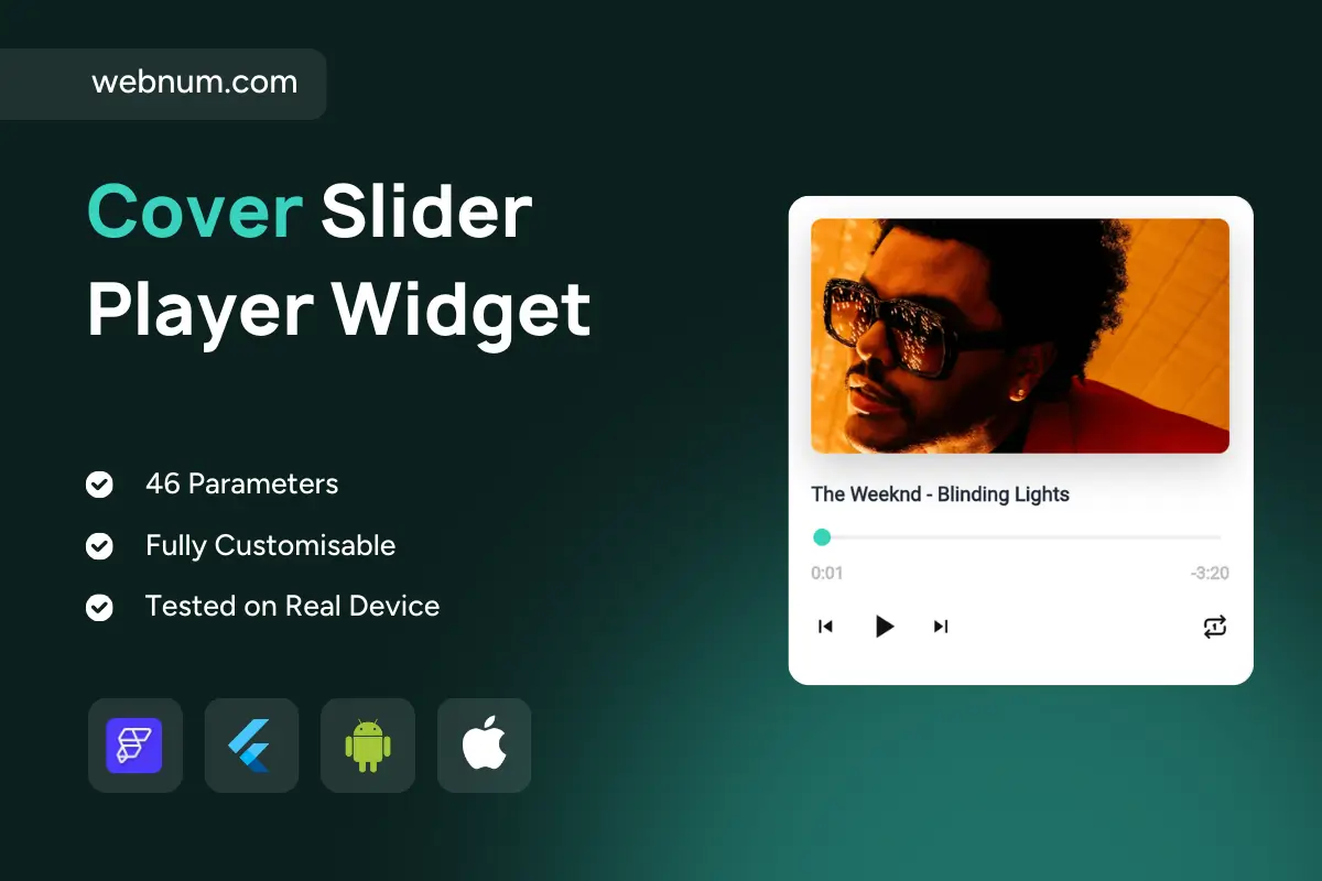
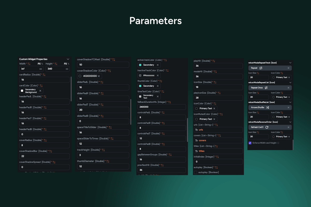
Meet your cover slider music widget 🎶🖼️ — a premium, media-rich player card that puts bold cover art, elegant typography, and a silky, scrubbable seekbar front and center. Balanced visuals + control for detail screens, feature sections, and curated playlists in FlutterFlow.
✨ Functionality
🖼️ Hero artwork header with rounded corners and subtle elevation.
🎼 Title + artist line with clean hierarchy and smart truncation.
🎚️ Colored seekbar with a draggable thumb and smooth progress animation.
⏱️ Dual timestamps: elapsed (left) and remaining (right, e.g., -0:48).
▶️⏸️ Transport controls: previous, play/pause, next.
Featured tracks, album details, podcast episodes, lesson audio, and editorial playlists where big artwork + intuitive controls matter.
Keywords: cover slider music widget, flutterflow audio player, hero artwork player, seekbar, progress bar, draggable thumb, elapsed time, remaining time, repeat toggle, play pause, previous next, music player ui, podcast player, album detail card, responsive layout, just_audio integration, premium template, dark mode, light theme.