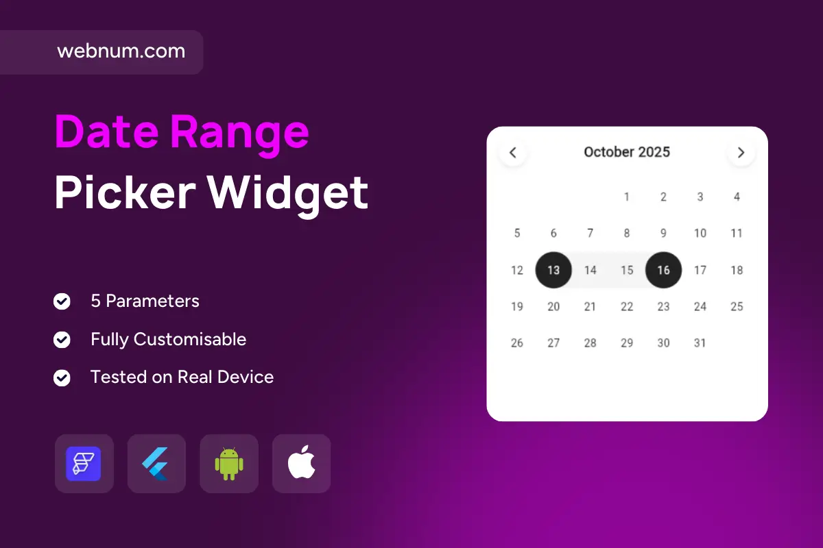
Date range picker widget 📅✨
A clean, modern month-view component that makes selecting dates feel effortless. Tap a start day and an end day to form a smooth pill-style range 🎯, glide between months with soft arrows ⬅️➡️, and theme it to match any FlutterFlow project in seconds. Lightweight, readable, and built for fast scheduling flows ⚡.
Functionality
-
🗓️ Header with current month/year + previous/next arrows.
-
🎯 Single-day or start–end range selection with a connected pill highlight.
-
📍 Today indicator and optional default selection on load.
-
🚧 Min/Max date limits to restrict selectable days.
-
⛔ Disabled dates for holidays, blackout periods, or past days.
-
🔁 First-day-of-week (Mon/Sun) + weekend styling.
-
🔵 Optional event/availability dots for instant context.
-
🧼 Clear/Reset action to remove the chosen range.
-
⌨️🖱️ Keyboard & tap interactions (mobile + desktop friendly).
-
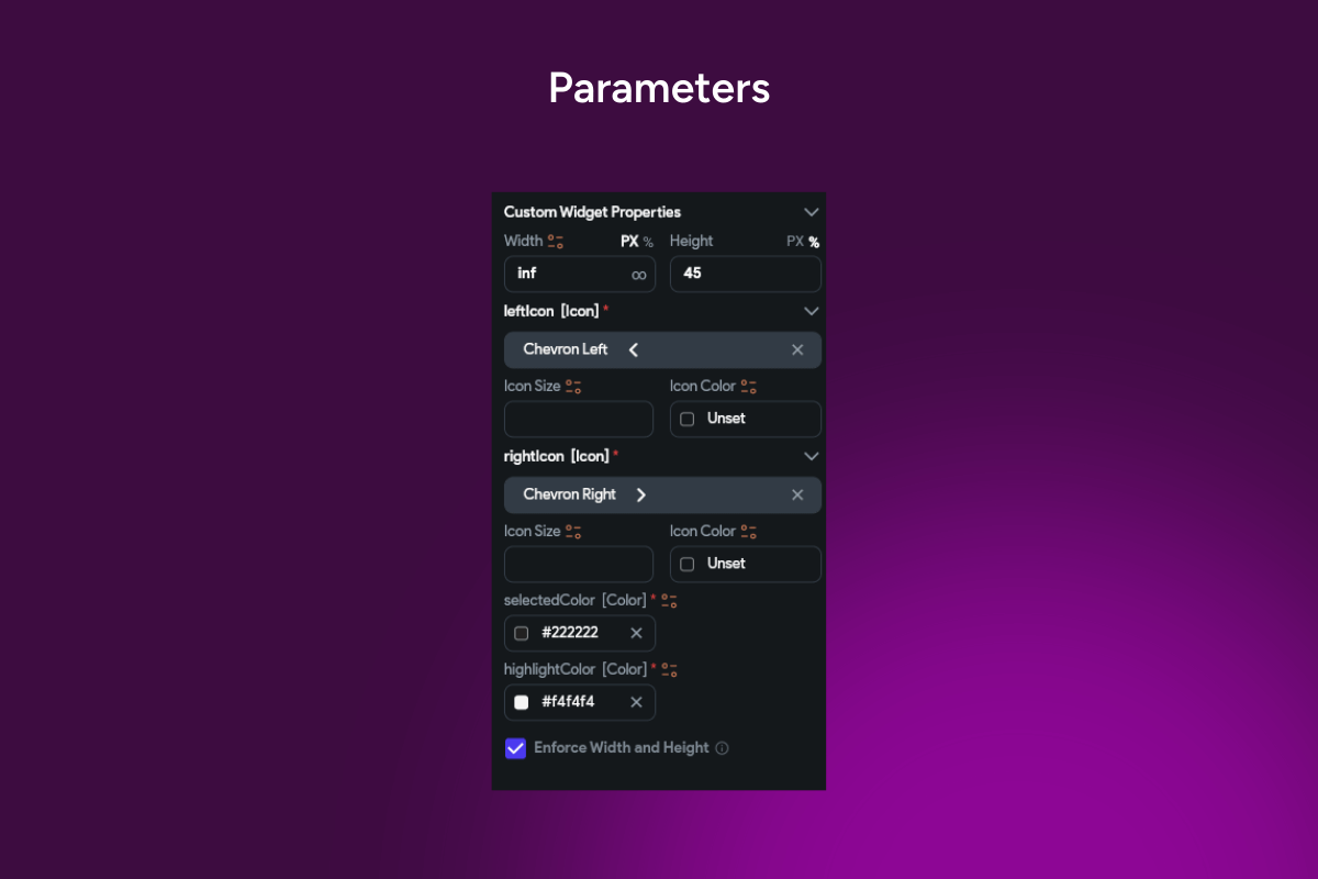
🎨 Theming controls: accent color, radius, typography, hover/pressed states.
-
🌗 Light/Dark modes with accessible contrast.
-
✅ Validation hooks (onChange / onConfirm) for forms & flows.
-
📱💻 Responsive for cards, sheets, or full screens.
-
🌐 i18n-ready: locale, month/day names, number formats.
Great for
🏨 Bookings & check-in/out, 📅 appointments, 🏠 rentals, 🔎 date filters, ✈️ travel search, 🏷️ promo periods—any form that needs a simple, fast date range.
Keywords: FlutterFlow calendar, date range picker, date picker, month view, range selection, start date, end date, pill highlight, previous next arrows, today indicator, min max dates, disabled days, blackout dates, availability, event dots, first day of week, weekend style, localization, i18n, validation, onChange, onConfirm, responsive calendar, inline calendar, modal calendar, booking calendar, hotel dates, appointment scheduler, rental dates, filter by date, themable UI, light mode, dark mode, Flutter widget, FlutterFlow component.