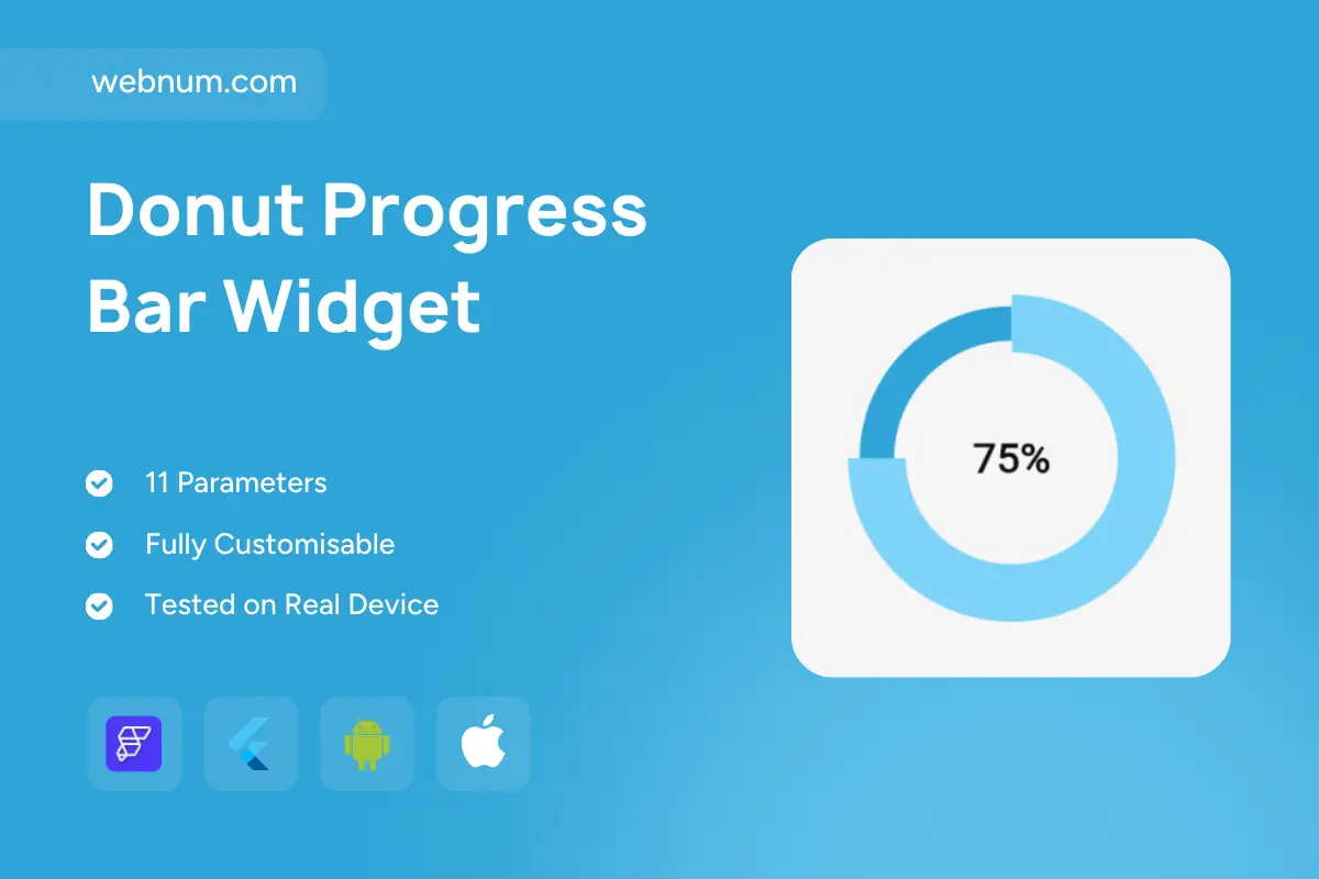
A bold, circular donut progress bar widget for FlutterFlow that puts clarity first 🍩✨ Thick stroke, crisp center % label, and a distinct start gap for instant readability. Supports solid or two-tone sweeps, buttery-smooth animations, and full theming — perfect for KPIs, goals, and usage meters across your app 📈⚡
Functionality
-
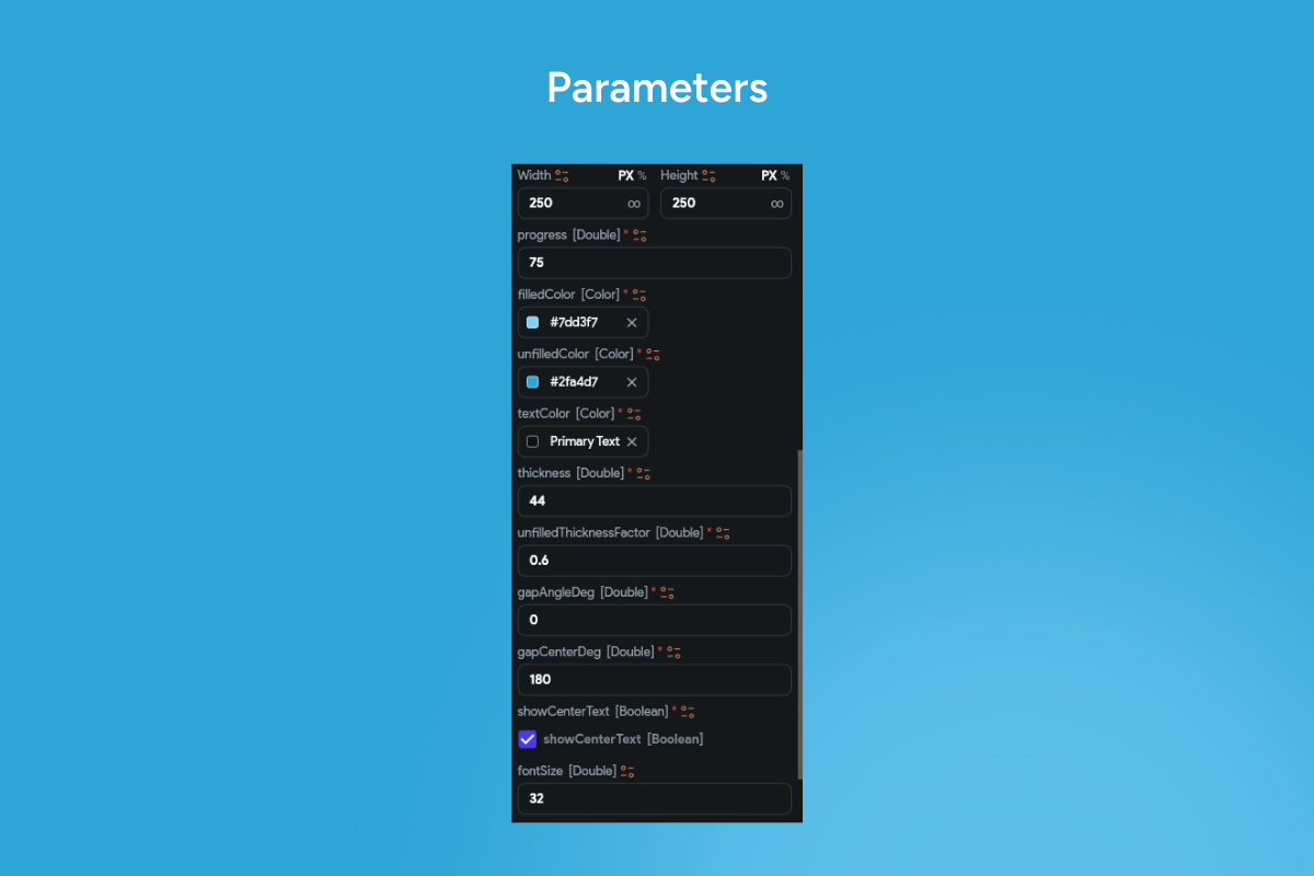
🍩 Thick donut ring — configurable stroke width & inner radius.
-
🎯 Start gap / notch — set start angle & clockwise/counter-clockwise direction.
-
🎨 Solid or two-tone sweep along the active arc (light/dark accents).
-
🔢 Center label — percent, value + units, or custom text.
-
🌀 Animated progress — tunable duration & easing for fluid motion.
-
📊 Value range — bind 0–100% or custom min/max.
-
🟢🟠🔴 Threshold palettes (success/warning/danger) or brand colors.
-
💡 Shadow / glow options for depth on light & dark UIs.
-
👆 Tap / long-press actions to open details or refresh data.
-
♿ Accessible semantics — announces value/state to screen readers.
-
🌗 Light/Dark ready with high-contrast text.
-
🔗 Data-ready — Firestore / Supabase / REST / local state.
-
🚀 Performance-minded — GPU-accelerated drawing & minimal rebuilds.
Great for
📌 KPI cards • 💾 Storage/quota meters • 🏃♂️ Habit & fitness goals • 📚 Course/task completion • 🟢 Uptime/health indicators • 🚀 Onboarding progress • 📊 Dashboard summaries
Keywords: FlutterFlow progress, circular progress, donut progress, ring progress, radial progress, thick stroke, start gap, start angle, clockwise, counterclockwise, two-tone sweep, gradient arc, percentage label, value label, threshold colors, animated progress, easing, KPI widget, goal tracker, flutterflow widget, usage meter, storage meter, fitness progress, habit tracker, uptime indicator, dashboard component, light mode, dark mode, accessible UI, data binding, Firestore, Supabase, REST API, Flutter widget, FlutterFlow component, modern UI, premium design, performance optimized.