

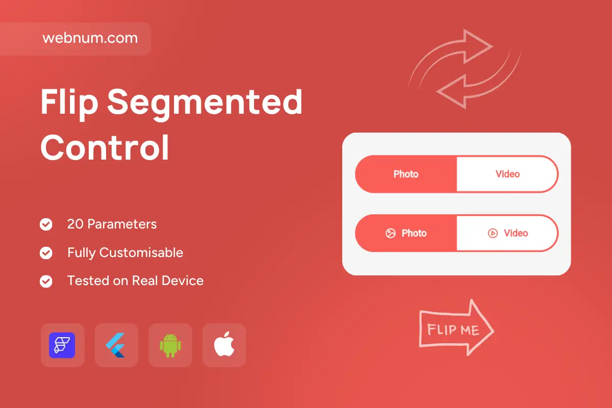
Modern Segmented Control ⚙️✨. A sleek two-option switch with a smooth sliding highlight and pill-shaped track — perfect for clear, delightful state changes on touch or mouse. Our flutterflow flip segmented control brings fluid animations, subtle haptics, and full responsiveness, with filled or outlined styles, icons, and badges for extra clarity. Accessible by design and easy to theme across light/dark modes.
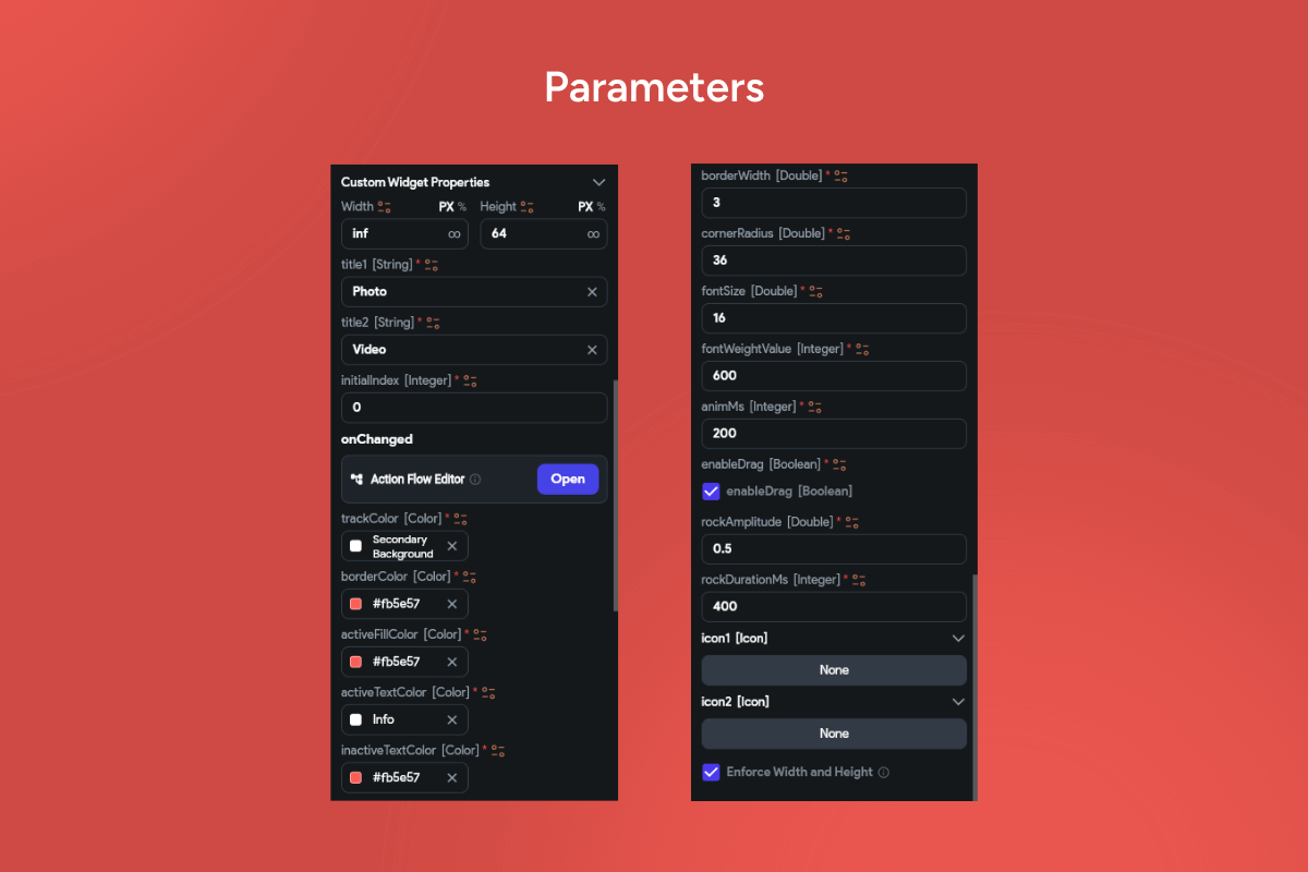
🔧 Functionality
-
🎞️ Animated thumb & track: easing, color interpolation, and ripple/hover feedback
-
🎛️ Two styles: filled vs outlined with smart auto-contrast text
-
🖼️ Optional adornments: leading icons, 🔖 badges (e.g., “new”), disabled/loading states
-
⌨️ Keyboard ready: Arrow/Home/End, visible focus ring, ARIA roles & semantics
-
🔗 State binding: works with forms/filters;
onChange+ optional debounce -
🌍 RTL/LTR aware, responsive sizing, and Reduce Motion fallback
-
🎨 Theming controls: radius, spacing, elevation/shadow, borders, color tokens
✅ Use Cases
-
📸 Media pickers: Photo vs Video, Camera vs Library
-
🗺️ Mode switches: Light/Dark, Map/List, Monthly/Yearly
-
🛍️ Filters in shops or galleries: New/Popular
-
🧭 Step selectors in onboarding/settings
-
📊 Quick view toggles in dashboards & content tools
🔑 Keywords: segmented control, pill toggle, tab bar, two-state switch, animated slider, photo video picker, ui switcher, accessible navigation, ripple, hover, icons, badges, responsive, flutter widget, flutterflow component, haptics, theming, rtl, stateful toggle, flutterflow flip segmented control
Flip Segmented Control
- Fixed price & scope
- Pixel-perfect UI/UX
- App Store & Google Play submission
You may only use this template for one project. For more details, please read the Marketplace Terms of Service.