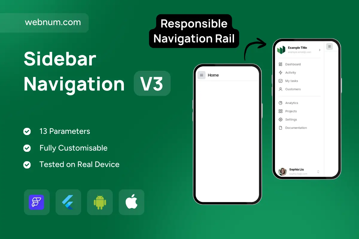
Adaptive Sidebar/Drawer for Pro Apps 🧭✨. A flutterflow sidebar navigation that seamlessly adapts from a desktop/tablet left rail to a mobile modal drawer. Enjoy smooth open/close animations, active-item highlighting, icons, badges, nested groups, dividers, and a persistent profile/footer. It’s route-aware and data-driven: syncs with GoRouter/FlutterFlow actions, remembers pinned/collapsed width, supports swipe-to-open on mobile, hover on desktop, RTL, and light/dark themes — built with accessibility in mind (focus order, ARIA, keyboard shortcuts). ⚡
⚙️ Functionality
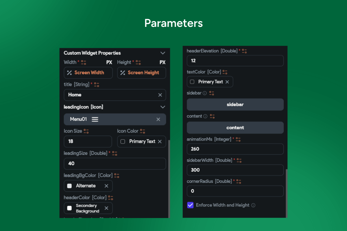
🧩 Collapsible states: mini-rail, expanded rail, full drawer; pin/unpin per breakpoint
🗂️ Nested sections: headers, dividers, badges/counters, tooltips, clear active styling
🖐️ Gestures & input: edge-swipe open (mobile), Esc to close, ⌘/Ctrl+B toggle, drag-to-resize (desktop)
🔗 Route sync & deep links; programmatic open/close; role-based visibility
🎨 Theme & locale aware: Material 3 tokens, dark mode, RTL; persisted width & selection