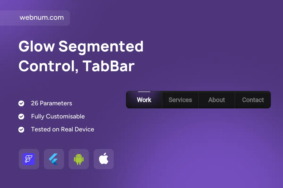
A sleek, dark-themed navigation bar with a soft glow on the active item and a subtle top indicator. The highlight smoothly slides as users switch sections, while hover, press, and focus states keep interactions clear on mouse, touch, or keyboard. Built for responsiveness and accessibility, it adapts from wide headers to compact toolbars without losing polish.
Functionality
-
Animated active state with easing (slide + fade glow)
-
Hover/press feedback and optional ripple on click
-
Keyboard navigation (Arrow/Home/End), focus ring, and ARIA roles for screen readers
-
Routing integration (keeps the correct tab active on reload/deep links)
-
Optional underline/indicator thickness and glow intensity controls
-
Badge/notification support and disabled items
-
Scrollable or wrapping layout for many items; responsive spacing
-
Theming: light/dark modes, custom colors, radii, and shadows
-
High-contrast mode and reduced-motion fallback for accessibility
-
Lazy content mounting per tab to improve performance
Use cases
-
Website headers and product marketing pages
-
SaaS dashboards and admin panels
-
Portfolio or agency sites with sections (Work, Services, About, Contact)
-
Mobile/desktop hybrid apps needing a segmented control or top tab bar
-
Kiosk/TV interfaces that require keyboard or remote navigation
Keywords
navigation bar, tabs, tab bar, segmented control, menu, animated indicator, hover glow, focus state, accessible nav, ARIA, responsive header, dark theme, routing, deep link, badges, Flutter widget, FlutterFlow component, UI navigation, top app bar, glowing tab.
Glow Segmented Control, TabBar
- Fixed price & scope
- Pixel-perfect UI/UX
- App Store & Google Play submission
You may only use this template for one project. For more details, please read the Marketplace Terms of Service.