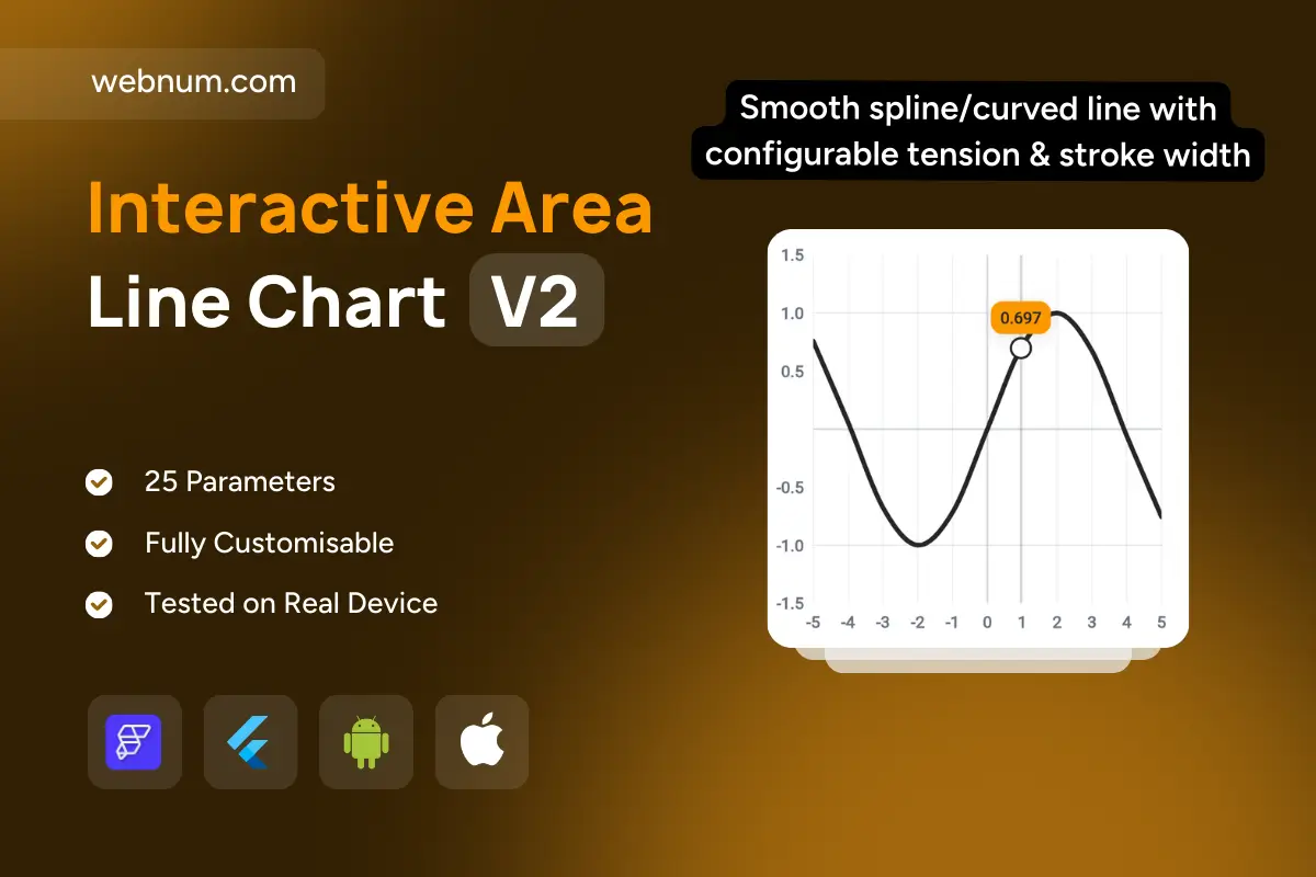
About

A precise, touch-friendly spline line chart for exploring continuous data. The smooth curve highlights trends and inflection points, while a draggable vertical cursor locks onto the nearest data point for exact reading. A circular marker and pill badge display the current value (e.g., 0.697) without obscuring the curve. Light gridlines and labeled axes keep scales readable from negative to positive ranges. Works equally well for math functions, signals, sensor streams, and KPIs. Fully themeable (stroke, badge, grid) and responsive across mobile and web. Built for dashboards that need clean trends with pinpoint lookup.

Functionality

  • Smooth spline/curved line with configurable tension & stroke width

  • Draggable/tappable cursor that snaps to nearest point

  • Point marker + floating value badge (prefix/suffix support)

  • X/Y axes with min–max, tick density, and negative values

  • Gridlines on/off, theme colors, light/dark mode

  • Responsive rendering; accepts dynamic/streamed datasets

Use cases

  • Plot math functions and parametric curves for education

  • Monitor real-time signals: sensors, telemetry, IoT metrics

  • Visualize KPIs with precise point inspection on dashboards

  • Show smoothed trends in finance, operations, or marketing

  • Demonstrate algorithms (filters, predictions, regressions)

Keywords

line chart, spline chart, curved line, interactive chart, value tooltip, cursor, data marker, gridlines, axis labels, time series, real-time chart, analytics dashboard, KPI chart, responsive chart, dark mode, Flutter chart, FlutterFlow widget, mobile chart, web visualization

Interactive Area Line Chart V2

We’ll build your app in 7 days
Features
Categories
Style
Support
Single Use Individual License

You may only use this template for one project. For more details, please read the Marketplace Terms of Service.