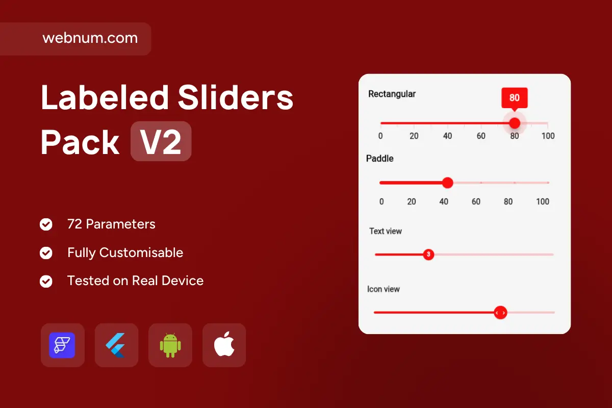
A clean bundle of four single-value sliders for slider widget flutterflow — each with a distinct head and label. 🧊 Rectangular value tooltip, 🫧 paddle bubble, 🔴 compact text badge, and ⭐ icon thumb. Smooth, precise, and fully themeable — perfect for settings, analytics filters, and forms.
⚙️ Functionality
-
🔢 4 variants: Rectangular tooltip, Paddle tooltip, Text badge, Icon thumb
-
📏 Labeled scale (e.g., 0–100) with optional divisions/tick marks
-
🎯 Live value tooltips that follow the thumb + custom number formatter
-
📐 Step size & snapping for consistent increments
-
🎚️ Active/inactive track with smooth animations & ripple focus
-
⌨️ Keyboard control: arrows / PageUp / PageDown + tap-to-seek
-
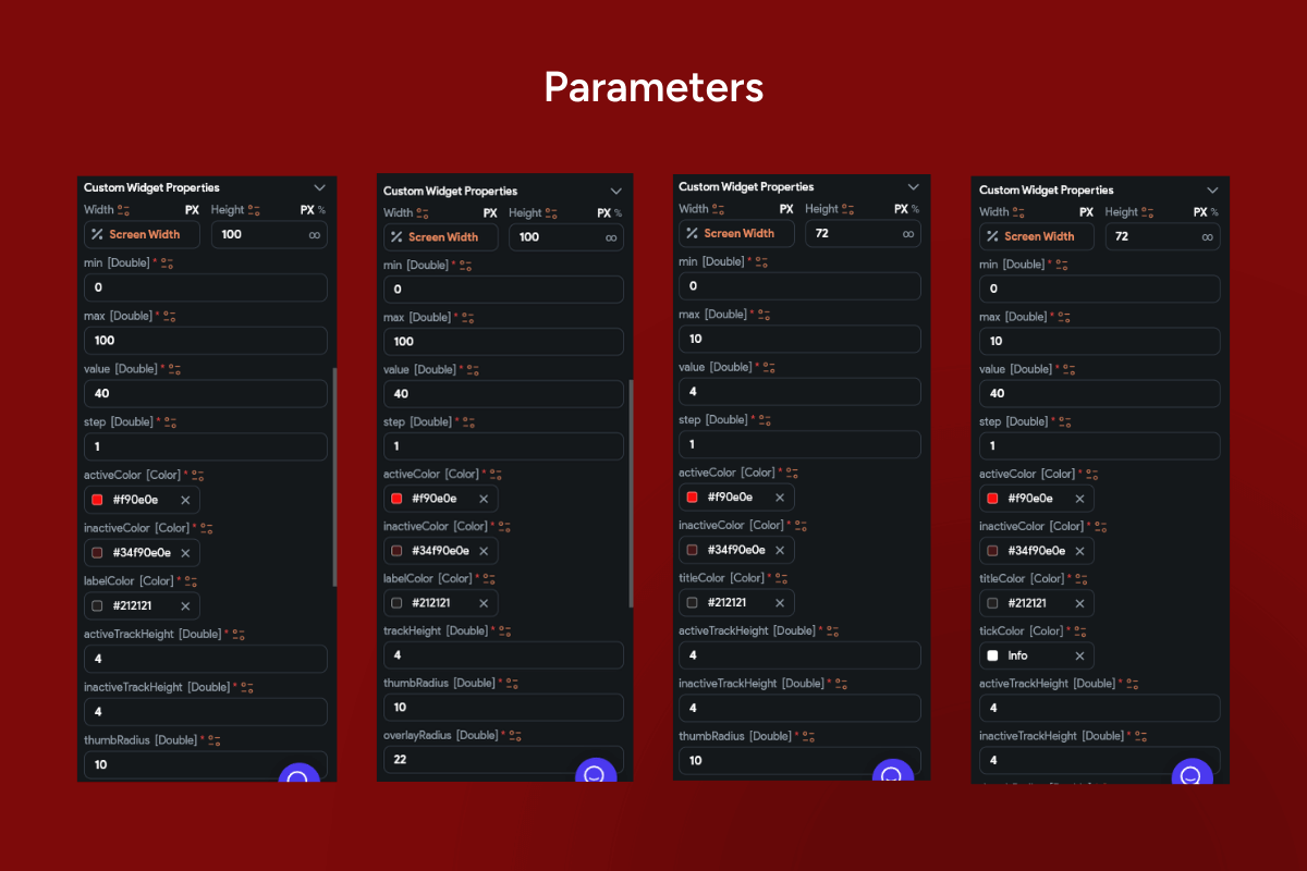
🧭 Bounds & precision: min/max, decimals, clamping
-
🌍 RTL support and accessible semantics for screen readers
-
🎨 Theming: accent color, track height, thumb size/shape, tooltip style
-
🌙 Light/Dark ready with high-contrast labels
-
📱 Responsive layout for cards, sheets, or full-width rows
✅ Great for
⚙️ Preferences & settings • 🎯 score/threshold pickers • 📈 analytics dashboards • 📝 forms needing clear value feedback
Keywords: slider widget flutterflow, single value slider, value tooltip, rectangular tooltip, paddle tooltip, text badge, icon thumb, numeric labels, tick marks, divisions, step size, snap to step, active track, inactive track, ripple feedback, keyboard control, RTL support, accessible slider, semantic labels, min max bounds, precision control, number formatter, unit formatter, themeable colors, track height, thumb radius, tooltip style, light mode, dark mode, responsive UI, data binding, Firestore integration, Supabase integration, REST API, smooth animation, settings control, analytics filter, FlutterFlow widget, FlutterFlow component.