


Podster - Podcast App Ui Kit
- Best World Class UI Design
- Fixed scope & fixed rate
- Auto Layout everywhere
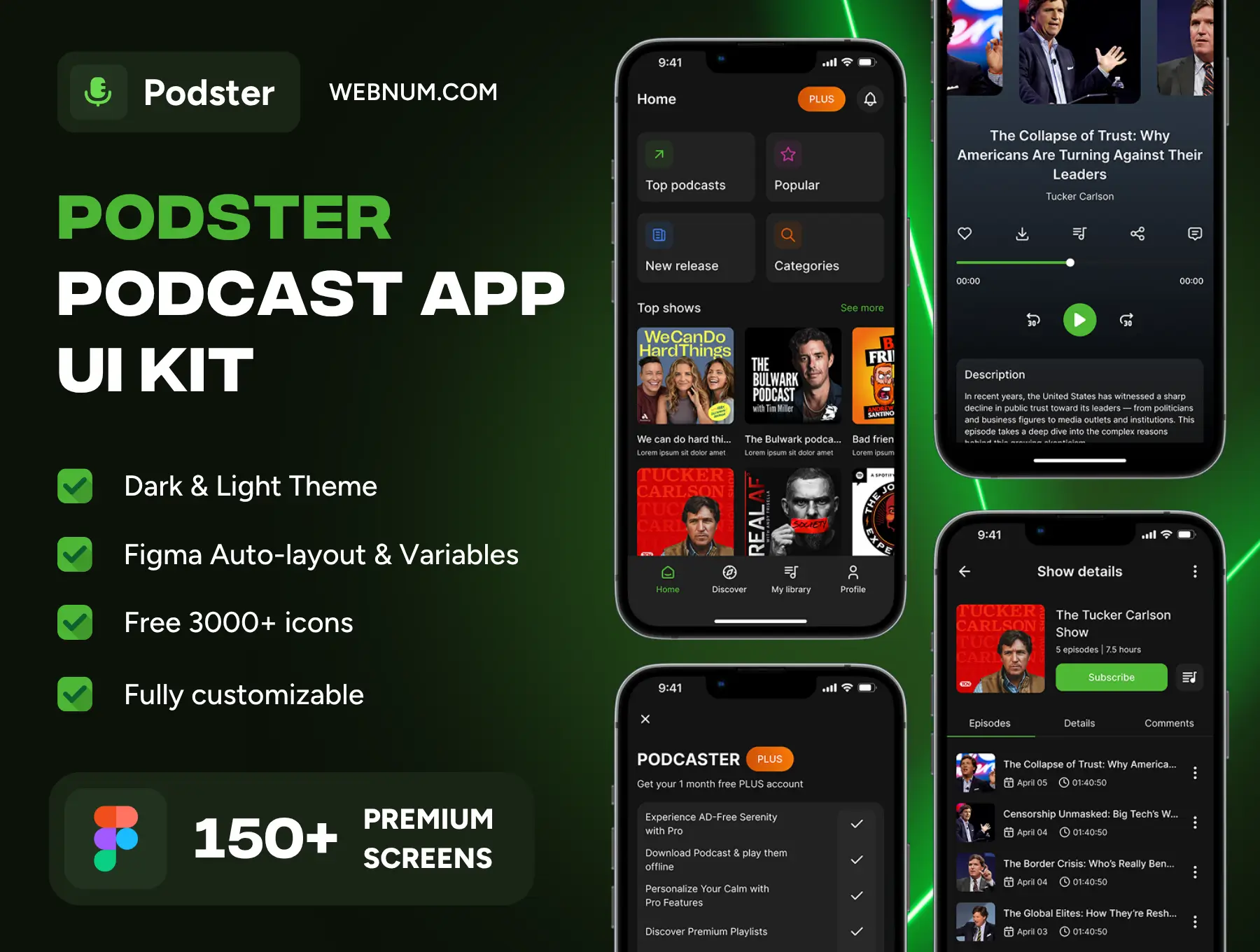
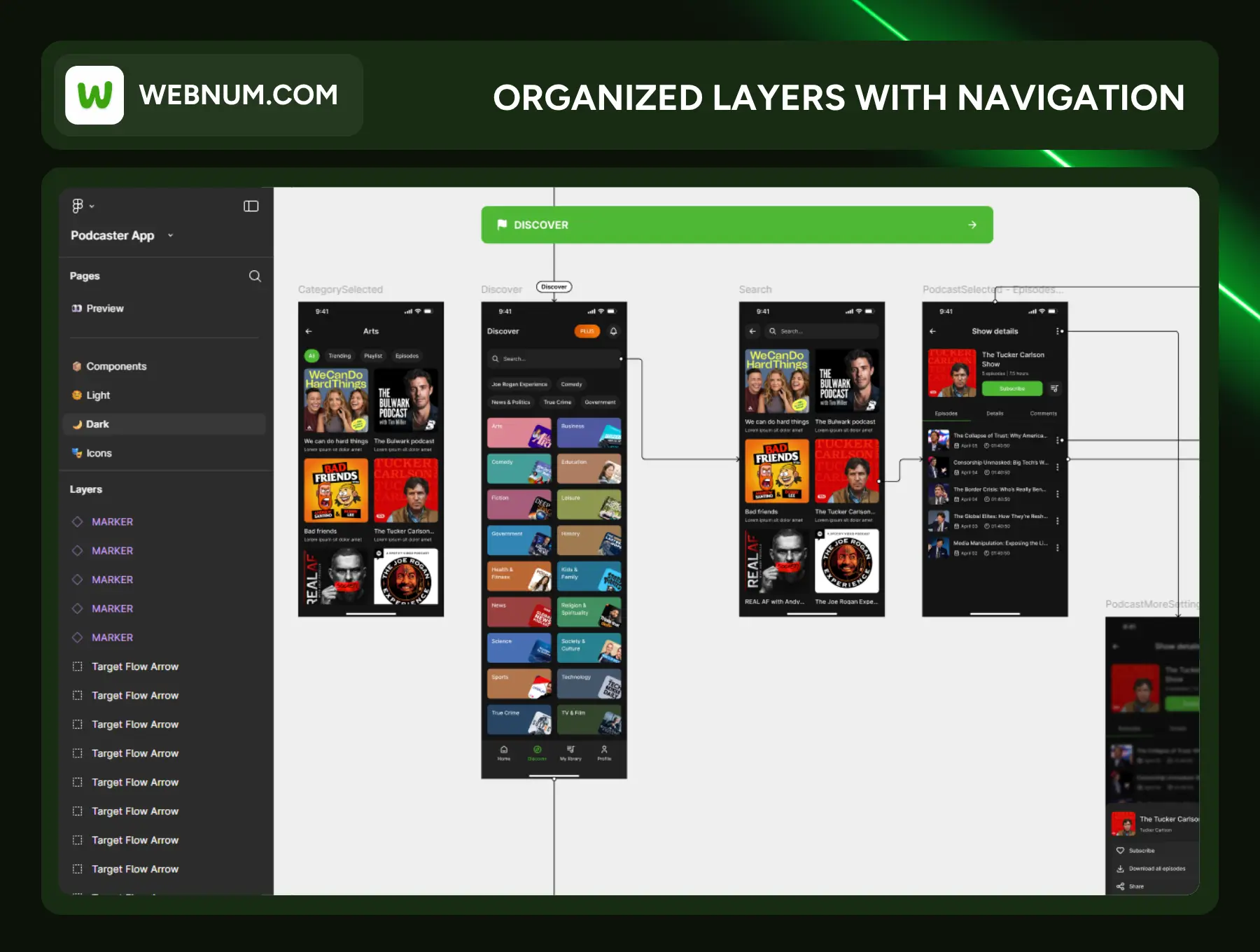
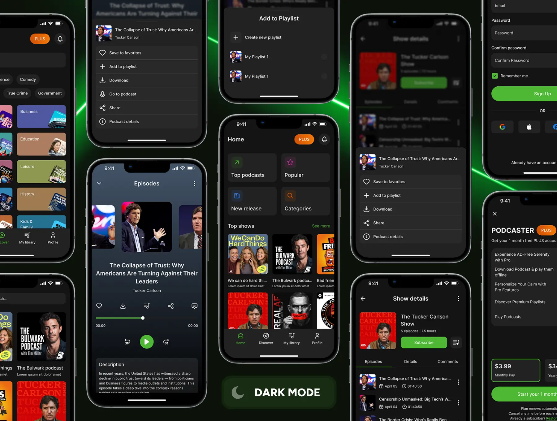
Design a world-class podcast app in a fraction of the time. Podster is a polished Figma UI kit with everything you need to launch fast: carefully crafted screens, a robust design system, and production-ready components that pass smoothly to development.
Who it’s for
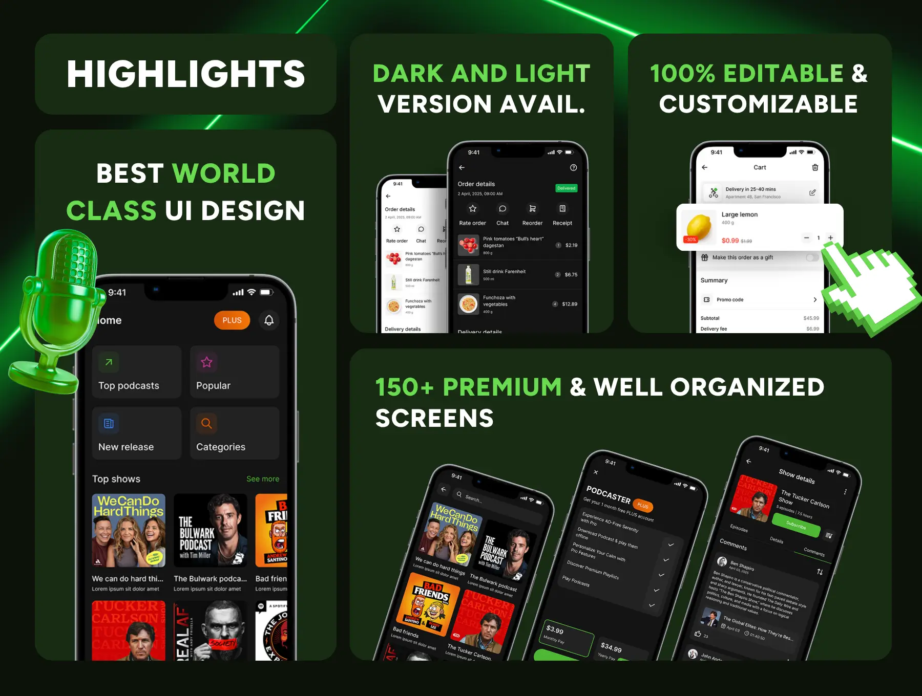
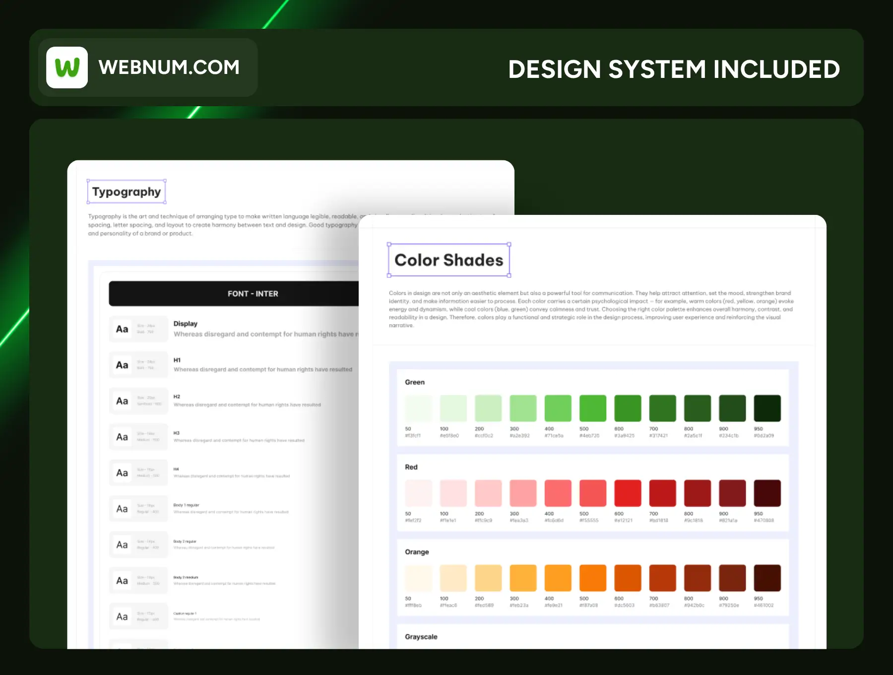
Founders, product teams, and agencies building podcast, audio, or media apps who need a clean, modern interface with Dark & Light themes and a scalable design system.
What you can build
-
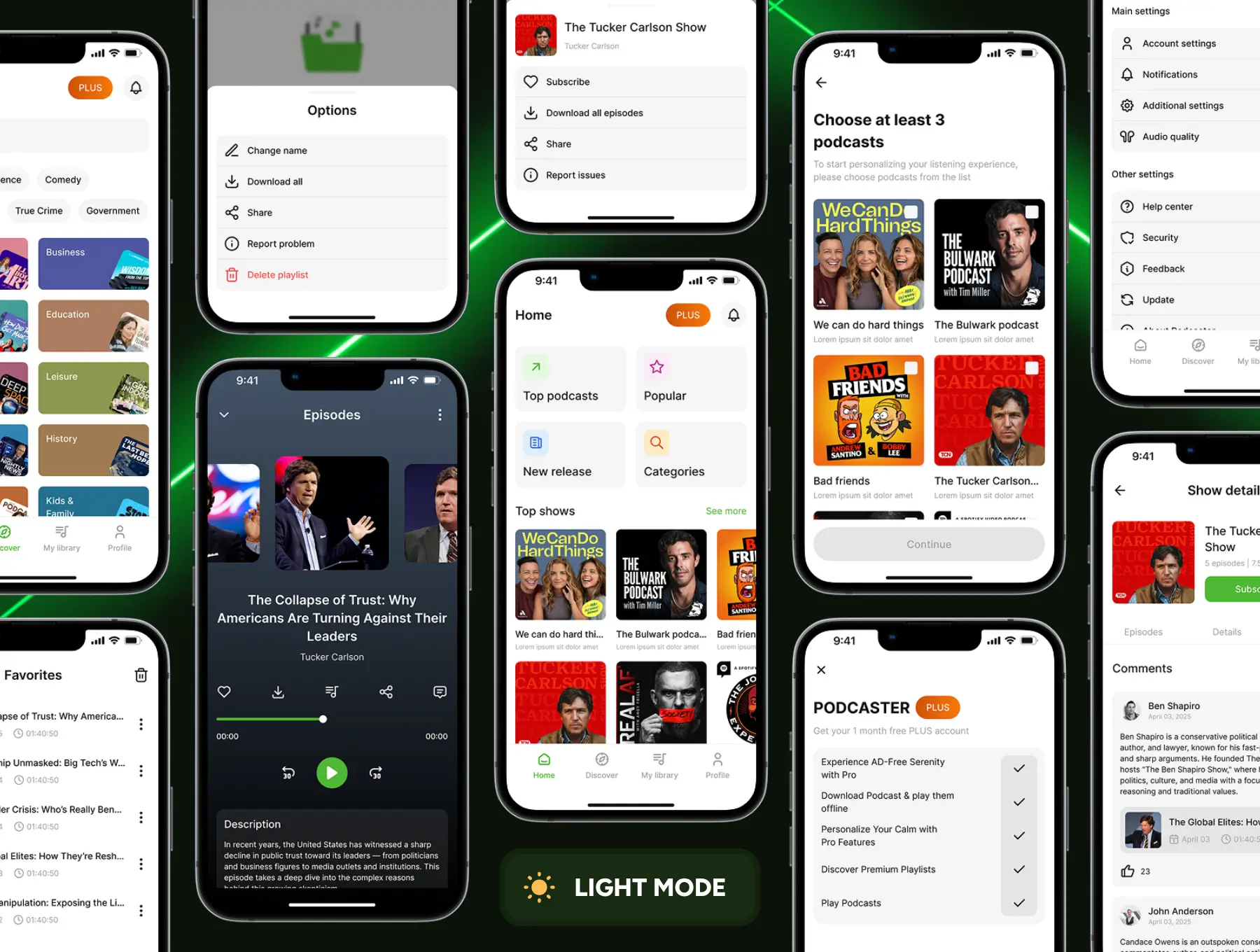
Podcast discovery, charts, and curated lists
-
Show pages with episodes, details, and comments
-
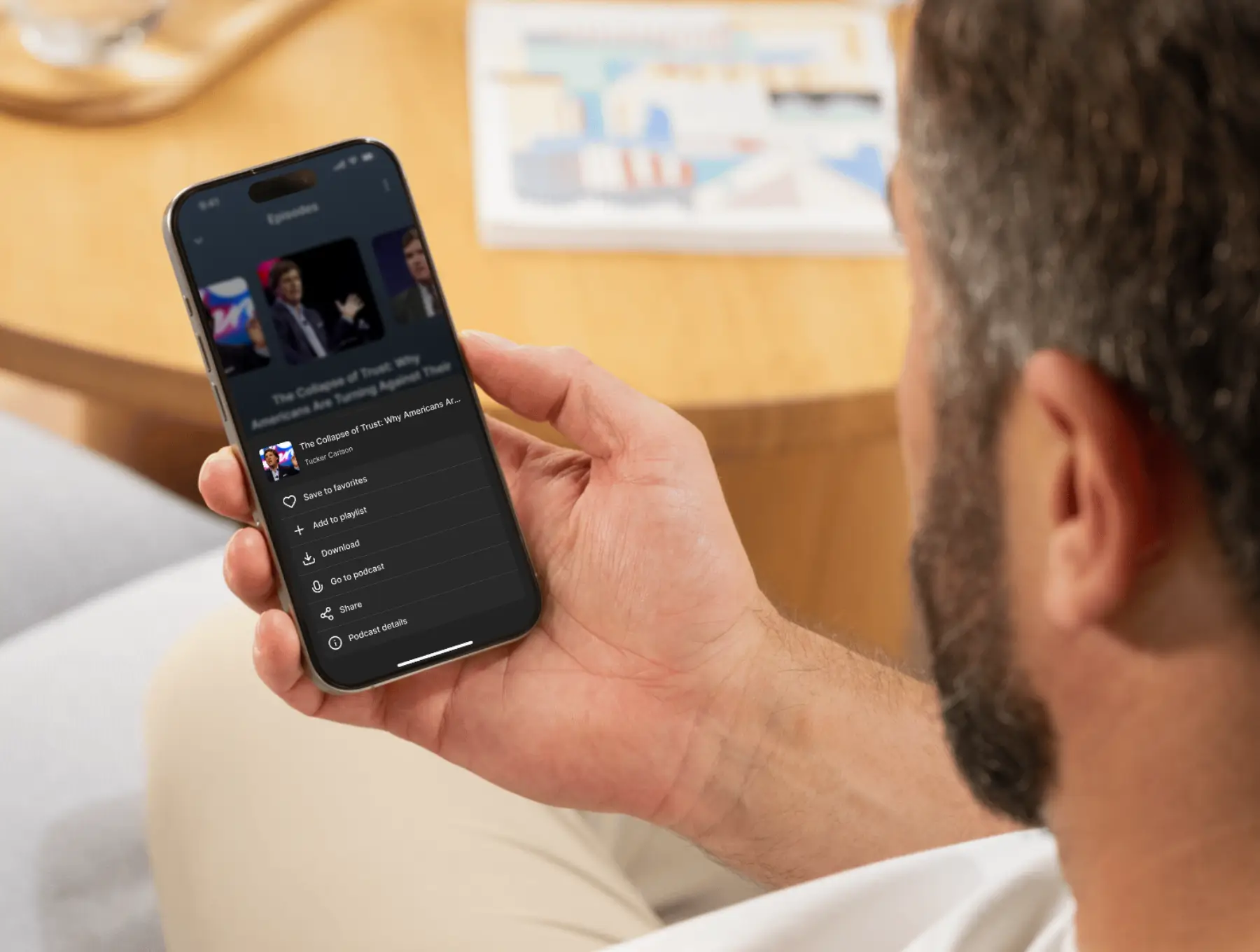
A full-featured audio player (mini & full), queue, speed, and sleep timer
-
Library, playlists, favorites, downloads (offline)
-
Subscriptions, premium paywall (PLUS), and onboarding flows
-
Search, filters, categories, and topic selection
-
Accounts, profiles, notifications, and settings (appearance, language, playback)
What’s inside
-
150+ premium screens organized by flows (Home, Discover, Search, Show Details, Player, Library, Playlists, Downloads, Auth, Paywall, Settings, Help, Empty/Loading/Error states)
-
Design system with typography, color scales, spacing, elevation, and state tokens
-
Component library: cards, list items, tab bars, toolbars, chips, tags, ratings, dialogs, toasts, forms, toggles, sliders, progress, audio controls, and more
-
Variants & states (active/hover/disabled/selected, dark/light, filled/outline)
-
3,000+ icons (SVG), ready to swap globally
-
Navigation map of screens for quick onboarding of your team
Built for Figma
-
Auto-layout everywhere for effortless edits and perfect resizing
-
Figma Variables for color, typography, radii, and spacing—switch themes or brand colors in seconds
-
Constraints & responsive layouts for common breakpoints
-
Clean layers & naming aligned to best practices for easy dev handoff
Highlights
-
Pixel Perfect Design
-
Fully Auto Layout
-
Global Style Guide
-
100% Editable & Customizable
-
Ready-to-Use Components
-
Large Icon Library
-
Fonts & Theme Switch (Dark & Light)
-
Figma Variables for Smarter Design
Why teams choose Podster
-
Ship faster. Use ready flows instead of starting from scratch.
-
Scale with confidence. A consistent system reduces design debt as you grow.
-
Smooth handoff. Clear structure, component variants, and tokens keep design and code in sync.
-
Brand-ready. Replace fonts, colors, and logos once—see updates across the file.
- 115+ Premium Screen 💚
- Semi-Animated Prototype 😍
- Design System Included 📂
- Figma Auto Layout 📐
- Well Organized Design ☘️
- World Class UI Design 🥳
You may only use this template for one project. For more details, please read the Marketplace Terms of Service.