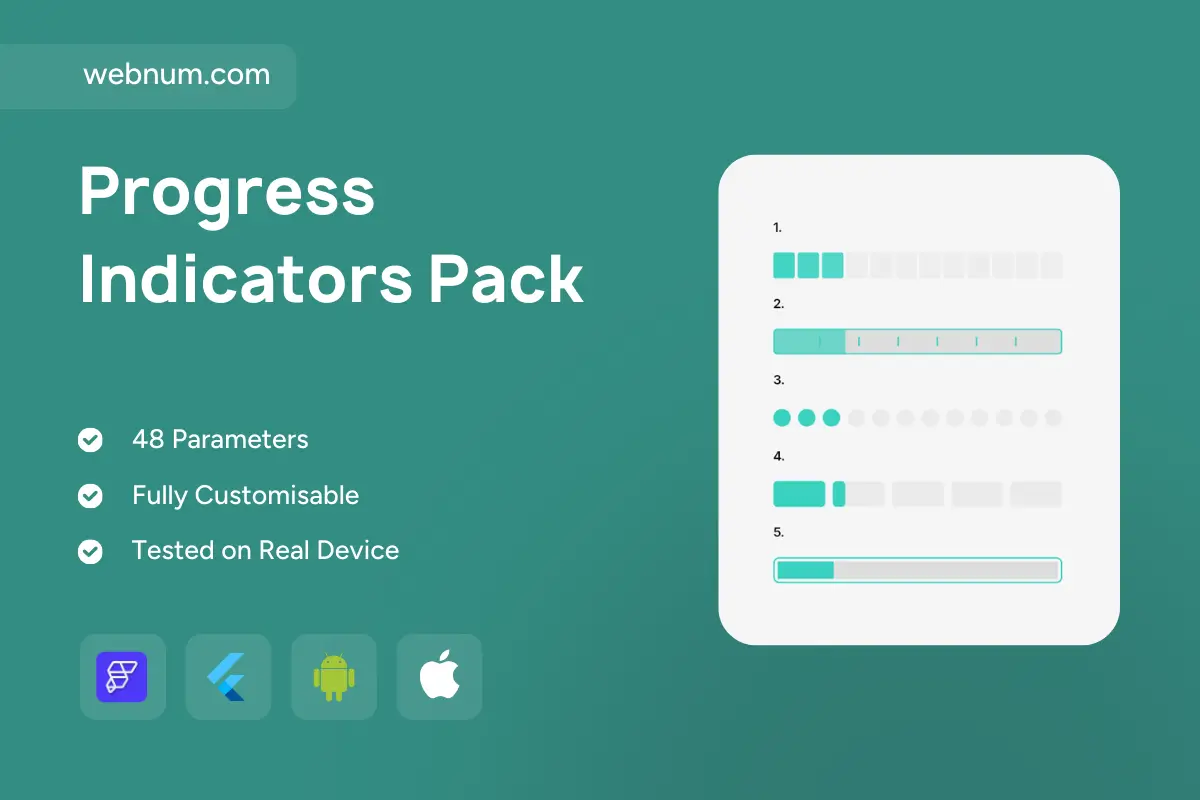
⚡ A tidy set of five lightweight progress indicators widgets for FlutterFlow — perfect for onboarding, multi-step forms, quizzes, uploads, and dashboards. Mix & match squares, dots, segmented bars, and a classic linear bar, all with smooth states, subtle animations, and easy theming. 🚀
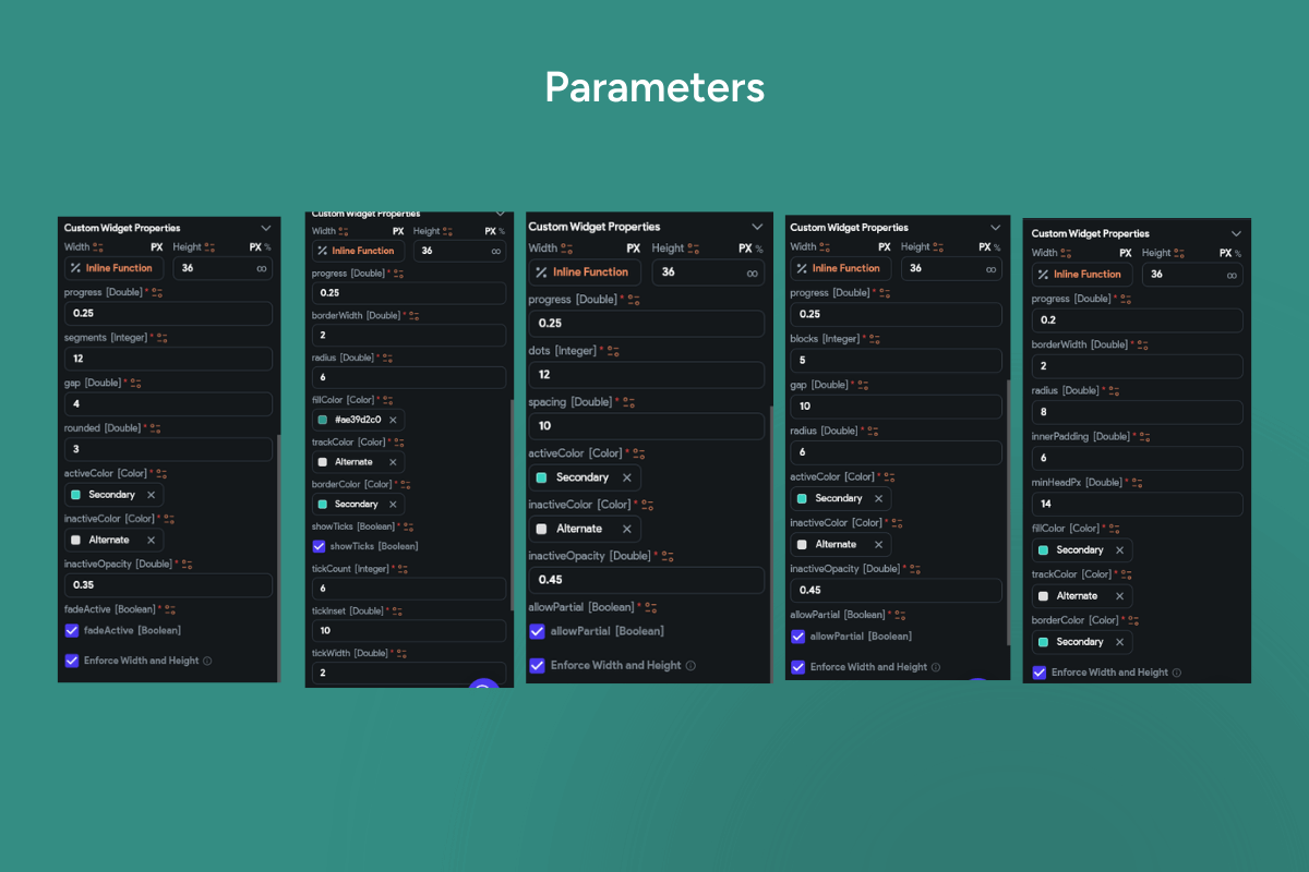
✨ Functionality
Five styles included
🟩 Square Stepper — discrete steps as rounded squares.
📏 Segmented Bar w/ Ticks — linear bar split into milestones.
🔵 Dots Stepper — pagination-style circular dots.
🧱 Chunked Cards — wide blocks with an active mini-chunk.
💊 Rounded Linear Bar — classic progress with pill edges.