

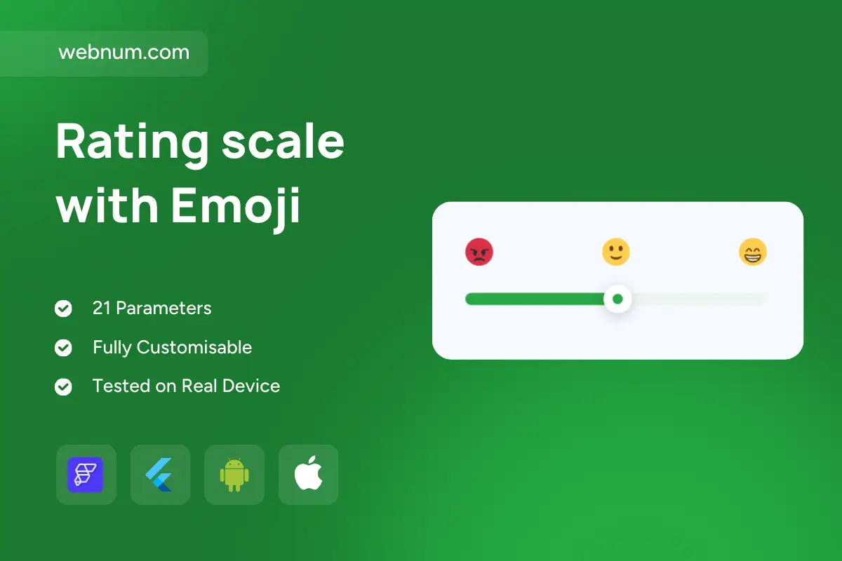
A friendly, space-efficient feedback control that mixes a smooth slider with emoji anchors (angry β neutral β happy). The filled track shifts from π΄βπ‘βπ’ to mirror sentiment, while the thumb adds tiny micro-bounces, haptics, and optional value labels. Built for quick, low-friction feedback on mobile and web, fully accessible and analytics-ready.
β¨ Functionality
-
Scales: continuous or stepped (0β100, 0β10) with optional snap to 3/5 emoji anchors.
-
Dynamic track: automatic π΄βπ‘βπ’ gradient with thresholds + tooltips (βPoor / Okay / Greatβ).
-
Thumb UX: drag/tap, micro-bounce, haptic tap, hover/focus ring, disabled & read-only.
-
Labels & markers: emoji anchors, tick marks, numeric value or caption above the thumb.
-
Accessibility: ARIA slider semantics, Tab/Arrow/Page/Home/End, screen-reader hints, RTL, Reduce Motion.
-
Data hooks:
onChange/onChangeEnd, debounce, default value, validation (min/max/required), optimistic updates. -
Theming: sizes SβXL, thumb/track colors, gradient presets, shadows, typography; light/dark modes.
-
Analytics & targeting: log view/change/submit, user/session attribution, remote config to control when it appears.
π§° Use cases
-
Post-action CSAT pulses (checkout, ticket close, feature use) πποΈ
-
Onboarding friction checks and release feedback π
-
Wellness or mood tracking ππ
-
Classroom confidence checks π
-
Kiosk/field data collection for one-handed input ποΈ
Keywords: emoji slider, sentiment slider, satisfaction scale, csat, rating control, likert slider, gradient track, anchor emojis, haptic feedback, aria slider, accessibility, keyboard navigation, analytics events, debounce, theming tokens, dark mode, flutter widget, flutterflow component, mobile ux, rating scale with emoji widget
Rating scale with Emoji
- Fixed price & scope
- Pixel-perfect UI/UX
- App Store & Google Play submission
You may only use this template for one project. For more details, please read the Marketplace Terms of Service.