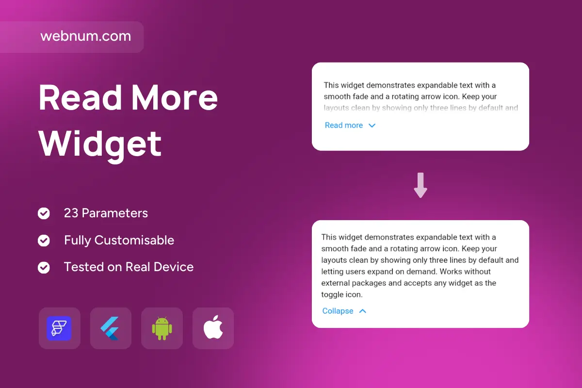

Functionality
-
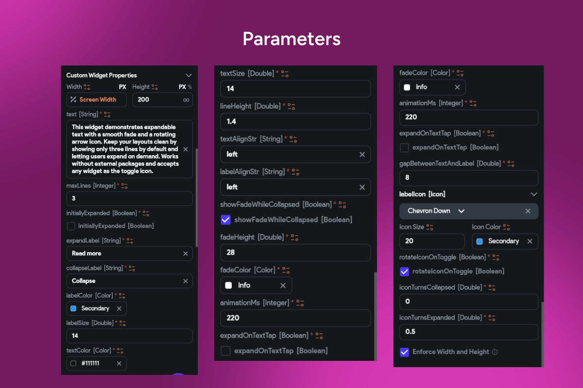
✂️ Line clamp with ellipsis + fade; set max lines, fade height, easing.
-
🎬 Expand/Collapse with animated height & rotating caret; custom labels/icons.
-
🔧 Controlled & uncontrolled modes: initial state,
isExpanded, callbacks. -
🧱 Inline or block layouts; supports rich text/Markdown and any child (images, chips).
-
💾 Persistence: remember last state per item (key/storage).
-
♿ Accessibility & i18n: screen-reader labels, proper semantics, fully translatable.
-
🎨 Theming tokens: typography, padding, radius, shadows, divider, icon size/color, link styles.
-
⚡ Performance-safe: one-time measurement, virtualization-friendly in lists.
Use cases
-
🛍️ Product descriptions, FAQs, reviews, release notes.
-
📰 News feeds & social posts with optional “show more”.
-
📜 Legal copy (privacy/terms), help tips, educational callouts.
-
📊 Compact dashboards where details shouldn’t push primary KPIs.
Keywords: read more widget, expandable text, show more, collapsible section, line clamp, truncation, ellipsis, fade, rotating arrow, animated height, accessible, localization, theming, rich text, markdown, list virtualization, flutter widget, flutterflow component, ux pattern, content reveal.
Read More Widget
- Fixed price & scope
- Pixel-perfect UI/UX
- App Store & Google Play submission
You may only use this template for one project. For more details, please read the Marketplace Terms of Service.