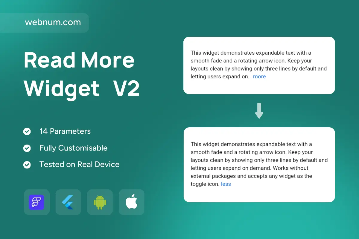
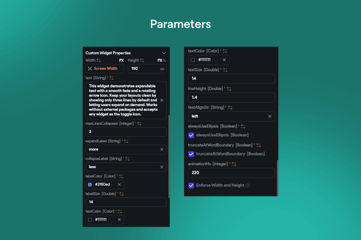
A refined expandable-text component that keeps long copy compact without losing clarity. V2 clamps content to a set number of lines with an inline “more” link placed right at the truncation point (with ellipsis). On expand, text reflows smoothly and switches to “less” so users can collapse again. The widget is fully themeable, localization-ready, and tuned for lists and dynamic layouts.
Functionality
-
Line-clamp with ellipsis + inline link (more/less); configurable maxLines, fade/none, and expand/collapse duration & curve.
-
Smooth height animation with reflow; preserves scroll position to avoid layout jumps.
-
Controlled/uncontrolled modes: set default state, read
isExpanded
, and listen via callbacks (onExpand
,onCollapse
). -
Rich content support: plain text, RichText/Markdown; accepts custom toggle builder (icon, chip, text).
-
Accessibility & i18n: ARIA/semantics for expanders, focus order, screen-reader labels, fully translatable strings.
-
Styling tokens: link color/hover/underline, typography, padding, radius, divider, icon size, light/dark themes.
-
Persistence options: remember state per item (e.g., via key/cache) in long lists.
-
Performance-safe: single measurement pass, virtualization-friendly, minimal rebuilds.
Use cases
-
Product descriptions, blog teasers, FAQs, release notes, and review snippets.
-
Legal/help text where you show a summary first and reveal full details on demand.
-
Data-dense cards and dashboards that must stay compact on mobile.
-
Social/news feeds to shorten long posts while keeping context visible.
Keywords
read more, show more, expandable text, collapsible text, line clamp, ellipsis, inline link, more/less, animated height, accessibility, localization, theming, rich text, markdown, list virtualization, mobile UI, Flutter widget, FlutterFlow component.
Read More Widget V2
- Fixed price & scope
- Pixel-perfect UI/UX
- App Store & Google Play submission
You may only use this template for one project. For more details, please read the Marketplace Terms of Service.