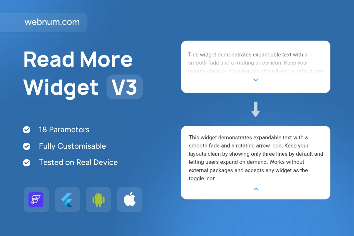
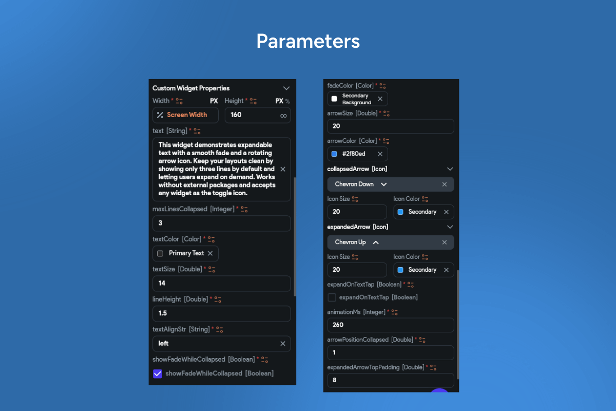
Read more widget — elegant expandable text for Flutter/FlutterFlow ✨. Keep long copy tidy and reveal the rest with style. This polished read more widget uses a soft gradient fade 🌫️ at the bottom of clamped text and a centered chevron ⬇️ that rotates on expand/collapse ⬆️. It preserves scroll position for buttery-smooth lists and cards, and it’s fully themeable to match your brand.
Functionality 🚀
-
Line clamp & fade: configurable lines with ellipsis … plus adjustable fade height/opacity/curve.
-
Centered chevron toggle: down/up icon with rotation + scale animation; drop in your own icons/widgets.
-
Smooth reflow: expands/collapses without layout jumps, retaining scroll position.
-
Controlled & uncontrolled:
isExpanded,onExpand,onCollapse,onToggle. -
Rich content: plain/RichText/Markdown, links, and inline widgets supported.
-
Accessibility-first: semantic expander, focus ring, keyboard nav, full i18n/localization.
-
Design tokens: typography, paddings, radius, shadows, icon size/color, light/dark.
-
State persistence: per-item keys for long/virtualized lists.
Use cases 💡
-
Blog/news teasers & product descriptions that shouldn’t overwhelm layouts.
-
Reviews, FAQs, and release notes with compact-by-default behavior.
-
Legal/help sections that expand to full details on demand.
-
Card-heavy dashboards & mobile feeds where vertical space matters.
Keywords: read more, expandable text, collapsible, line clamp, ellipsis, fade overlay, center chevron, rotating arrow, animated expand, scroll retention, accessibility, localization, theming, markdown, list virtualization, flutterflow widget, flutterflow component, mobile ui