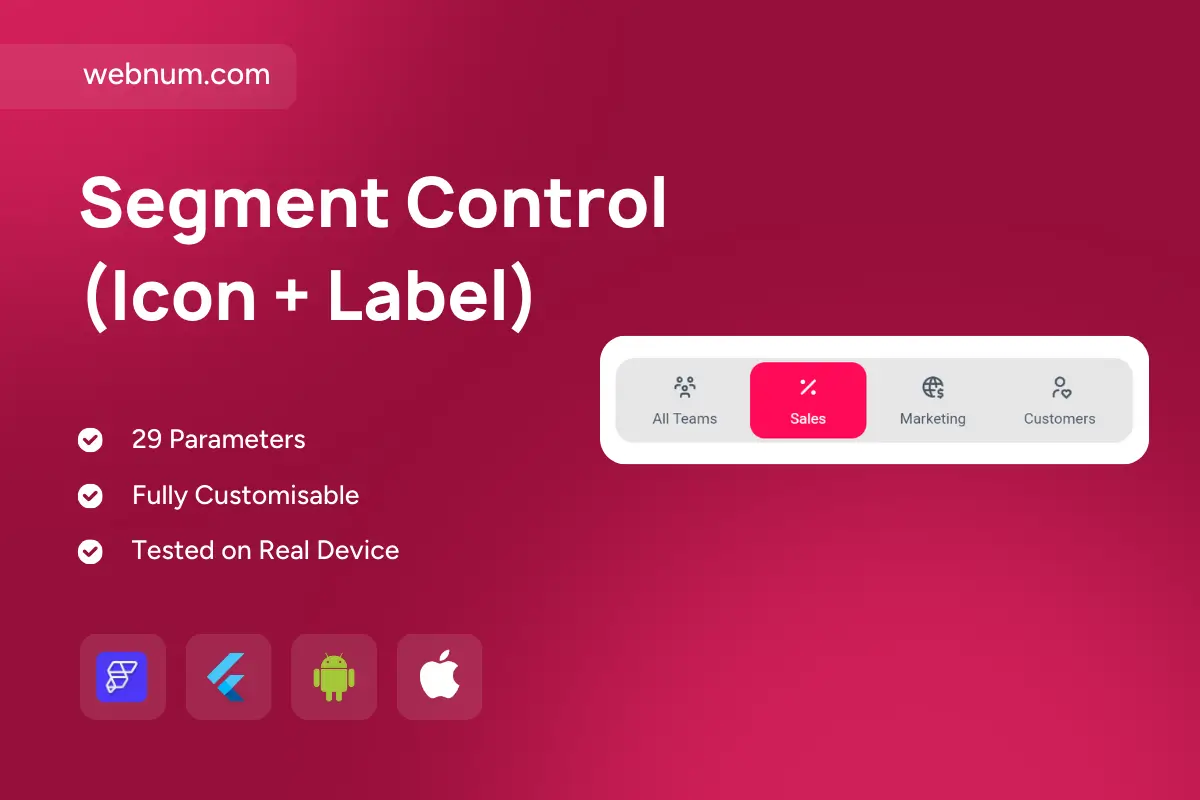
Introducing the segment control widget flutterflow β a modern, pill-style tab bar that makes switching categories/views effortless π. Pair icons π§ with labels π·οΈ, highlight the active pill β¨, and guide users cleanly through dashboards, lists, and filters.
Functionality π
-
π£ Icon + text tabs with a bold selected pill and silky transitions.
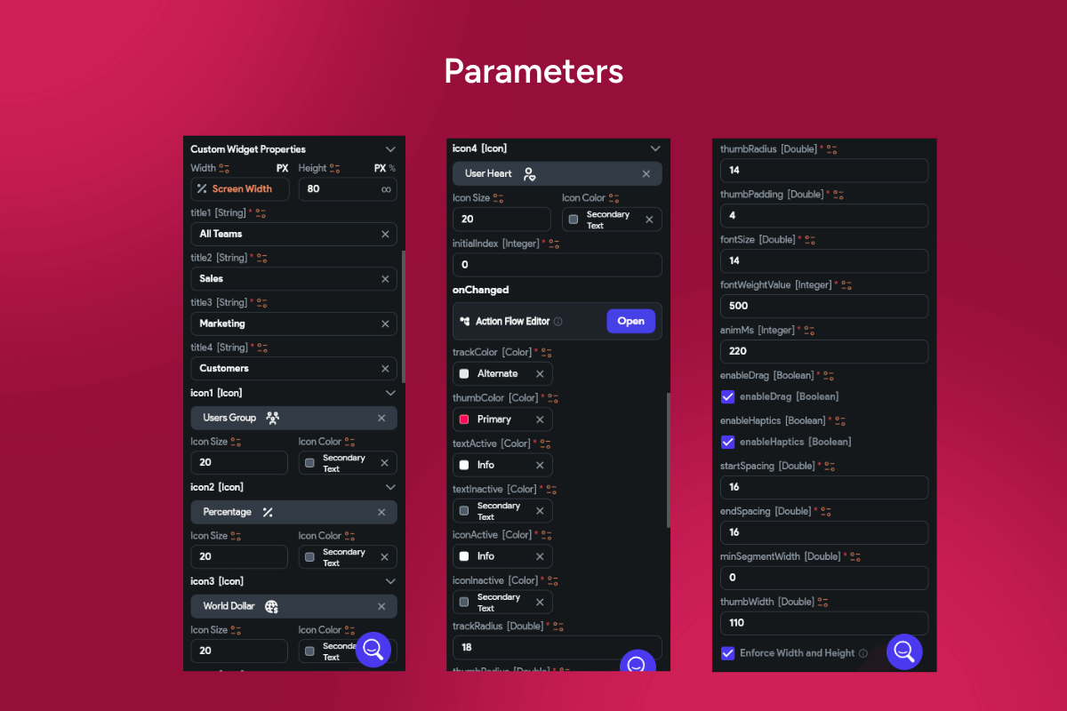
-
βοΈ Scrollable or fixed layouts; equal-width or content-width pills.
-
π’ Badges/counters, disabled states, and graceful overflow handling.
-
βΏ Accessible by default: ARIA roles, focus ring, keyboard shortcuts.
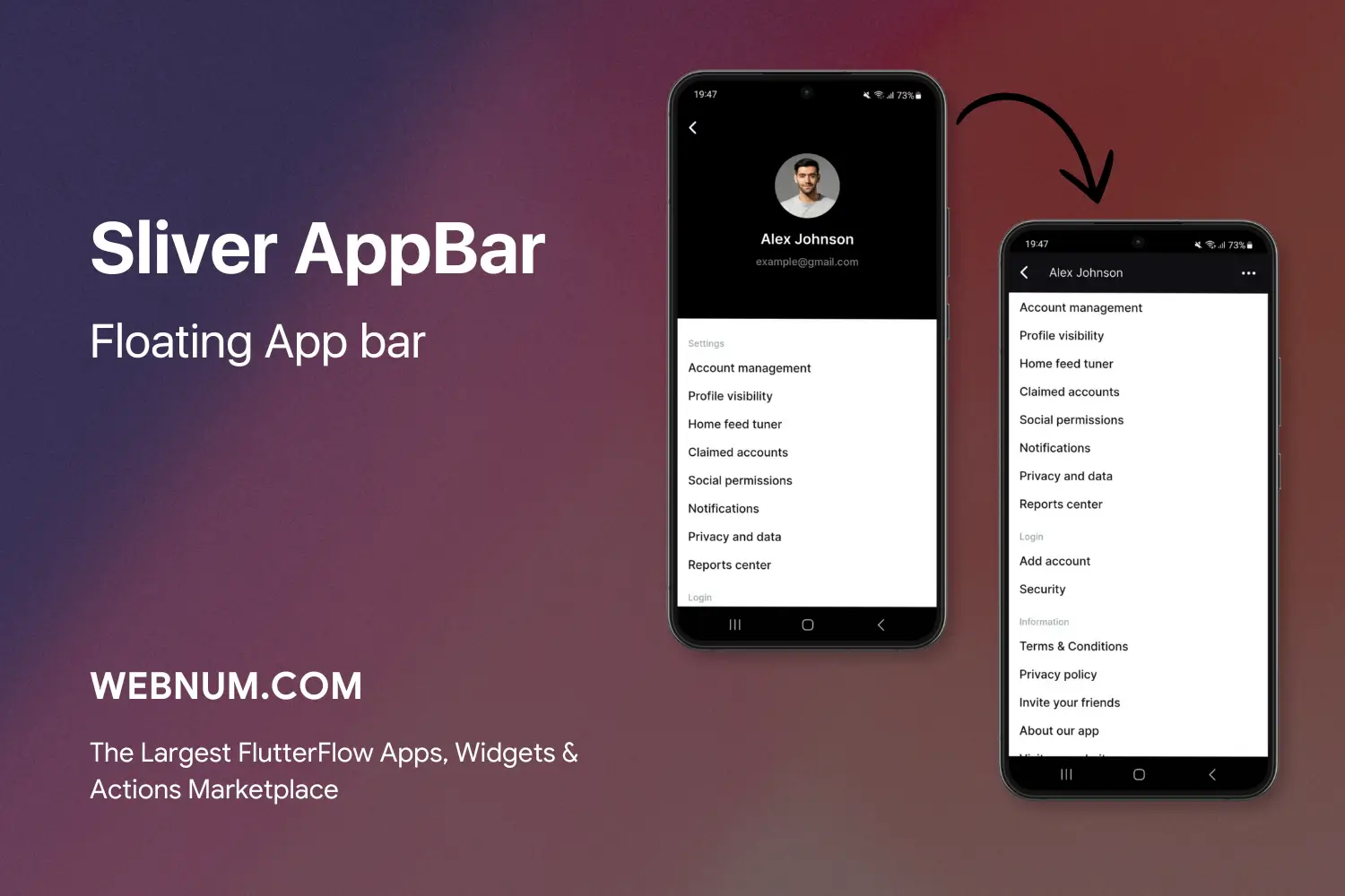
-
π§ Navigation or filter modes (route tabs or inline segmented control).
-
π Controlled/uncontrolled; remembers last choice;
onChangefor reloads. -
π¨ Responsive theming: light/dark, custom colors, rounded radii, elevation.
-
π€ Lazy load content per tab + deep links via query/route params.
Use Cases π‘
-
π Admin dashboards: Teams / Sales / Marketing / Customers.
-
ποΈ Marketplace/category filters.
-
βοΈ Settings pages: Profile / Security / Billing.
-
π Content apps: Articles / Videos / Podcasts; analytics: Day / Week / Month.
-
π± Mobile segmented controls when radio buttons feel too heavy.
Keywords: segment control widget flutterflow, pill tabs, segmented control, icon tabs, scrollable tab bar, filter chips, accessible aria tabs, responsive navigation ui, dashboard tabs flutterflow, tab bar custom widget
Segment Control (Icon + Label)
- Fixed price & scope
- Pixel-perfect UI/UX
- App Store & Google Play submission
You may only use this template for one project. For more details, please read the Marketplace Terms of Service.