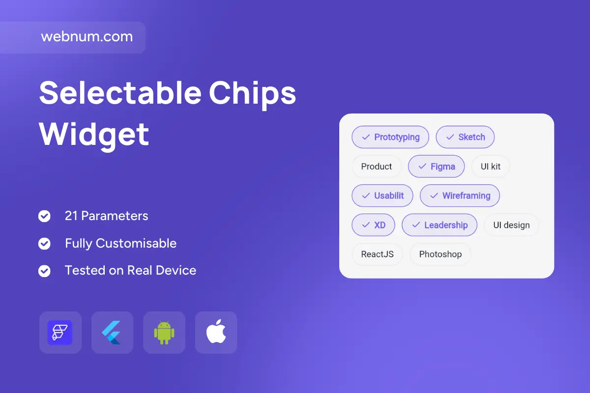
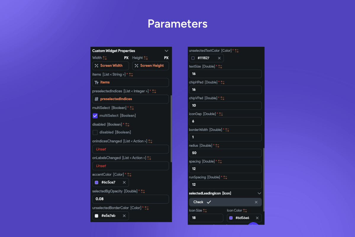

A clean, pill-style chip set for tagging, skills, and quick filters. Each chip supports active/inactive states, with an outline style and a subtle checkmark to confirm selection. The compact design fits dense grids while staying highly tappable on mobile. Colors and typography are token-driven so the component adapts to any design system. Works with single or multi-select logic and exposes callbacks for instant filtering. Ideal for profiles, search facets, category pickers, and preference settings. Built lightweight for fast rendering in long lists.
Functionality
-
Single or multi-select chips with selected/unselected states
-
Checkmark indicator, outline/fill variants, and rounded “pill” shape
-
Configurable colors, radius, spacing, icon placement, and typography
-
Keyboard focus, hover, and pressed states; accessible roles & labels
-
Async/onTap callbacks for filtering, querying, or form binding
-
Supports dynamic data (add/remove chips, long lists, virtualization)
Use cases
-
Skill/interest selectors on resumes, portfolios, and user profiles
-
Faceted search filters (category, brand, price tags) in eCommerce
-
Topic labels and quick filters in dashboards and analytics apps
-
Tag input for content creation: posts, notes, and project labels
-
Preference settings, onboarding surveys, multi-choice forms
Keywords
chips, tag chips, filter chips, selectable chips, pill buttons, category chips, multi select, single select, tags, facets, search filters, skill tags, interests, labels, UI chips, outline chip, filled chip, checkmark chip, Flutter widget, FlutterFlow component, mobile UI, web UI, design system, accessible component, pill UI, quick filter, category filter, faceted search.
Selectable Chips Widget
- Fixed price & scope
- Pixel-perfect UI/UX
- App Store & Google Play submission
You may only use this template for one project. For more details, please read the Marketplace Terms of Service.