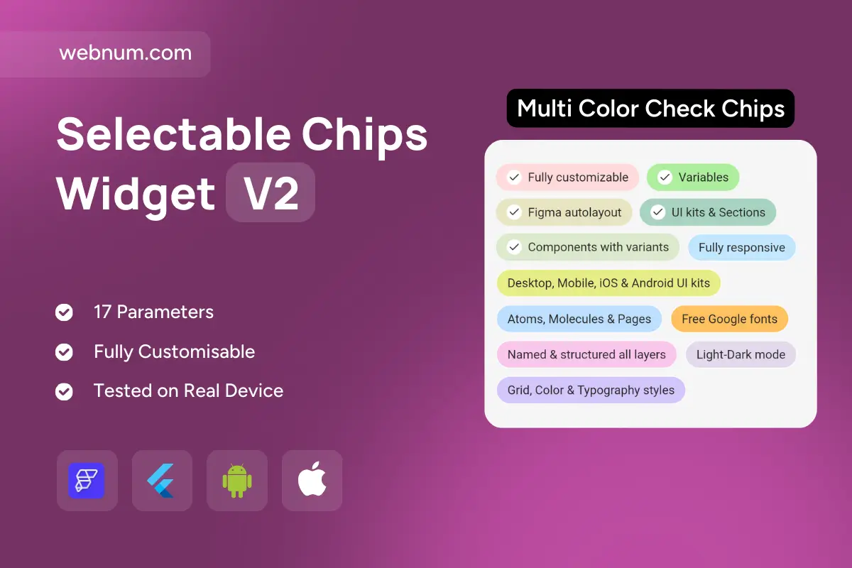
Colorful, pill-shaped badges for highlighting product features, benefits, or specs. Each chip supports a subtle checkmark and soft background to communicate status (available, included, recommended) at a glance. Designed to be highly readable in dense lists and responsive across breakpoints. Works equally well on marketing pages, onboarding flows, pricing tables, and in-app settings. Token-based colors and typography make it easy to align with any design system. Lightweight and accessible out of the box, with keyboard focus and screen-reader labels. Ideal for Figma handoffs and production UI in Flutter/FlutterFlow.
Functionality
-
Filled/outline pill variants with optional checkmark icon
-
Status colors (success/info/warning/neutral) and custom palettes
-
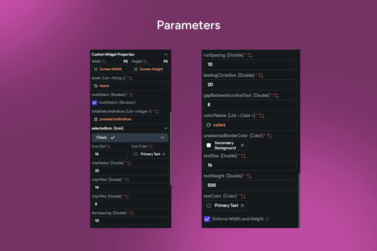
Adjustable radius, spacing, padding, and typography tokens
-
Single or grouped layout with wrapping and alignment controls
-
Click/tap actions for filters, anchors, or modal/info popovers
-
Accessibility: focus states, ARIA labels, high-contrast support
-
Responsive by default: auto wrap for mobile, tablet, desktop
Use cases
-
Marketing feature lists on landing and pricing pages
-
“What’s included” sections for product tiers and bundles
-
App settings, capability matrices, and permission summaries
-
Onboarding checklists and progress confirmations
-
Search/filter hints, tags, and categorical labels in dashboards
Keywords
feature badges, pill badges, chips, checkmark chip, benefit list, feature list, product features, included items, pricing page UI, landing page UI, tag chips, status badge, outline chip, filled chip, responsive chips, accessibility, ARIA, design system, UI component, Flutter widget, FlutterFlow component, web app UI, mobile UI, marketing UI, onboarding checklist, settings summary, filter tags.