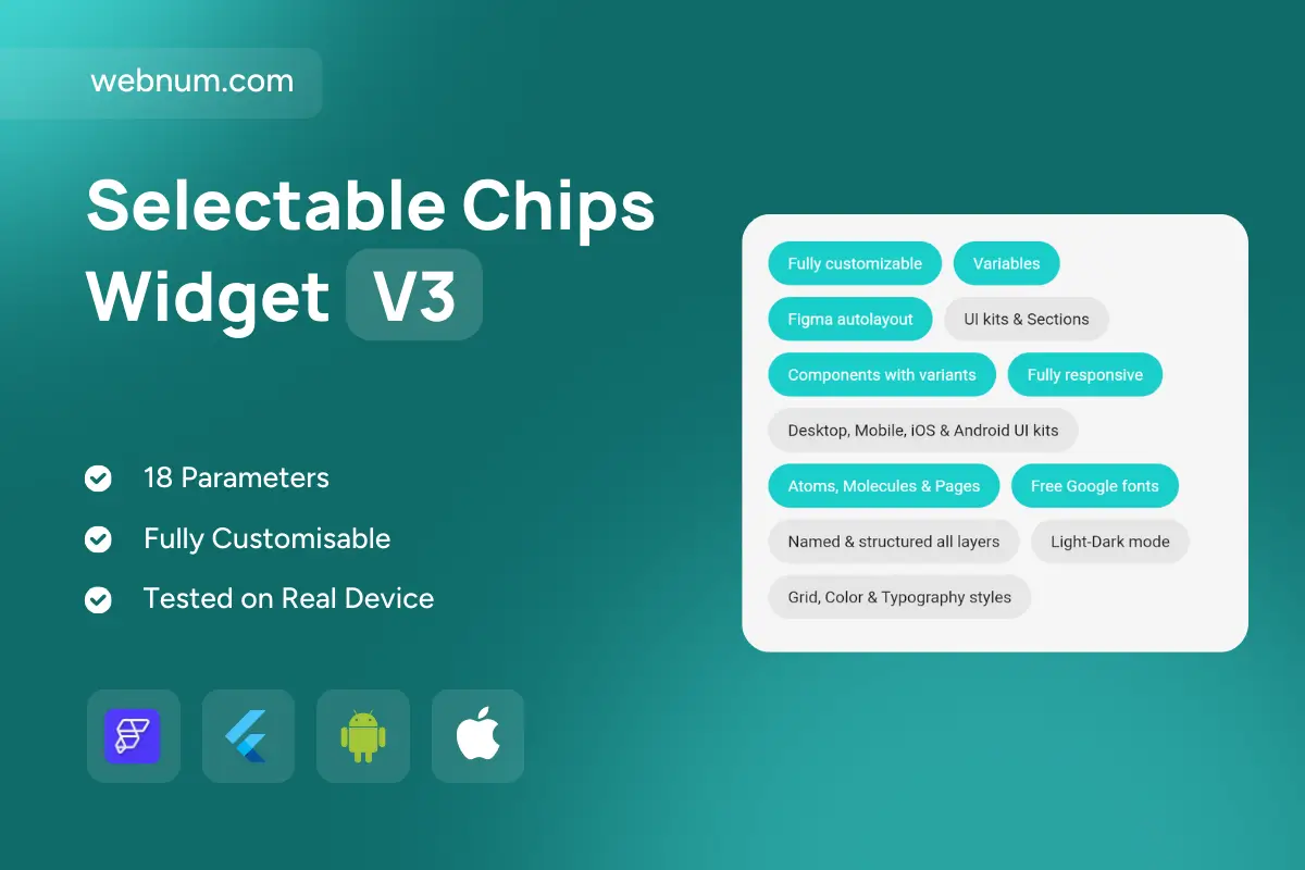
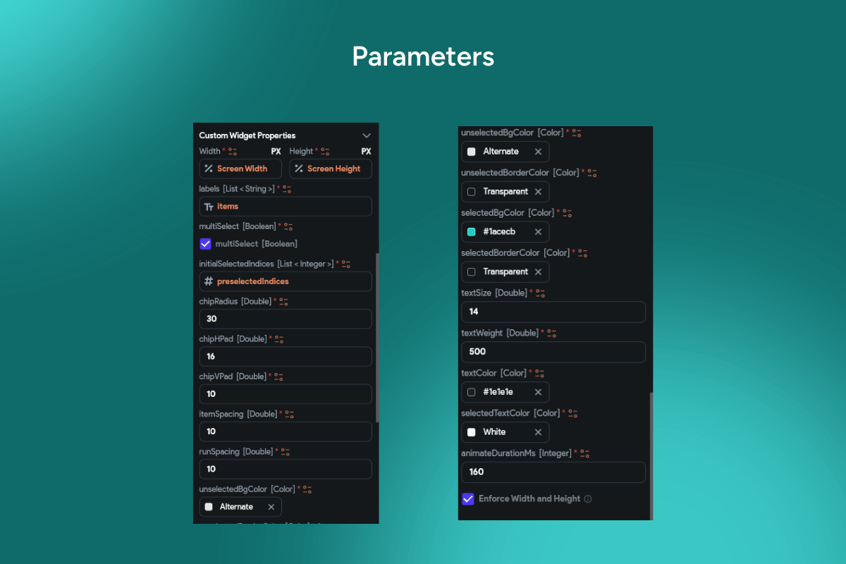
A polished fill chips widget 💊 for high-readability feature lists, benefits, and specs. Mix vivid primary pills with subtle neutral chips to create a clear visual hierarchy — must-have vs optional at a glance. Rounded corners, comfy padding, and balanced typography make chips scannable on dense pages and small screens 📱. Fully responsive: groups auto-wrap from desktop to mobile. Plug-and-play color tokens and type scales slot into any design system in seconds ⚙️ — perfect for landing pages, pricing tables, onboarding, and in-app settings.
Functionality
-
🎨 Filled & neutral pill variants with configurable colors & typography
-
🧱 Adjustable radius, spacing, and padding (compact → roomy)
-
🧭 Grouped chips with auto-wrap + alignment (left/center/right)
-
🔔 Optional icons, counters, or status dots per pill
-
👆 Click/tap actions for filters, anchors, or modal details
-
♿ Accessible focus states & ARIA labels; high-contrast friendly
Use cases
-
🗂️ Feature lists on marketing/product pages
-
💳 “What’s included” on pricing & plan comparisons
-
✅ Capability matrices, settings summaries, onboarding checklists
-
🔎 Tagging & quick filtering in dashboards/catalogs
-
📐 Design-system docs & Figma handoffs highlighting components
Keywords (one line)
fill chips widget, fill chips custom widget FlutterFlow, pill badges Flutter widget, feature badges chips, neutral chips UI, pricing table chips, comparison table badges, responsive chips component, accessible chips ARIA, filter tags chips FlutterFlow, status chip with icon, design system chip component, landing page feature list, mobile web chips UI