
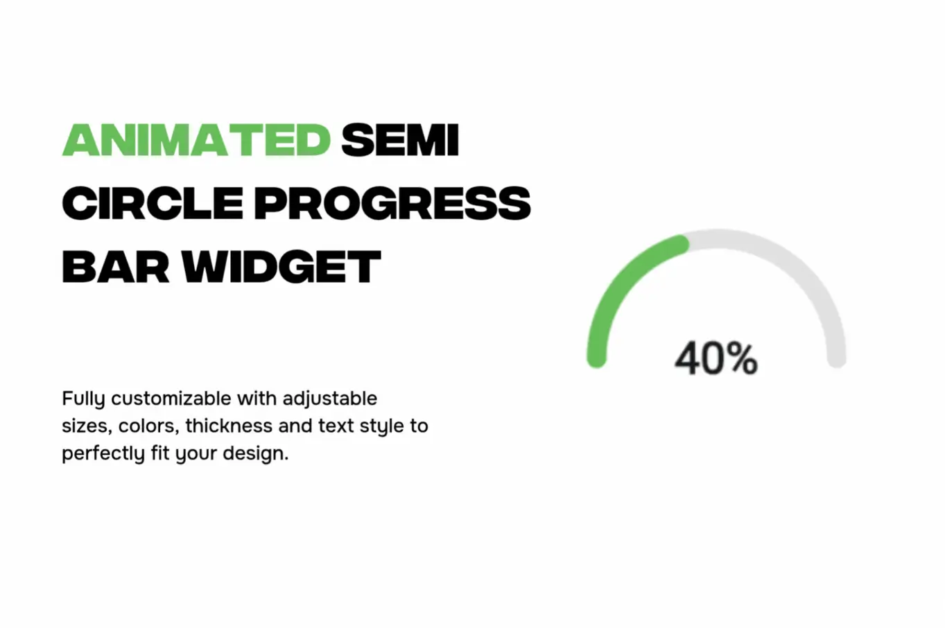
Give your app a sleek, modern progress gauge with this lightweight, animated semi circle progress bar widget. It fills butter-smooth from 0% → target% 🎯 and shows the live value right in the center 🔢 for instant feedback. Tailor every detail to your brand: size 📏, thickness 🧵, colors/gradients 🎨, and font style ✍️. Drop it into dashboards, checklists, workouts, downloads, onboarding steps—anywhere you want a clear, compact progress readout.
Why you’ll love it 💚
-
⚡ 60 FPS animation with easing for natural motion
-
🔢 Center label (%, value, or custom text)
-
🛠️ Fully customizable: radius, arc start/end, rounded caps, background track
-
🌗 Light/Dark ready with accessible contrast
-
🔗 Data-friendly: bind to Firestore/REST/local state easily
-
📱 Responsive and lightweight for Android & iOS
-
🧩 Perfect for goals, KPIs, learning progress, fitness rings, upload/download status, and task completion
Quick ideas 💡
-
✅ Habit/goal tracker rings
-
🏋️ Workout completion meter
-
🧠 Course progress & quizzes
-
📦 Order or delivery status
-
⏬ Download/processing indicator
Keywords: semi-circle progress bar widget, semicircle progress indicator, animated progress bar, radial progress, half circle progress meter, arc progress gauge, circular loader, percentage arc, progress ring widget, dashboard KPI widget, gradient progress arc, rounded stroke progress, flutter progress bar, flutterflow progress widget, lightweight loading indicator, custom progress component, mobile UI progress, webnum component
Semi Circle Progress bar Widget
- Fixed price & scope
- Pixel-perfect UI/UX
- App Store & Google Play submission
You may only use this template for one project. For more details, please read the Marketplace Terms of Service.