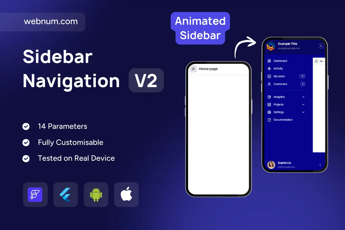
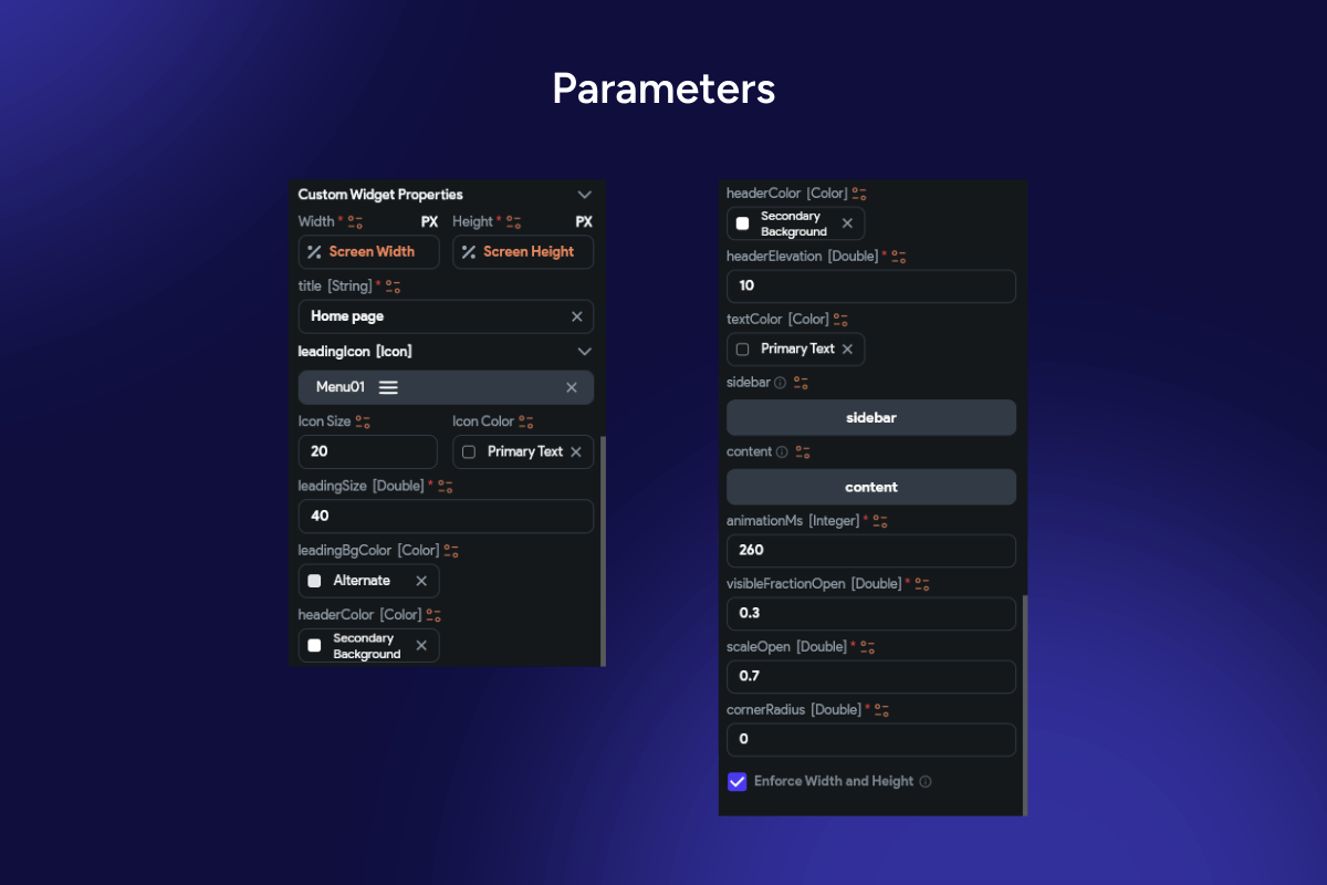
A sleek, mobile-first sidebar that slides in from the left with a smooth, springy animation when the hamburger icon is tapped. It dims the content with a scrim, highlights the active route, and supports icons, badges, and section headers. Built to feel native on both iOS and Android, the drawer respects safe areas, adapts to tablet/landscape layouts, and is fully themeable (colors, radius, elevation, blur). Ideal for apps that need quick, unobtrusive navigation without sacrificing screen real estate.
Functionality
-
Slide-in/out modal drawer with scrim, backdrop blur, and 60 fps transitions
-
Edge-swipe and drag gestures to open/close; tap-outside and back-press to dismiss
-
Active item state, icons + labels, counters/badges, and optional profile/header & footer
-
Collapsible groups and nested routes (one-level or multi-level)
-
Deep-link & router integration; programmatic open/close APIs
-
Light/Dark themes, custom widths, paddings, rounded corners, and shadows
-
Accessibility: large hit targets, focus order, semantics/roles, keyboard support
-
Safe-area awareness and responsive behavior (persistent/rail on wider screens)
Use cases
-
Admin dashboards and internal tools with many sections
-
E-commerce back office (Orders, Products, Customers, Reports)
-
Social/news/content apps that require quick context switching
-
Knowledge bases, LMS, documentation portals, and settings hubs
-
Multi-tenant apps with role-based menus and counters (e.g., unread items)
Keywords
sidebar, navigation drawer, modal drawer, hamburger menu, slide-in menu, navigation rail, collapsible menu, nested navigation, scrim, backdrop blur, active state, badges, responsive UI, safe area, accessibility, Flutter widget, FlutterFlow component, mobile navigation, tablet layout, admin dashboard.
Sidebar Navigation V2
- Fixed price & scope
- Pixel-perfect UI/UX
- App Store & Google Play submission
You may only use this template for one project. For more details, please read the Marketplace Terms of Service.