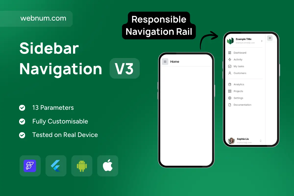
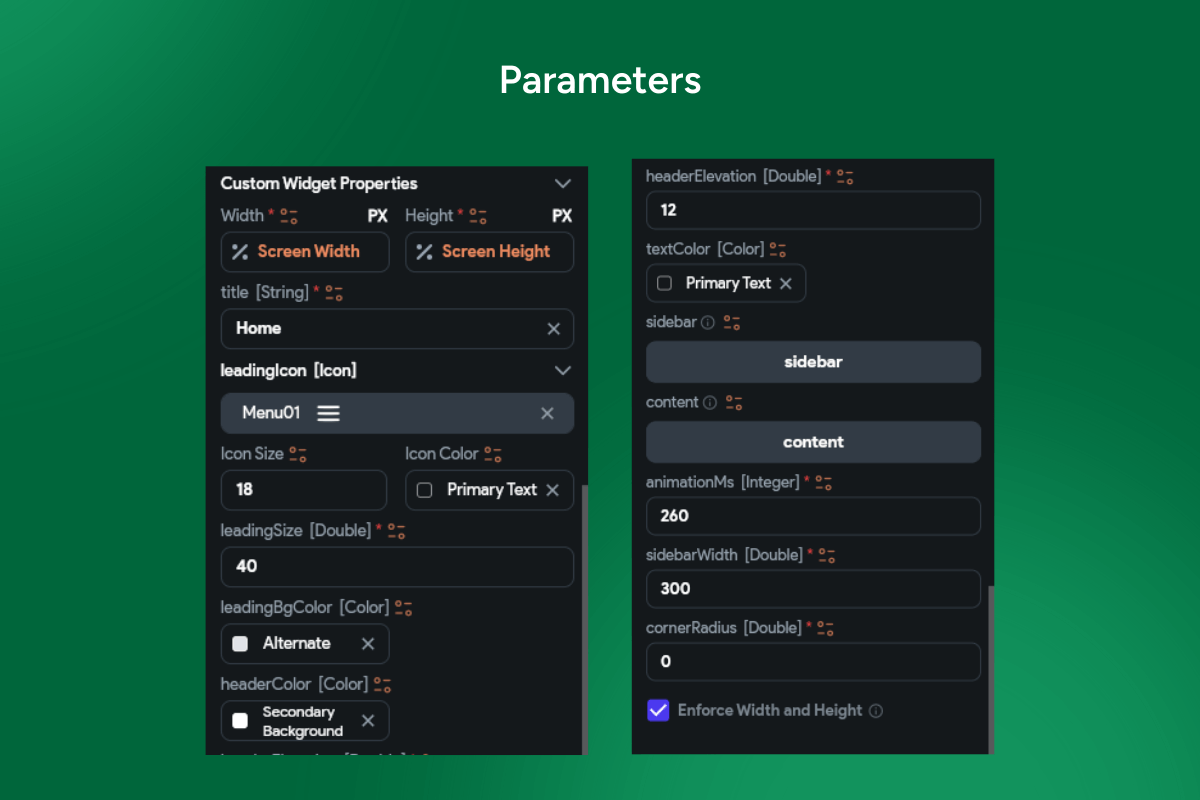
Adaptive Sidebar/Drawer for Pro Apps 🧭✨. A flutterflow sidebar navigation that seamlessly adapts from a desktop/tablet left rail to a mobile modal drawer. Enjoy smooth open/close animations, active-item highlighting, icons, badges, nested groups, dividers, and a persistent profile/footer. It’s route-aware and data-driven: syncs with GoRouter/FlutterFlow actions, remembers pinned/collapsed width, supports swipe-to-open on mobile, hover on desktop, RTL, and light/dark themes — built with accessibility in mind (focus order, ARIA, keyboard shortcuts). ⚡
⚙️ Functionality
-
🧩 Collapsible states: mini-rail, expanded rail, full drawer; pin/unpin per breakpoint
-
🗂️ Nested sections: headers, dividers, badges/counters, tooltips, clear active styling
-
🖐️ Gestures & input: edge-swipe open (mobile), Esc to close, ⌘/Ctrl+B toggle, drag-to-resize (desktop)
-
🔗 Route sync & deep links; programmatic open/close; role-based visibility
-
🎨 Theme & locale aware: Material 3 tokens, dark mode, RTL; persisted width & selection
🧭 Use Cases
-
📊 Admin dashboards, analytics suites, internal tools
-
🛒 E-commerce back-office: orders, products, customers
-
☁️ SaaS apps with multi-module nav (projects, tasks, docs)
-
📚 CMS/LMS portals & knowledge bases
-
📱 PWAs targeting web + mobile with a unified nav pattern
🔑 Keywords: flutterflow sidebar navigation, sidebar drawer custom widget, navigation rail collapsible menu, responsive ui admin dashboard, gorouter route sync flutterflow, badges nested list sidebar, swipe gesture keyboard shortcuts, rtl dark mode accessibility, material 3 animated drawer, data driven navigation flutterflow
Sidebar Navigation V3
- BEST VALUE
- 200+ FlutterFlow Widgets & Icons
- 30+ Hour FlutterFlow Express Course (Real Projects)
- 70+ Figma UI Kits & 3D icons
- Help with Customizations
- Unlimited Project Help
- Unlimited Bug Fixing Assistance
You may only use this template for one project. For more details, please read the Marketplace Terms of Service.

