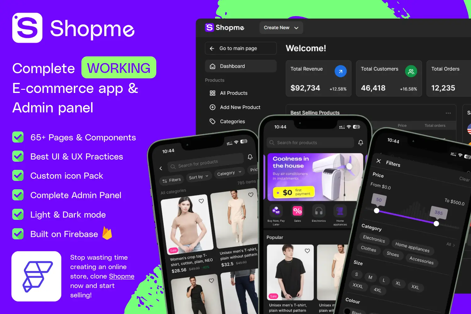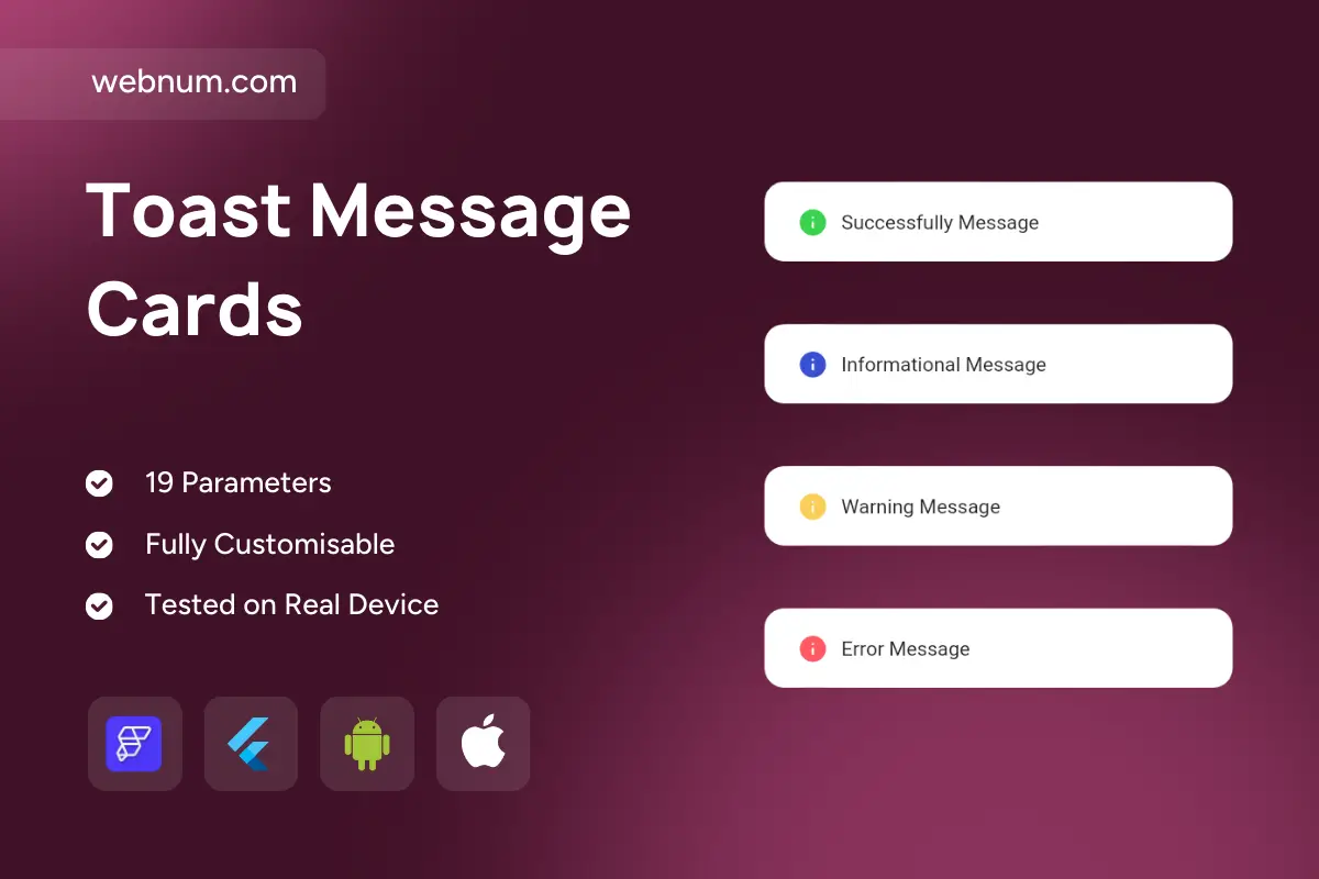
A polished in-app alert system ⚡ that feels at home in any modern UI. Each toast is color-coded and icon-backed for clarity — ✅ green (Success), ℹ️ blue (Info), ⚠️ yellow (Warning), ❌ red (Error). Rounded containers, subtle shadows, and adaptive sizing keep it elegant and readable on iOS & Android. Perfect for confirmations, status updates, and validation feedback.
Functionality
-
✅ Four alert types: Success, Info, Warning, Error
-
🎨 Predefined colors & icons for instant recognition
-
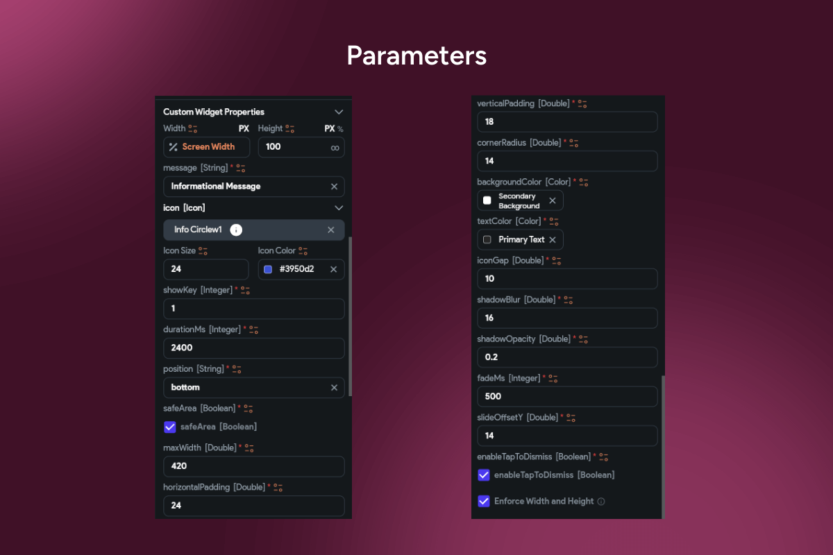
✍️ Customizable text: font, size, style, weight
-
⏱️ Auto-dismiss or persistent display options
-
🎬 Smooth animations: fade, slide, or scale
-
🧹 Tap to close & swipe to dismiss interactions
-
📱 Safe-area aware & responsive across screen sizes
Use cases
-
🧾 Confirm form submissions or payments (Success)
-
💡 Provide helpful instructions or system notes (Info)
-
🚧 Flag potential issues like low balance or weak password (Warning)
-
🛑 Highlight validation failures or blocked actions (Error)
-
📊 Real-time events in dashboards & mobile apps
-
🛍️ Ecommerce, fintech, SaaS, social apps—everywhere users need clear feedback
Keywords
alert message, success message, info alert, warning alert, error alert, simple toast card widget, notification bar, message banner, toast message, snackbar, inline feedback, system messages, validation errors, status updates, user feedback, confirmation alert, UI alerts, FlutterFlow widget, FlutterFlow component, responsive design, dismissible alert, auto dismiss, swipe to dismiss, smooth animation, colored alert, material design alert, cross-platform UI, mobile notifications, in-app alerts, instant feedback
Toast Message Cards
- BEST VALUE
- 200+ FlutterFlow Widgets & Icons
- 30+ Hour FlutterFlow Express Course (Real Projects)
- 70+ Figma UI Kits & 3D icons
- Help with Customizations
- Unlimited Project Help
- Unlimited Bug Fixing Assistance
You may only use this template for one project. For more details, please read the Marketplace Terms of Service.