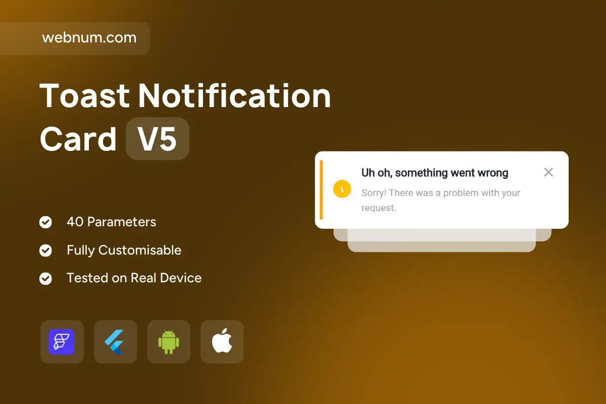
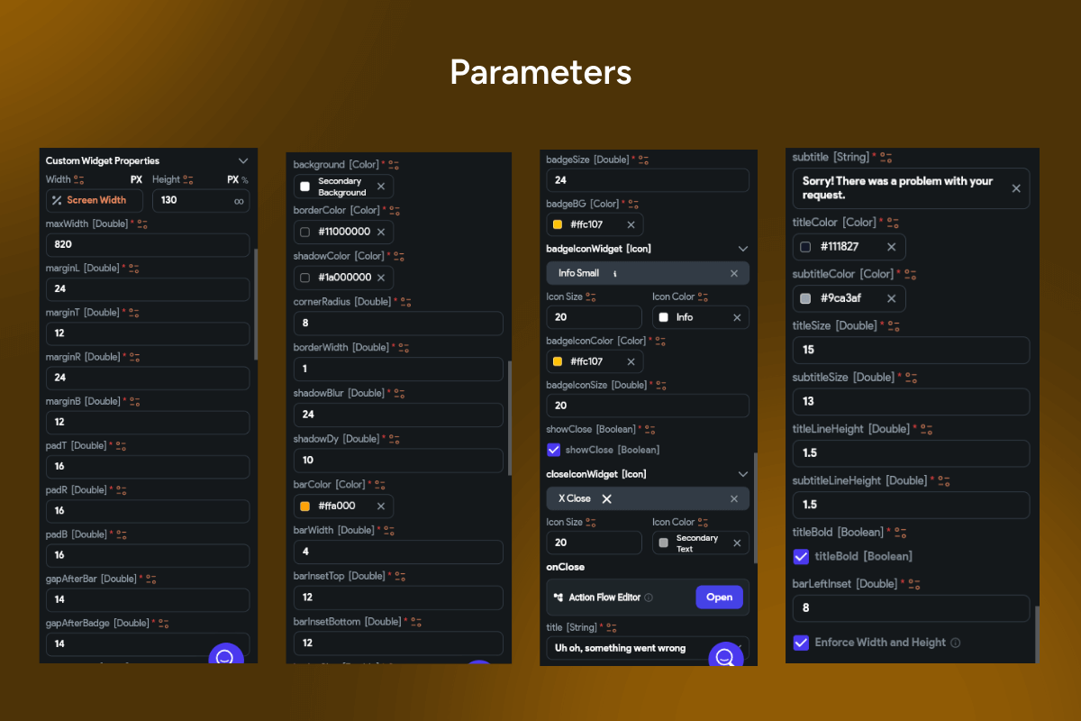
A compact, high-contrast Toast Notification Card Widget for communicating problems without blocking the UI. It pairs a bold headline (e.g., “Uh oh, something went wrong”) with a short, human message so users instantly understand what happened. A left accent bar and status icon 🎯 draw attention while keeping the design calm and readable. Users can dismiss anytime with a close × button, and optional auto-dismiss ⏱️ keeps flows fast. Colors, copy, and elevation are fully themeable for light/dark modes. Perfect for network issues, validation errors, or recoverable warnings across mobile and web.
Functionality ✨
-
Prominent title + secondary message with semantic styles 📝
-
Status visuals: accent bar + warning/info icon (fully themeable) ⚠️ℹ️
-
Dismiss actions: close button ✖️ and optional auto-timeout ⏳
-
Variants: warning, error, info—custom colors, icons, tone 🎨
-
Motion: slide/fade in/out with configurable duration & easing 🎞️
-
Accessibility: screen-reader labels, high contrast, large tap targets ♿
-
Layout: responsive width, multi-line wrapping, RTL support ↔️
Use cases 🚀
-
Show API/network failures with retry flows 🌐
-
Surface form validation issues after submit ✅❌
-
Notify about partial saves or missing permissions 🔐
-
Warn on unsaved changes, quota limits, or degraded service 🛑
-
Inline alerts in dashboards, checkout, settings 🧭
Keywords: warning banner, error notification, alert toast, inline alert, snackbar, dismissible notification, problem message, retry error, network error, form validation error, warning toast, info alert, UX feedback, app notification, FlutterFlow widget, FlutterFlow component, mobile UI, web UI, dark mode, accessibility, high contrast, Toast Notification Card Widget.
Toast Notification Card V5
- BEST VALUE
- 200+ FlutterFlow Widgets & Icons
- 30+ Hour FlutterFlow Express Course (Real Projects)
- 70+ Figma UI Kits & 3D icons
- Help with Customizations
- Unlimited Project Help
- Unlimited Bug Fixing Assistance
You may only use this template for one project. For more details, please read the Marketplace Terms of Service.