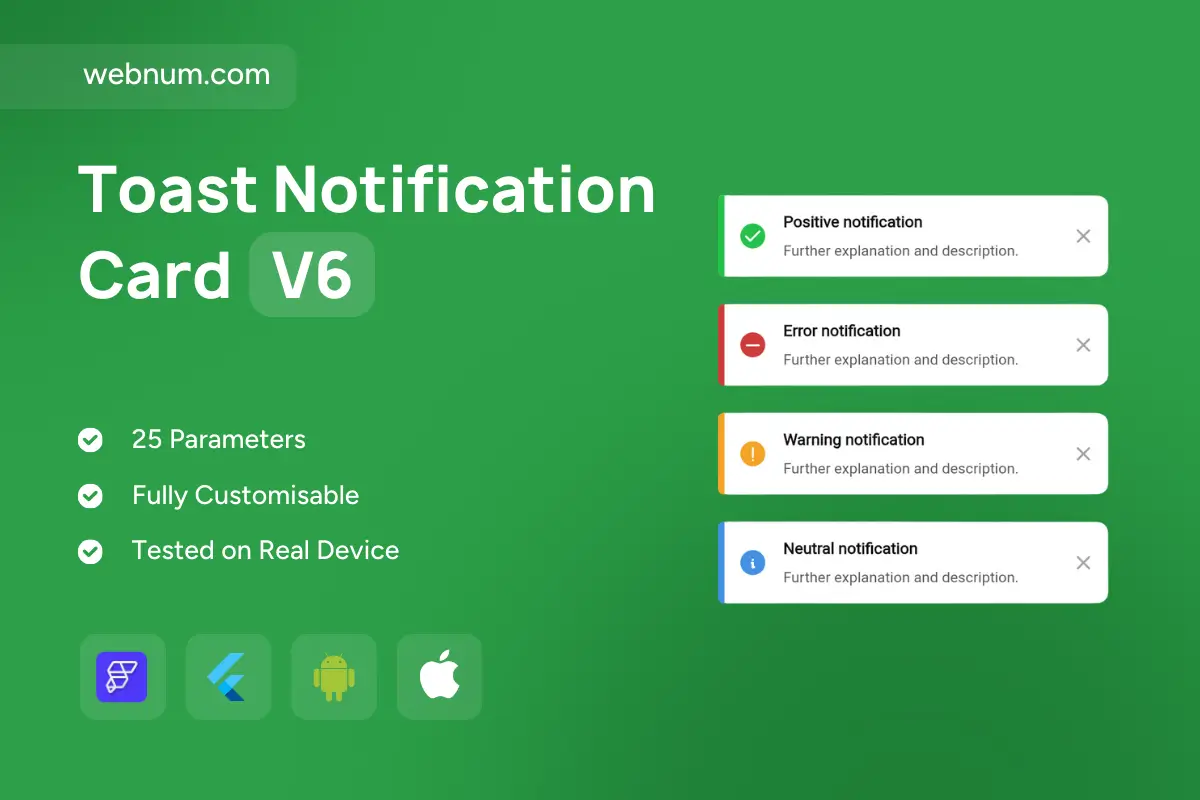
Toast Notification Card ⚡️A versatile, color-coded alert system for modern apps. Each card pairs a clear state icon with a bold headline and concise description — so users instantly understand what happened. Dismissible by design and wrapped in a soft, elevated container, the Toast Notification Card blends into dashboards, e-commerce, SaaS, and mobile UIs without stealing the show.
✨ Functionality
-
✅ Positive, ❌ Error, ⚠️ Warning, ℹ️ Neutral states
-
📰 Headline + description layout for quick scanning
-
🖼️ State icons: check, cross, exclamation, info
-
🎨 Color cues: green, red, orange, blue for instant recognition
-
🗙 Dismissible via close button (tap/click)
-
📱 Responsive card with shadow/elevation for any background
🚀 Use Cases
-
🟢 Show success after forms, payments, or saves
-
🔴 Alert errors with retry/help links
-
🟠 Warn about risky actions (unsaved data, deletions)
-
🔵 Provide neutral updates like system messages or tips
-
📊 Upgrade UX across dashboards, e-commerce, SaaS, mobile apps
🔎 Keywords
notification toast, toast message, alert message, error notification, success notification, warning toast, info toast, popup message, message card, dismissible toast, inline notification, ux feedback, alert component, status message, contextual notification, colored toast, error handler, warning alert, flutterflow widget, flutterflow component, mobile notification, app notification, success alert, info alert, warning message, error message, ui component, app feedback, interactive toast, user feedback system, real-time notifications
Toast Notification Card V6
- BEST VALUE
- 200+ FlutterFlow Widgets & Icons
- 30+ Hour FlutterFlow Express Course (Real Projects)
- 70+ Figma UI Kits & 3D icons
- Help with Customizations
- Unlimited Project Help
- Unlimited Bug Fixing Assistance
You may only use this template for one project. For more details, please read the Marketplace Terms of Service.