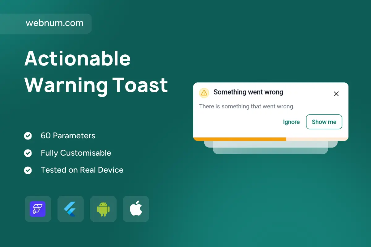
⚠️ Toast notification with progress — compact, actionable, and calm. A lightweight warning banner that surfaces issues without breaking flow. It pairs a 🟡 caution icon, clear title, and supportive message so users instantly get what happened. Two inline CTAs — Ignore and Show me — drive quick choices, while a subtle bottom ⏳ progress bar shows auto-dismiss timing. Fully dismissible (✖️), with smooth slide/fade animations for a modern, low-friction feel across mobile and web.
🚀 Functionality
-
🟨 Warning style: icon + title + subtitle.
-
🔁 Dual actions: primary Show me & secondary Ignore with custom callbacks.
-
⏳ Auto-dismiss with visible progress indicator; configurable duration.
-
✖️ Manual dismiss (close icon) and optional persistent mode.
-
📚 Stackable toasts with queueing; smooth fade/slide animations.
-
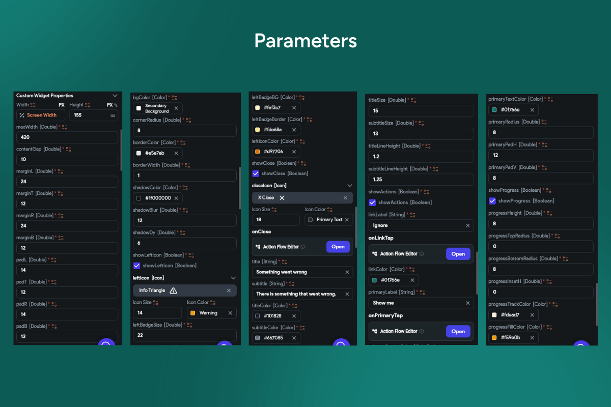
🎨 Theming: colors, typography, radius, elevation, spacing.
✅ Use cases
-
🧩 Recoverable issues: validation gaps, partial syncs, missing fields.
-
🧭 Quick remediation: open error details or jump to the failed step.
-
📶 Gentle warnings: quota nearly full, unstable connection, deprecated settings.
-
🧾 Inline guidance in onboarding, forms, checkout, dashboards.
-
📱🌐 Cross-platform status messaging for iOS, Android, and web.
🔎 Keywords (one line)
toast notification with progress, warning toast, actionable alert, dismissible toast, auto dismiss banner, progress bar toast, retry prompt, show details action, snackbar alternative, inline actions ui, status message, non-blocking alert, flutter widget, flutterflow component, mobile ui, web ui, material toast, caution icon, yellow alert
Actionable Warning Toast
- BEST VALUE
- 200+ FlutterFlow Widgets & Icons
- 30+ Hour FlutterFlow Express Course (Real Projects)
- 70+ Figma UI Kits & 3D icons
- Help with Customizations
- Unlimited Project Help
- Unlimited Bug Fixing Assistance
You may only use this template for one project. For more details, please read the Marketplace Terms of Service.