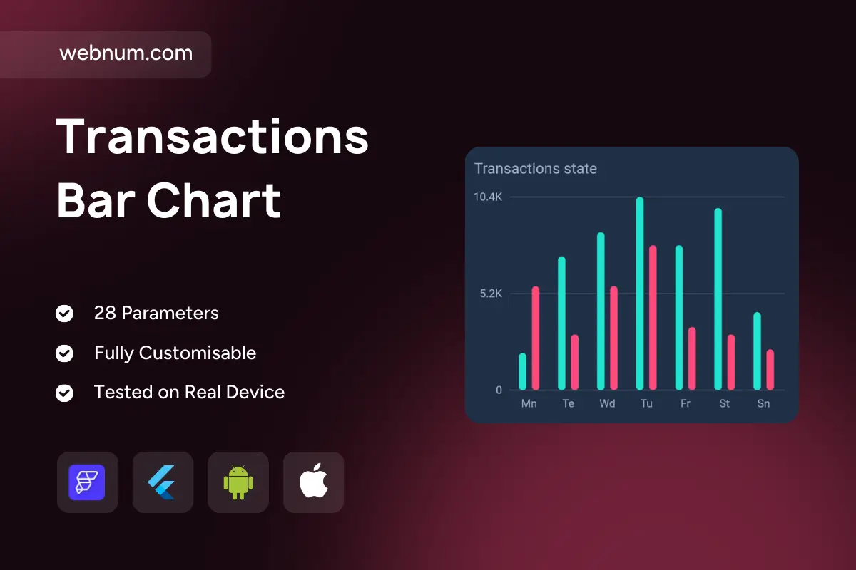
A clean, high-contrast double vertical bar chart widget 📊 for instant daily comparisons. Two color-coded series (e.g., income vs expenses, approved vs declined) pop on dark UI 🌙, with crisp gridlines, K-formatted ticks (0 → 10.4K), and short weekday captions for mobile legibility. Bars animate smoothly on load/update ✨, tooltips 🏷️ reveal exact values, and optional legends/threshold lines add context — perfect for finance and analytics screens where quick comparison beats long tables.
Functionality
🟦🟣 Dual-series grouped bars with themeable colors
📐 Axis controls: configurable ticks, formats (K/M), and gridlines
🎞️ Animated render & seamless transitions on data change
🏷️ Value tooltips on tap/hover; optional legend & series labels
🎯 Min/Max/Target lines and highlight bands (e.g., weekends)
💵 Finance dashboards: income vs expense by day/week
💳 Fintech: approved vs declined transactions by weekday
🛍️ Ecommerce: orders vs returns, paid vs pending
🚀 KPI screens: conversions vs drop-offs in funnels
🛠️ Operations: tickets opened vs closed for support teams
Keywords (one line) double vertical bar chart widget, grouped bar chart custom widget FlutterFlow, dual series bar chart FlutterFlow, transactions bar chart, finance analytics chart widget, mobile dashboard chart, tooltip bar chart FlutterFlow, dark mode bar chart, K formatted axis labels, responsive bar chart custom widget, KPI visualization widget FlutterFlow, gridlines axis labels chart, animated bar chart Flutter widget