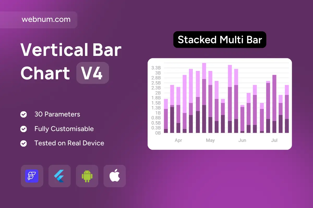
A clean, mobile-ready custom stacked bar chart widget 📊 for comparing categories over time while showing the total. Each column aggregates multiple series with soft gradients 🌈 so individual contributions stand out and overall totals are clear at a glance. Month labels anchor the X-axis 📅, a compact Y-axis with gridlines 📐 aids scale reading, and smooth load animations ✨ add life without distraction. Fully responsive and themeable—perfect for cards or full-width dashboards on web & mobile.
Functionality
🧱 Stacked bars for multiple series with cumulative totals
🔢 Optional percent-stacked mode + total value labels
💵 Monthly revenue breakdown by product/channel with grand totals
🧾 CAPEX/OPEX distribution over time with trend context
🚦 Traffic sources, conversions, or engagement by month
🧑🤝🧑 Resource allocation/workload split across teams or projects
📈 KPI dashboards for SaaS, ecommerce, finance, and operations
Keywords (one line) custom stacked bar chart widget, stacked bar chart flutterflow, multi series bar chart custom widget, percent stacked bar chart, part to whole chart widget, monthly time series chart, gradient rounded bars chart, legend toggle bar chart, responsive dashboard chart flutterflow, kpi bar chart widget, analytics data visualization, mobile web chart flutterflow, gridlines tooltip bar chart, dark mode chart widget, flutterflow custom widget charts