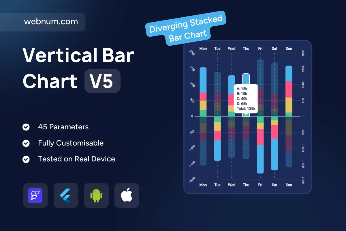
A clear, insight-first custom mirror stacked bar chart widget 📊 for visualizing positive vs negative contributions by day. Each column stacks segments above/below a zero baseline so totals — and how each category pushes up or pulls down — are obvious at a glance. Centered axes with mirrored ticks 📏 and subtle gridlines make week-to-week comparison effortless. A floating tooltip 🏷️ shows segment values plus the day’s total on tap/hover. Rounded bars and soft gradients 🎨 keep dense data readable in cards or full dashboards. Fully responsive, themeable, and smooth-animated — great in both dark 🌑 and light 🌕 UI.
Functionality
-
↕️ Diverging stacked bars (positive/negative) with zero baseline
-
🧱 Multi-series stacks per day with totals in tooltip
-
🧭 Configurable axes (mirrored ticks, step, labels), gridlines & reference lines
-
🎚️ Legend with series toggle; highlight on hover/tap
-
🟦 Rounded corners, gradient fills, and load/interaction animations
-
🔢 Percent/absolute modes; value formatting (K, M)
-
📱 Responsive sizing; dark/light themes; RTL & accessibility labels
Use cases
-
💰 Profit vs loss by category per weekday
-
🙂/😐/🙁 Sentiment split over time
-
💳 Inflows vs outflows (transactions, energy, inventory)
-
🛠️ Support tickets: resolved vs escalated by day
-
📣 Marketing impact: gains vs churn across channels
-
🧭 Ops dashboards where contributions go above or below zero
Keywords (one line)
custom mirror stacked bar chart widget, diverging stacked bar chart flutterflow, positive negative bar chart custom widget, contribution analysis chart widget, weekly stacked bar chart flutterflow, tooltip totals bar chart, legend toggle bar chart widget, gradient rounded bars chart, responsive bar chart custom widget, dark mode chart flutterflow, analytics dashboard widget flutterflow, zero baseline bar chart, business intelligence chart widget, KPI bar chart flutterflow, mobile web chart visualization