
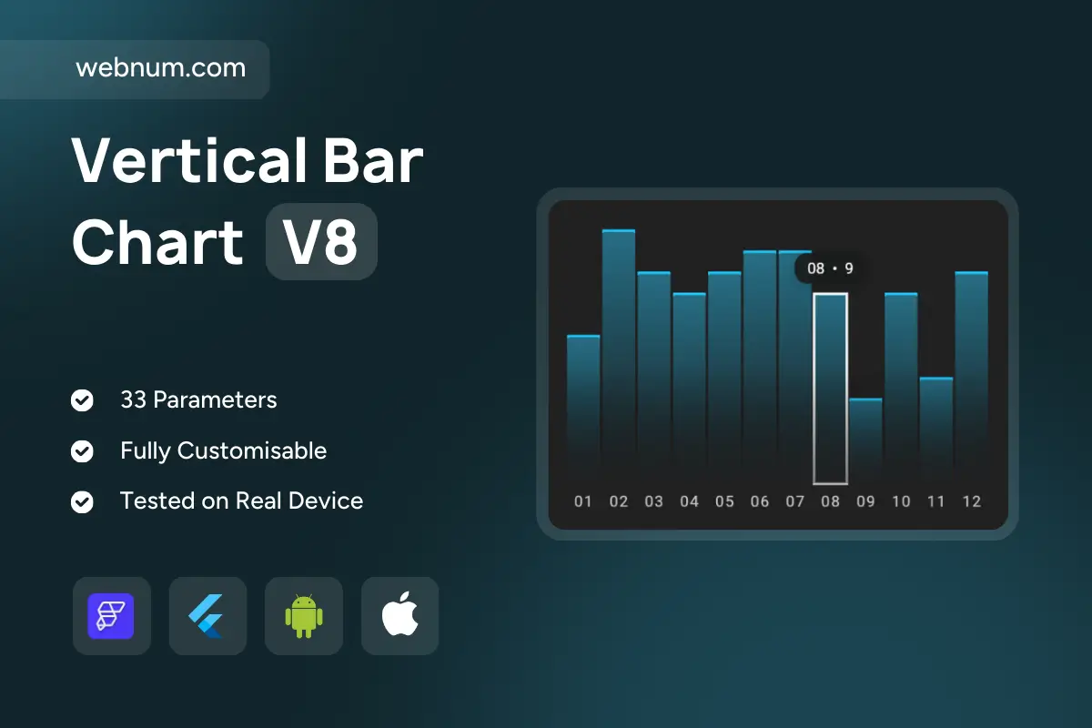
A vertical bar chart designed for comparing values across sequential categories. Each bar represents a numeric value aligned with its category, making it easy to see highs, lows, and overall distribution. The hover tooltip highlights the exact category and value, while a subtle gradient fill adds visual depth. The highlighted bar feature allows users to emphasize a specific data point for analysis. This chart is well-suited for reporting dashboards, KPIs, and quick insights into categorical data.
Functionality
-
Vertical bars with gradient color styling
-
Hover tooltips showing exact category and value
-
Highlighted/active bar state with border emphasis
-
Grid lines and Y-axis labels for readability
-
Smooth alignment of categories on the X-axis
-
Responsive resizing for different devices
Use cases
-
Monthly sales reports with category breakdowns
-
User activity tracking across days or weeks
-
Revenue or expense category comparisons
-
Performance dashboards for business KPIs
-
Analytics for surveys or polls with multiple choice answers
-
Quick visualization of structured categorical datasets
Keywords
bar chart, vertical bar chart, column chart, categorical data, data visualization, analytics, KPI dashboard, business intelligence, reporting chart, monthly trends, performance analysis, user activity chart, revenue tracking, expenses comparison, survey analytics, category distribution, hover tooltip, gradient bars, highlighted bar, responsive chart, Flutter widget, FlutterFlow component, interactive chart, mobile analytics, web dashboard, financial visualization, data comparison, quick insights, business metrics, visualization tool.