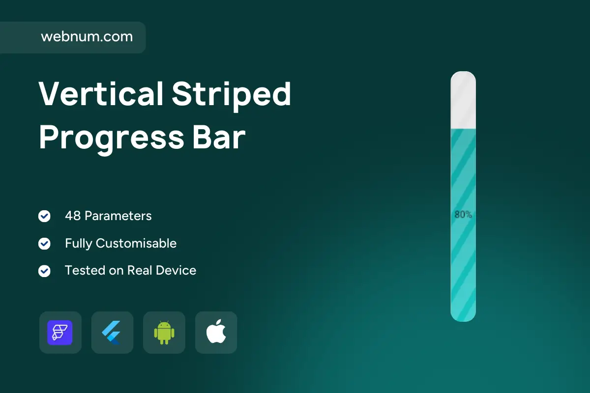
✨ A sleek vertical striped progress bar widget for FlutterFlow — rounded caps, diagonal stripes, and an inline % label. Drop it into dashboards, stat cards, or loaders to show completion, capacity, or goals with a modern, high-contrast look. 📊⬆️
⚙️ Functionality
-
🧭 Vertical orientation with smooth animated fill
-
🟩 Striped / gradient fill (optional animation speed & direction)
-
🔢 Inline percentage label — inside/outside, left/right options
-
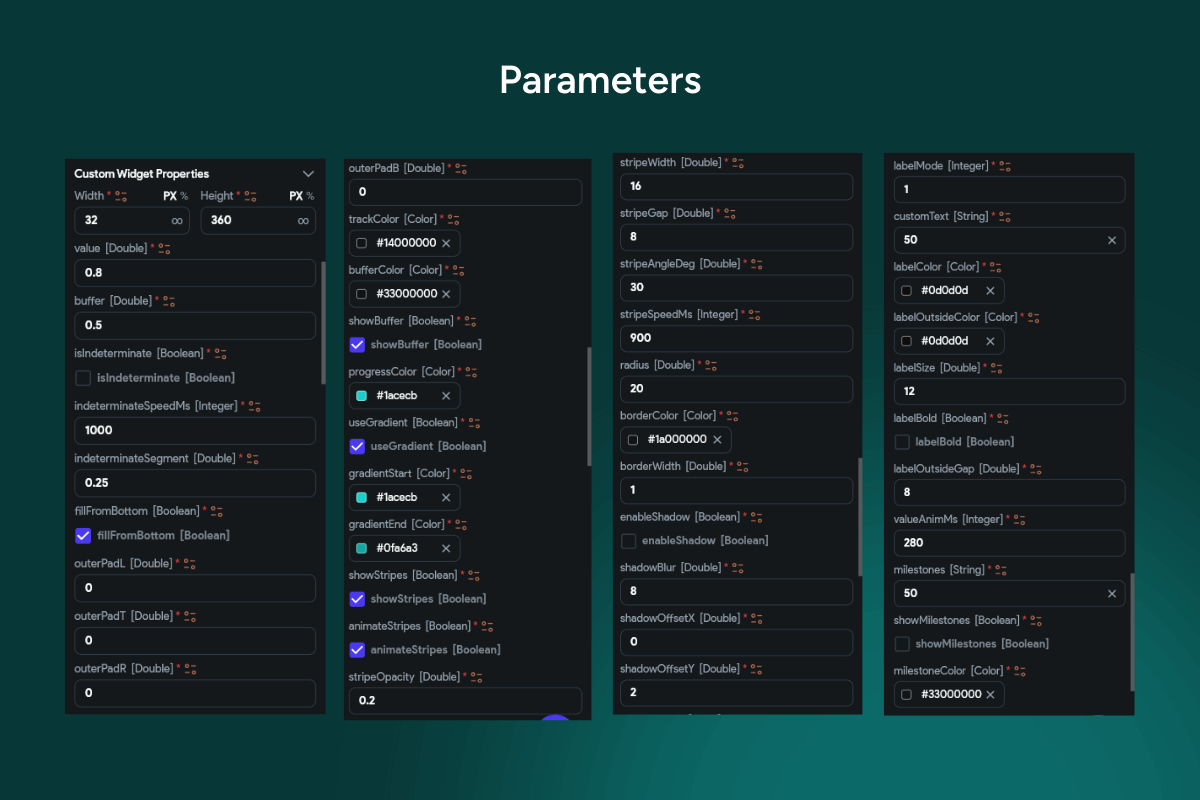
📈 Configurable range: min/max, step, decimal precision
-
🚦 Threshold colors (safe / warning / danger) with auto-switching
-
🎛️ Track styling: thickness, radius, shadow, background tint
-
🔄 Direction control: bottom→top or top→bottom
-
🔌 Data bindings: Firestore / Supabase / REST / local state
-
♿ Accessibility: ARIA/semantics + high-contrast text
-
🌗 Light/Dark themes with brand accent support
-
💬 Tooltip on tap/hover with exact value
-
⚡ Performance-friendly: minimal rebuilds, GPU-accelerated
✅ Great for
capacity & utilization • KPI dashboards • download/upload status • storage usage • fitness goals • hydration/energy meters • progress toward targets 🚀
Keywords: FlutterFlow progress bar, vertical progress bar, striped progress, gradient fill, completion meter, capacity gauge, utilization bar, KPI widget, goal tracker, percentage label, animated stripes, bottom to top, rounded caps, slim bar, status indicator, threshold colors, warning state, success state, progress indicator, dashboard component, loader, data binding, Firestore, Supabase, REST API, light theme, dark theme, accessible UI, mobile widget, Flutter widget, FlutterFlow component, minimal design, modern UI, performance optimized.