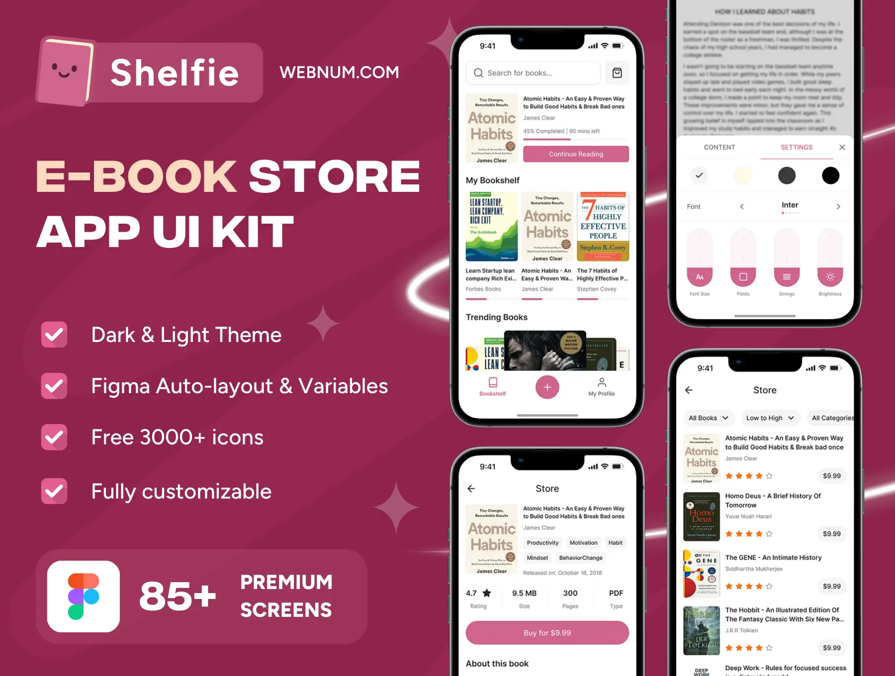
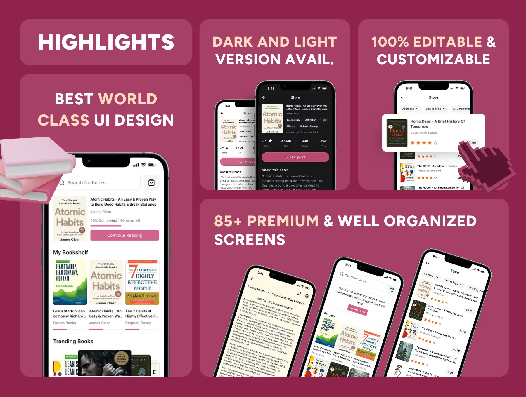
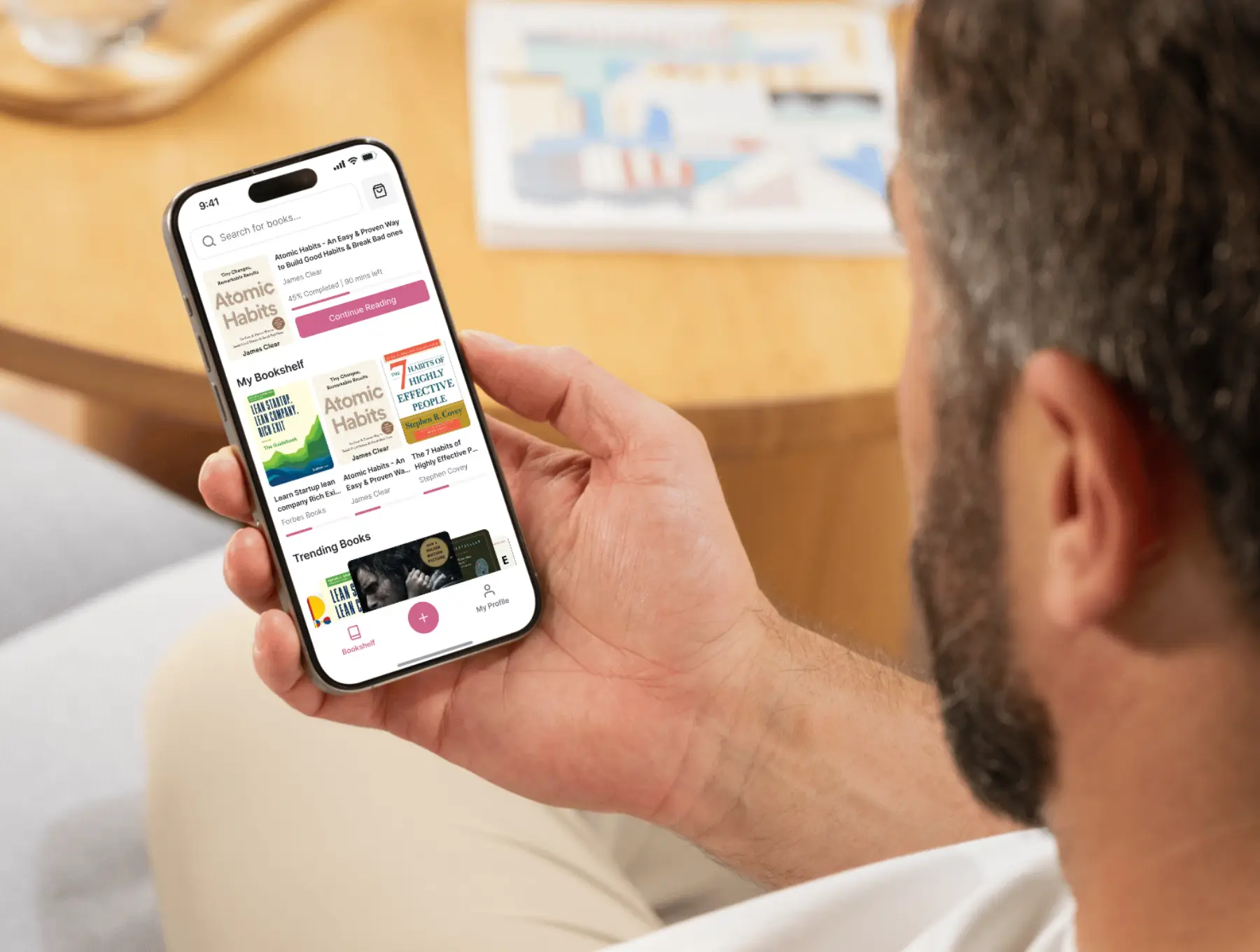
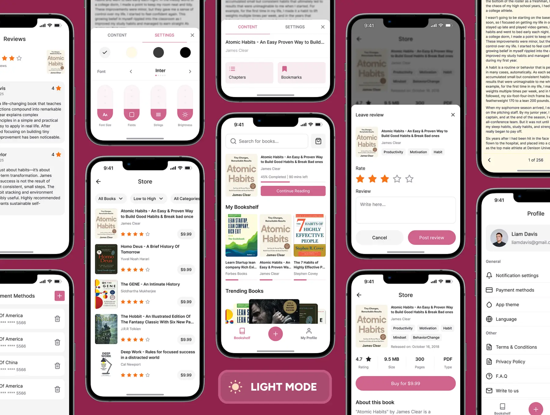
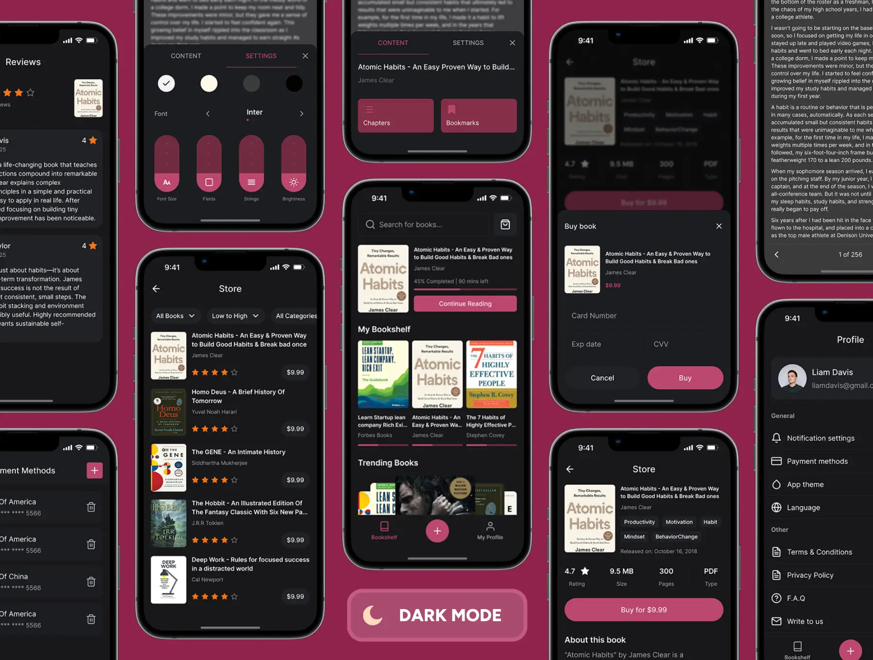
Launch a beautiful bookstore experience fast. Shelfie is a production-ready ebook store app ui kit for Figma with Dark & Light themes, a complete design system, and 85+ polished screens covering the whole journey — from discovery and purchase to the in-app reader. Rebrand in minutes, keep everything consistent, and ship faster. ⚡
What you get
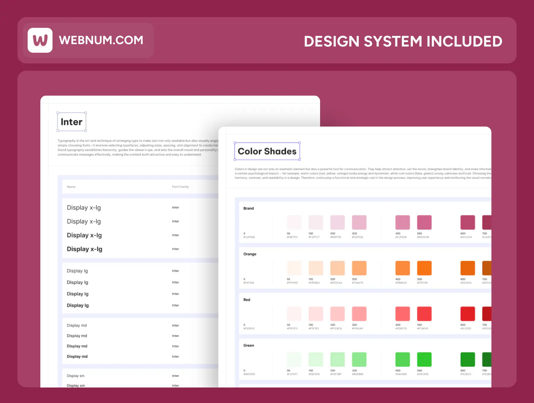
🗂️ .fig master file with 85+ pages & components
🧭 Design System: color tokens, typography (Inter), grids, spacing
🎚️ Smart theming via Figma Variables (colors, radius, typography)
🧩 3,000+ icons aligned to the system
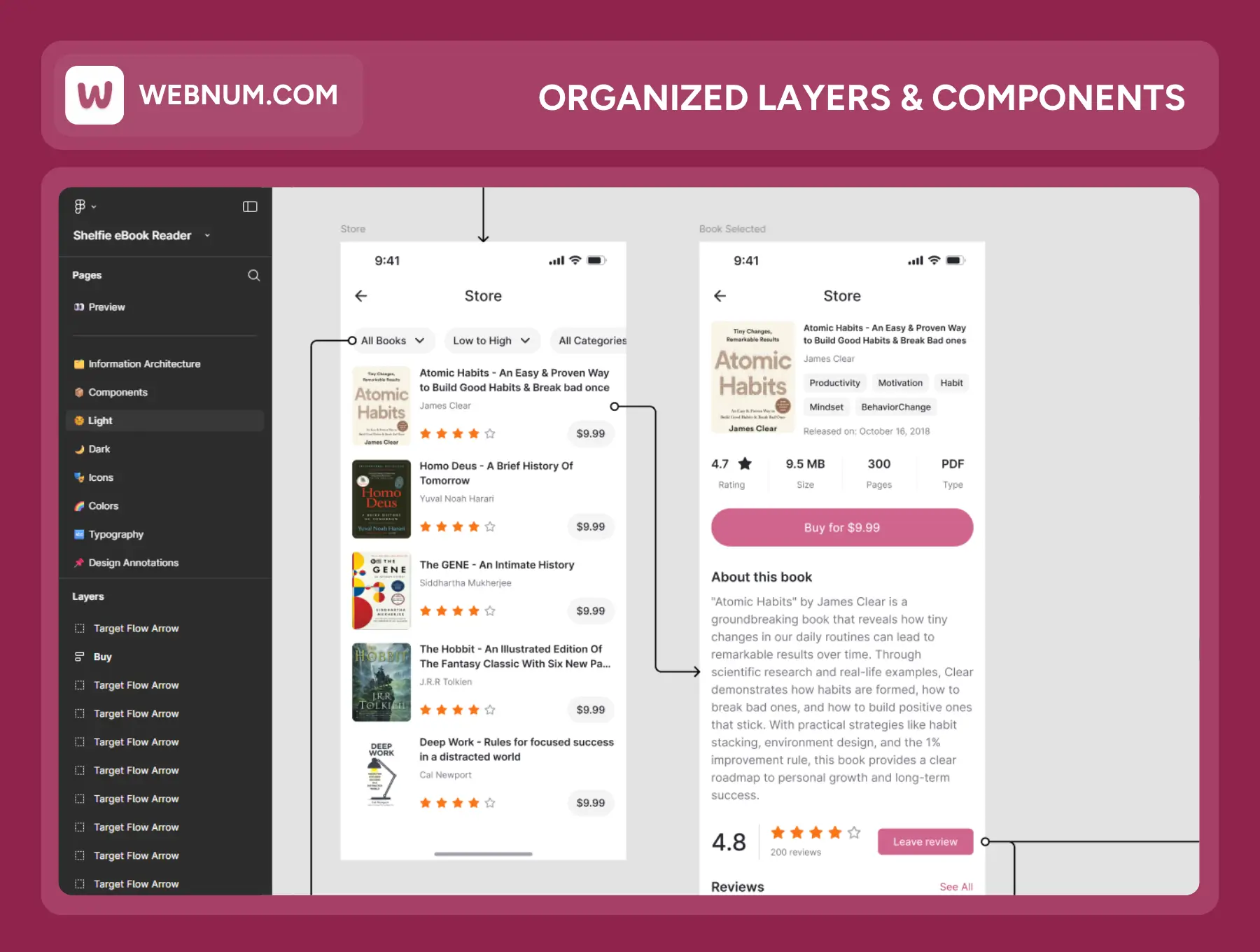
🗺️ Organized layers & user-flow map for quick onboarding